| Author | Thread |
|
|
07/30/2010 07:03:56 PM · #1 |
I think people are affraid to leave intelligent comments on pictures...There is no reason why this thread should be dead
|
|
|
|
07/24/2010 10:30:26 PM · #2 |
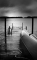
For such a young photographer you truly have a very artistic eye. This really is a truly stunning shot. The lighting is good. The scene is good. The sky is a little dark on the edges. This shot makes me want to go sit on the dock on the lake and cast a few times...Excellent work.
[Game: Comment or Die]
|
|
|
|
07/22/2010 01:53:36 AM · #3 |

Maybe it's just me (and it seems like it is), but this shot deserved a score more along the lines of 6.3 or 6.4.
+1 for cleverness in the title
+2 for excellent and creative crop/composition
+2 for beautiful imagery, quality and detail on the subject
+2 for good subject posture and expression
-1 for blown highlights on his hat
Fantastic. It's good, real good. This deserves "a longer look" from the voters. You were cheated. Part of it may be the "product placement" in the title, people didn't get it, and/or didn't think it fit perfectly with their description of he challenge.
I faved this, and I don't fav much.
ETA: Need to see more detail, sharpness, and/or focus on the coke can and the guy's face.
Message edited by author 2010-07-22 01:54:39.
|
|
|
|
07/22/2010 01:40:01 AM · #4 |
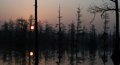
Lovely shot. Is there a reason the reflection of the trees' tips were cut off? I would have liked to see the full reflection. The silouette's edges are not tack-sharp, probably because of the very high f-stop used. It is my understanding (I'm no expert) that photo's do get "softer" and one does not gain much DOF with a normal lens with an f-stop of more than 16. However, I do think that the softness works in this photo. As one's eye is immediately drawn to the sun, I didn't like the thick tree trunk running right over the picture, but I do realise you could probably not have done anything about it. (don't you always have an extra explosive device in your back-pocket? he he). Overall the photo relaxes me, and my mind gets all fuzzy and drifts off into nothingness... so it's a very successful picture. |
|
|
|
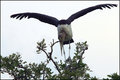
07/20/2010 03:24:02 PM · #5 |
Interesting looking bird. Not the pretties bird around but I like it. The colors look a little blown. The sky was not helping you out at all. Overall decent shot.
 |
|
|
|
07/20/2010 05:06:34 AM · #6 |
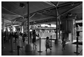
I should learn to look at B&W like you. This photo works wonderfully well in B&W. Look at the depth. I see three areas of interest, first the busy space in front, then the street area and thirdly the buildings at the back. Each area leads into the next, and creates a whole story. It is impossible to only look at this photo for 5 seconds. The people in front are dark, one see the bustle without being distracted by colour etc, and the people in the street, though much smaller, is seen well, so that they are just as important as the people in front.
Highly underrated in the challenge, IMHO.
Herman. |
|
|
|
07/18/2010 08:39:53 PM · #7 |

i dont know what it is about this image that draws me in ..
but i like the interesting crop where i can't see the full painting or radiogram so it leaves me to imagine the unshown .. i love so much the darkness and atmospheric/black & white processing ..
i spose this wouldnt appeal to everyone but it does have a quality that invokes thought and emotion ..
to me that's a photograph that has power and substance .:) ..
i'm not understanding the title, but i'm assuming that's my lack and not yours or the pics .. but it also makes me wonder, ponder and imagine .. all good .. :)
|
|
|
|
07/16/2010 08:19:13 PM · #8 |

Interesting shot. First thing I noticed was the the person and her hair does not stand out enough in the photo. Maybe altering the tones of the background or changing your lighting situation would help that. Second, there seems to be a lack of detail in the hair. Maybe it's just out of focus, but I would LOVE to see the same amazing detain you captured on the face to be in the hair.
Nice composition, but the hardest thing about this shot would be the lack of detail in the hair. Otherwise, fantastic!
|
|
|
|
07/14/2010 09:33:42 AM · #9 |
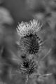
One could say that it's flat, another could say that DOF is too small, and maybe both are right. But if one concentrates on the shapes and lines and forms and the general business of this image, it's so interesting. It's so nice to see the nail-like petals in sharp focus and how the background answers to those. That's the main value of this shot for me. |
|
|
|
07/13/2010 07:55:35 PM · #10 |
Thanks for the comment...I will give a little background. At this point I barely had a camera and I did not have aceess to editing software at that point. This was directly out of the camera. I knew it wasn't going to be much here on DPC but atleast I was trying in adverse conditions. Again thanks for the comment.
|
|
|
|
07/13/2010 06:13:56 PM · #11 |
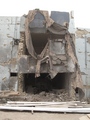
Love how this image is almost documentary-ish. I know it must be hard for you to find time and do edits etc. while on duty, but I see great potential of advanced edits on this image.. I could start by mellowing down the sky that is almost over exposed.. and then enhancing the texture of heavy fabric thing. Oh how impactful would it be in B&W:-)
Good capture, keep in up! |
|
|
|
07/13/2010 06:08:35 PM · #12 |
ok so why has this tread just died......Especially since I made the last comment.
|
|
|
|
07/10/2010 06:32:19 PM · #13 |
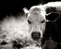
Excellent shot. I think this shot is more powerful as a B & W. You were able to capture every detail of the cow. Also the DOF is great. I think it adds to the shot. Good job.
|
|
|
|
07/10/2010 02:49:46 PM · #14 |

Very nice image and great title - even before I read the comment from  skewsme I thought 'crop the top' (and rotate about 5 degrees clockwise). Wonderful colours though and a great subject too. skewsme I thought 'crop the top' (and rotate about 5 degrees clockwise). Wonderful colours though and a great subject too.
Accomplished work. |
|
|
|
07/08/2010 08:38:18 PM · #15 |
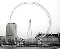
Nice work! I really like this. One thing that i don't like is how the blurred wheel blends in with the building, I would rather it stood out, since it is the main subject oh the photo. I also feel the entire shot is a bit under-contrasted.
|
|
|
|
07/08/2010 04:18:10 PM · #16 |
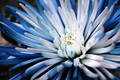
I think your flower images are pretty special. The coloration and depth of field on this one works exceptionally well. I like the composition and crop too. If I have a criticism, it is the inclusion of background top left; perhaps a tighter crop on the left might improve an already great image. |
|
|
|
07/08/2010 09:56:02 AM · #17 |
oops Roz, sorry, I did not notice the double.
It was hard to find of picture I can make constructive comment on : your portfolio is amazing!
I did not picked your picture with less comments because it is so old you might not benefit for comments on it. So I picked this one.
If I look the subject and the foreground and background, I notice the lighter parts (flash on the sand on the forehead, blond hair and skin for the subject, and red sky in the foreground) are all on the right side, leaving the left side very dark, except for the white wave and the foot. But the wave and the foot are not strong enough to balance the other three highlights. Unless the subject really is the foot in the air :) |
|
|
|
07/06/2010 11:21:32 PM · #18 |
seeing i missed out i'll post again coz i was really looking forward to a comment ..
doesnt happen much lately except for when i come in here .. !!

stunning flower ... love the colours .. i'm not sure about the tilt, but that could be just me ... the white background and softness is very lovely ..:)
|
|
|
|
07/06/2010 09:54:45 PM · #19 |
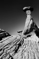
I like the Ansel's feel of this picture, particularly the sky.
What does not work for me is the tilt and also the extra rims (rock towel?) on each side of the main one. This kind of compo inspires me calm and serenity, the crowd of rims interfers with it. The foreground seems to be very textured but we lose some of it because it is not as sharp as it could be. Did you use a tripod?
Message edited by author 2010-07-06 21:55:22. |
|
|
|
07/05/2010 07:42:26 PM · #20 |
Originally posted by roz:
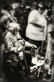
love this image .. !!
excellent the way you've highlighted the 'action' between the old man and the small dog and the way he's reaching out .. the blur works so well for this shot and the sepia tones are perfect ..
angels come in all forms !! .. |
Too bad nobody else does. If you saw the score you could see how disappointed I was with that one. I was sure it was gonna be a ribbon winner. Thanks for the comments, you just made my day!
ETA: Sorry for stealing your comment roz...
Message edited by author 2010-07-07 18:33:18.
|
|
|
|
07/05/2010 06:16:22 PM · #21 |
love this image .. !!
excellent the way you've highlighted the 'action' between the old man and the small dog and the way he's reaching out .. the blur works so well for this shot and the sepia tones are perfect ..
angels come in all forms !! .. |
|
|
|
07/05/2010 02:11:41 AM · #22 |
Fantastic capture. I love the creative idea of "rendering in progress". It really looks like that. Not sure what kind of editing was put into this, but it's just quirky and creative, I love stuff like that.
|
|
|
|
07/05/2010 12:17:48 AM · #23 |
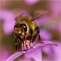
It is really easy to comment on  roz's photos, as there is never a lack of quality. roz's photos, as there is never a lack of quality.
Comment:
I think this is an outstanding shot, and definitely in your comfort zone. You are simply a master at taking macro photos of insects. The strengths in this shot are the vibrate colors, and the shallow DOF which really focuses the attention on the hungry bee.
ETA: wrong image number. Corrected now.
Message edited by author 2010-07-05 00:18:48. |
|
|
|
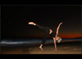
07/04/2010 11:23:03 PM · #24 |
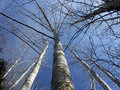
i'm going against your other commentors on this .. i think its an excellent shot .. i love the white trunks of the trees and the wonderful feeling i get when i look at this image .. for some reason it makes me think of a crisp and very cold morning in some country with amazing scenery ..
the trees are fantastic .. the branches forming a great pattern in the sky .. the sky so blue and gorgeous .. i dont know wot else to say but this really zings .. !!
could have a spot of contrast added in the processing to give more impact . ? .. havent tried it so i'm not sure ..
LOVE THIS THREAD .. !! |
|
|
|
07/04/2010 05:19:20 PM · #25 |

I think this is one of your best. The composition, the capture of emotion/feeling, and the processing are all done very well. It deserved a much higher score/placement. (Ah, just saw it was a free study. I think you automatically add .5 to the score for that)
8-)
Additionally, I applaud you for even taking the shot in the first place. I am still not comfortable with taking candid shots of strangers. Maybe, once I get more comfortable with my photography itself, that is something that will take care of itself.
Nicely done. |
|
Home -
Challenges -
Community -
League -
Photos -
Cameras -
Lenses -
Learn -
Prints! -
Help -
Terms of Use -
Privacy -
Top ^
DPChallenge, and website content and design, Copyright © 2001-2024 Challenging Technologies, LLC.
All digital photo copyrights belong to the photographers and may not be used without permission.
Current Server Time: 04/25/2024 07:06:30 AM EDT.


