| Author | Thread |
|
|
06/08/2008 03:04:12 PM · #1 |
I would like to start this thread so people who have further questions about why thier scores are so low for a photo.
I'll start.......
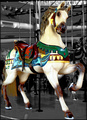
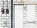
Why did this score so low? I thought this would score close to 6, but as you can see it did not. Anyone care to comment??
|
|
|
|
06/08/2008 03:30:35 PM · #2 |
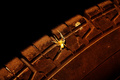
Hmm, at the end of the day it's just a fake horse? There's not really anything clever about the composition, no significant choices made with DOF (although the selective desat is a good cover for that), there's no larger story for the viewer to interact with (no child having fun, etc.), the perspective is fairly common and lacks drama... it's not that it is a terrible photograph it's just that it's not really all that interesting.
Take some risks next time. Get underneath and shoot up. Get inside and shoot out. Get on a different horse and shoot ahead. Use motion to show action, or people to tell a story. Get close and show the most interesting element, or get farther away and show context. Show a different perspective, one that the viewer doesn't usually see or has never seen before.
Think about what drew YOU to shoot this horse? This one, as opposed to any other? Did your shot really show why this one was so special?
|
|
|
|
06/08/2008 03:30:52 PM · #3 |
As Enzo already said, it's static and uninteresting. It's not a bad picture, but it lacks something interesting. A creative angle. Special lighting. Some action. A story. etc.
I think the votes reflect exactly that. You have lots of 5s, which I interpret as "Nice picture, nothing wrong with it, but nothing great about it either.", and not many votes on the low end and even less on the high one. |
|
|
|
06/09/2008 03:41:09 AM · #4 |
This is well done technically an average picture IMO. The selective desaturation added interest and stressed the main subject, otherwise it would be too busy. I agree with L2 and Sam94720. I gave it 5.
|
|
|
|
06/09/2008 10:11:48 AM · #5 |
Sure I'll play:
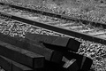
This is my first attempt at B&W. I liked the contrast, diagonals and textures and chose B&W to emphasize them. There was one comment that it was lacking a wow factor. Just trying to understand what to improve on for future challenges as my submissions to date are very hit or miss (mostly miss).
-Bob |
|
|
|
06/09/2008 10:26:15 AM · #6 |
Originally posted by bobnospum:
Sure I'll play:
This is my first attempt at B&W. I liked the contrast, diagonals and textures and chose B&W to emphasize them. There was one comment that it was lacking a wow factor. Just trying to understand what to improve on for future challenges as my submissions to date are very hit or miss (mostly miss).
-Bob |
Bob,
To me the image lacks contrast appearing very flat. I agree that the wood in the foreground could make for a good study in texture but the image needs to be processed to emphasize it. The wood is slightly out of focus and dark so the textures are obscured by the lack of detail.
Sorry if that's a bit harsh. |
|
|
|
06/09/2008 10:32:37 AM · #7 |
I'll throw one up: had hoped this shot would do better than middle of the pack, and obviously it didn't... For me, and I would assume for anyone who "knows" dogs, there's a whole story being told here, but then what do I know?
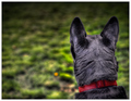
R.
|
|
|
|
06/09/2008 10:37:28 AM · #8 |
Ha you beat me Bear. I think the thing for me on your shot was the processing of the grass area. I like the grass area, but the ball has this huge halo around it that makes it look odd. I really like the DOF that you have here and to me it does tell a story. Mostly that SSSShe won't get it lol. Amazing that you brought out all the hair in the processing as black fur is a nightmare to make it look like fur.
So I am going to add mine to the mix. I adore teh shot and I didnt really care where it ended up. But I think that maybe the scores where so low becuase of the artistic almost painting affect that I got into it.
 |
|
|
|
06/09/2008 10:56:11 AM · #9 |
I had hoped for better on this, maybe a 6. Is it just too boring? Did I go overboard with the HDR?
 |
|
|
|
06/09/2008 11:00:37 AM · #10 |
Originally posted by Kelli:
I had hoped for better on this, maybe a 6. Is it just too boring? Did I go overboard with the HDR?
|
Compositionally, it's relatively blah, and that doesn't help. Many probably think tjhe HDR is overdone, but we're seeing a backlash against that right now and it doesn't stop *me* from doing it. However, in this case there's like a "streak" of flawed looking processing running vertically near the right edge of the frame, light anomalies there that don't fir in witht he rest, and that really others me.
R.
|
|
|
|
06/09/2008 11:02:32 AM · #11 |
Can I play?
 |
|
|
|
06/09/2008 11:07:19 AM · #12 |
Originally posted by metatate:
Can I play?
|
This one just feels blown out too far for me. I understand you were after an abstracted, sketchy look but you've pretty much lost my interest. It's a "good composition" in 2D way, but that's all it does for me.
I see hints of much more interesting texture throughout and wonder what the image is capable of being. Can we see an original?
R.
|
|
|
|
06/09/2008 11:38:25 AM · #13 |
This is an interesting shot with some beautiful elements. The pose is very strong. The processing perhaps takes it too far from photography and makes me wonder about the quality of the original. A similar fate suffered by my example.
[/quote] |
|
|
|
06/09/2008 11:43:45 AM · #14 |
Originally posted by metatate:
This is an interesting shot with some beautiful elements. The pose is very strong. The processing perhaps takes it too far from photography and makes me wonder about the quality of the original. A similar fate suffered by my example.
|
I've seen the original. Aside from converting to B/W very little was done...
R.
|
|
|
|
06/09/2008 08:26:13 PM · #15 |
Originally posted by metatate:
This is an interesting shot with some beautiful elements. The pose is very strong. The processing perhaps takes it too far from photography and makes me wonder about the quality of the original. A similar fate suffered by my example.
|
Why would the quality of the original matter? She didn't submit the original as her entry.
Message edited by author 2008-06-09 20:27:09.
|
|
|
|
06/10/2008 09:59:32 AM · #16 |

out of curiousity... |
|
|
|
06/10/2008 09:28:25 PM · #17 |
[img]//www.dpchallenge.com/image.php?IMAGE_ID=680364 [/img]//www.dpchallenge.com/image.php?IMAGE_ID=680364
Thought it would be high 6 or even 7 but it was still my best so far
Message edited by author 2008-06-10 21:32:12. |
|
|
|
06/10/2008 09:40:04 PM · #18 |
I can see that this thread is going to be popular so why not. I'm very new to this and am very interested in honest opinions as to what I can improve on. So have at it!
Thanks in advance! |
|
|
|
06/10/2008 10:44:10 PM · #19 |
Originally posted by rbecker:
[img]//www.dpchallenge.com/image.php?IMAGE_ID=680364 [/img]//www.dpchallenge.com/image.php?IMAGE_ID=680364
Thought it would be high 6 or even 7 but it was still my best so far |
 <-- just fixed the link <-- just fixed the link
Message edited by author 2008-06-10 22:44:33. |
|
|
|
06/10/2008 11:08:19 PM · #20 |
Originally posted by yanko:
Originally posted by metatate:
This is an interesting shot with some beautiful elements. The pose is very strong. The processing perhaps takes it too far from photography and makes me wonder about the quality of the original. A similar fate suffered by my example.
|
Why would the quality of the original matter? She didn't submit the original as her entry. |
As in, "What else could have been done with this interesting image?" maybe...?
R.
|
|
|
|
06/11/2008 12:03:07 AM · #21 |
Originally posted by bobnospum:
Sure I'll play:
This is my first attempt at B&W. I liked the contrast, diagonals and textures and chose B&W to emphasize them. There was one comment that it was lacking a wow factor. Just trying to understand what to improve on for future challenges as my submissions to date are very hit or miss (mostly miss).
-Bob |
I left a comment. |
|
|
|
06/11/2008 04:37:09 PM · #22 |
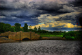
I really like this one. It also really confuses me. Many voters probably got a little freaked out. It does kind of look like the subject is out of focus. I assume it's just the style, and I like it, but it might have turned some people off. |
|
|
|
06/20/2008 03:20:44 PM · #23 |
Originally posted by JBHale:
I really like this one. It also really confuses me. Many voters probably got a little freaked out. It does kind of look like the subject is out of focus. I assume it's just the style, and I like it, but it might have turned some people off. |
Hale, it's a great photo, but your 7.1 score would have been higher if the subject and basically the whole top of the image did not look like it was copied from some famous painting. It just looks to un-real.
The below photo got a mere 5.0 rating, I thought it was a fantastic picture! Why did it score so low? Reach out to me...
Message edited by author 2008-06-20 15:21:14.
|
|
|
|
06/22/2008 07:06:24 PM · #24 |
Originally posted by ColemanGariety:
Originally posted by JBHale:
I really like this one. It also really confuses me. Many voters probably got a little freaked out. It does kind of look like the subject is out of focus. I assume it's just the style, and I like it, but it might have turned some people off. |
|
Sorry, not mine. I was giving critique to JulietNN. |
|
Home -
Challenges -
Community -
League -
Photos -
Cameras -
Lenses -
Learn -
Prints! -
Help -
Terms of Use -
Privacy -
Top ^
DPChallenge, and website content and design, Copyright © 2001-2024 Challenging Technologies, LLC.
All digital photo copyrights belong to the photographers and may not be used without permission.
Current Server Time: 04/16/2024 12:37:43 AM EDT.


