| Author | Thread |
|
|
04/08/2006 06:04:49 PM · #151 |
|
|
|
04/08/2006 08:57:44 PM · #152 |
OK, I must have been a Lumberjack in a past life. Not sure what it is about trees? Maybe it's because they're the tallest natural thing above the horizon I could find and are slightly more interesting than a bare corn field? At least the grass is turning green. :)
 |
|
|
|
04/08/2006 10:00:18 PM · #153 |

Apologies for this archived shot, however, the next week or so has no time to spare for a jaunt outside of the paved jungle. |
|
|
|
04/09/2006 12:33:35 AM · #154 |
Originally posted by justin_hewlett:
Ok, here's my re-working of my Golden Light:
From  to to  |
That's quite a bit better don't you think? I'm especially heartened to see that you found the necessity of cropping a tad of the bottom to get of the minor, horizontal distraction. Good work!
R.
|
|
|
|
04/09/2006 12:46:38 AM · #155 |
|
|
|
04/09/2006 12:53:56 AM · #156 |
| Now that is why I come here.... thank you Robert, just felt a growth spurt taking place. |
|
|
|
04/09/2006 12:57:40 AM · #157 |
Originally posted by rblanton:
Now that is why I come here.... thank you Robert, just felt a growth spurt taking place. |
(wink)
Incidentally, which version best suits your sensibilities?
R.
Message edited by author 2006-04-09 00:58:56.
|
|
|
|
04/09/2006 01:06:20 AM · #158 |
| Im thinking two, middle one. I'll play with it tomorrow, time for shut eye now. |
|
|
|
04/09/2006 01:09:23 AM · #159 |
Originally posted by rblanton:
Im thinking two, middle one. I'll play with it tomorrow, time for shut eye now. |
I'd agree with that :-) Some people will prefer the lighter overlay, very few will prefer the heavy-handed one.
R.
|
|
|
|
04/09/2006 01:17:40 AM · #160 |
I have an image similar to rblanton's but it is oversharpened and I deleted the original because my hard drive was nearly full. Is this fixable?
 |
|
|
|
04/09/2006 01:19:10 AM · #161 |
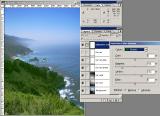
Since the voting's over now ... I used a pair of graduated masks for tone curves to adjust my Best Of 2002 entry -- on a diagonal roughly following the shoreline -- plus a few other adjustments. Incredibly, I apparently used selective color correction correctly!
Original:  Entry: Entry:  |
|
|
|
04/09/2006 01:21:32 AM · #162 |
Originally posted by myra:
I have an image similar to rblanton's but it is oversharpened and I deleted the original because my hard drive was nearly full. Is this fixable?
|
Not from that version, no. Teach you to toss originals. Get an external drive for archiving :-)
Robt.
|
|
|
|
04/09/2006 01:26:39 AM · #163 |
Originally posted by GeneralE:
Since the voting's over now ... I used a pair of graduated masks for tone curves to adjust my Best Of 2002 entry -- on a diagonal roughly following the shoreline -- plus a few other adjustments. Incredibly, I apparently used selective color correction correctly!
Original: Entry: |
Nice improvement, but look closely at your sky, especially upper right; see the blotchiness? That happens a lot when we mess with hyper-saturating the blues. It's really important to do BOTH blue and cyan together; if the two components are out of balance, you get blotches. This is true to a lesser extent with red and yellow, and yellow and green, depending on the udnerlying tonalities.
Robt.
|
|
|
|
04/09/2006 01:28:23 AM · #164 |
| OK. I'll look around for another. I am really enjoying reading this thread. Thanks for taking the time to teach this photo lesson Robert. |
|
|
|
04/09/2006 01:39:46 AM · #165 |
Originally posted by Bear_Music:
Nice improvement, but look closely at your sky, especially upper right; see the blotchiness? That happens a lot when we mess with hyper-saturating the blues. It's really important to do BOTH blue and cyan together; if the two components are out of balance, you get blotches. |
I see quite a bit of noise (I did not use noise-reduction software) but not exactly "blotchiness" -- also, I only used tone curves (RGB and Blue) but no selective color-correction on the blues.
However, if there's blotchiness based on a balance of Blues and Cyans, I may well not see it at all -- I have a red/green color-blindness defect which seems to lessen my ability to see the red component within other colors. That's why I was so surprised at the comments I got regarding color during the voting ... I thought I'd have a pink ocean or something ... : )
I put up a print image of this -- do you think I should pull it to fix this?
BTW: This is a backlit image.
Message edited by author 2006-04-09 01:41:30. |
|
|
|
04/09/2006 01:46:59 AM · #166 |
Re-edited my canyons shot, hope it looks better?

Also, took this one today, think I did OK on the editing?
  |
|
|
|
04/09/2006 01:53:48 AM · #167 |
Originally posted by GeneralE:
Originally posted by Bear_Music:
Nice improvement, but look closely at your sky, especially upper right; see the blotchiness? That happens a lot when we mess with hyper-saturating the blues. It's really important to do BOTH blue and cyan together; if the two components are out of balance, you get blotches. |
I see quite a bit of noise (I did not use noise-reduction software) but not exactly "blotchiness" -- also, I only used tone curves (RGB and Blue) but no selective color-correction on the blues.
However, if there's blotchiness based on a balance of Blues and Cyans, I may well not see it at all -- I have a red/green color-blindness defect which seems to lessen my ability to see the red component within other colors. That's why I was so surprised at the comments I got regarding color during the voting ... I thought I'd have a pink ocean or something ... : )
I put up a print image of this -- do you think I should pull it to fix this?
BTW: This is a backlit image. |
From where I'm sitting, the color's overcooked, particularly in the blue, which is very cartoonish/unnatural. In this case, what I'm callin "blotchiness is, in fact, noise, and it's coming from hyper-saturation in the blue/cyan area. It's a real problem when you try to juice up skies; I fight it all the time. Doesn't matter which path you take to get there, when you overcook blues that bright & chromatic you start getting these artifacts.
I've done my own take on it, from the "before" shot you posted. There's no noise problem here, and overall the palette looks more natural to me. You're right, btw, that trying to separate out the horizon is hopeless. In fact, it's not even desirable; one of the great beauties of the Big Sur seascapes is when you get that low mist merging the sky into the sea. (Added a second version that's more contrasty and luminous)
 
Robt.
And, oh yes, definitely fix the sky before trying to sell prints; the noise will show up big-time in a print.
Message edited by author 2006-04-09 02:07:42.
|
|
|
|
04/09/2006 01:57:33 AM · #168 |
Yes, the canyons shot is MUCH better now. Lesson well-absorbed. The PP on the susnet shot is on the extreme end, but since you need something to hold our interest it may's well be hyper-color, eh? It's pretty smoothly done, anyhow...
R.
|
|
|
|
04/09/2006 02:23:35 AM · #169 |
Well this isn't exactly a landscape but here is a photo that is untouched.
 |
|
|
|
04/09/2006 02:50:39 AM · #170 |
Thanks Robt.
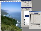
I can't re-edit right now, but just so people can see how I got to this point, I've put step-by-step screenshots of the color processing (not sharpening) in this pbase gallery -- here are the individual thumbnails:
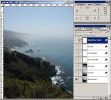 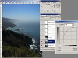 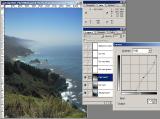 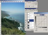
   |
|
|
|
04/09/2006 03:16:32 AM · #171 |
Here is my edited version.
 |
|
|
|
04/09/2006 03:03:32 PM · #172 |
I'm not very good as post processing, although you'll probably gather that as soon as you see the image below!
  |
|
|
|
04/09/2006 03:05:03 PM · #173 |

Original..........................Added Gradient |
|
|
|
04/09/2006 04:21:08 PM · #174 |
Here's mine, from a few days ago. I'm still kinda' in the dark about post-processing. These are sized down to 960x640, but I can post full-size links if needed.
Original:  Edited: Edited: 
|
|
|
|
04/09/2006 08:47:00 PM · #175 |
OK - here's my landscape - tough in NYC to get the large open spaces that others are getting here, but here goes.
This is the unedited one:
//www.samchadwickphoto.com/dpchallenge/IMG_3311e1.jpg
And then I had a go at the highlights and shadows bit, adjusting the levels of each layer til I liked what it looked like and ended up with this (which seems almost identical!)
//www.samchadwickphoto.com/dpchallenge/IMG_3311e2%20copy.jpg
Rob, are you sure you mean Ctrl+I to invert the contrast of the selection, rather than Ctrl+Shift+I to invert the selection? I did the Ctrl+I first and ended up with a very strange almost black result!
|
|
Home -
Challenges -
Community -
League -
Photos -
Cameras -
Lenses -
Learn -
Prints! -
Help -
Terms of Use -
Privacy -
Top ^
DPChallenge, and website content and design, Copyright © 2001-2024 Challenging Technologies, LLC.
All digital photo copyrights belong to the photographers and may not be used without permission.
Current Server Time: 04/18/2024 12:04:18 PM EDT.


