| Author | Thread |
|
|
04/07/2006 02:23:57 PM · #101 |
|
|
|
04/07/2006 05:12:50 PM · #102 |
Originally posted by Bear_Music:
Originally posted by Skyarcher:
Uhmm... I'll have to double check, don't think it was awb though.
Shot jpg's for these and only resized, did no other changes to them. |
White balance isn't important for the exercise. Don't worry about it. Real eye-opener, isn't it?
Now, if you want, do the exercise again, with +2, -2 and 0 exposure compensation dialed in :-)
Robt. |
Yes, it is very much an eye opener!
I redid them again, this time outside instead of my utility room :D
Interesting part to me, was watching the histogram when I loaded into PS. The black and white together shot, histogram was separated, but the black and white individually - the histogram for each was almost identical.
Left to right: b&w, white, black
[thumb]317974[/thumb] [thumb]317976[/thumb] [thumb]317975[/thumb]
Off to read Lesson 3! :D |
|
|
|
04/07/2006 08:11:34 PM · #103 |
Originally posted by Skyarcher:
[
Interesting part to me, was watching the histogram when I loaded into PS. The black and white together shot, histogram was separated, but the black and white individually - the histogram for each was almost identical. |
Yes, that's exactly the point. The identical histograms PROVE that the camera has no idea what it's looking at and is just "making assumptions"...
Robt.
|
|
|
|
04/07/2006 09:44:55 PM · #104 |
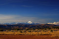
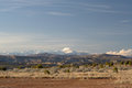
Here's my try at a landscape without a subject..

I don't know if the trees are subjects though. |
|
|
|
04/08/2006 12:08:37 AM · #105 |
Originally posted by MadMan2k:
Here's my try at a landscape without a subject..
I don't know if the trees are subjects though. |
Yup, that fits the bill. Now, what can you do to it to elevate it enough to really grab our interest?
R.
|
|
|
|
04/08/2006 12:25:28 AM · #106 |
| Hmm.. Maybe if there was a sunset/rise or a bunch of star trails behind it, it would be better? |
|
|
|
04/08/2006 12:30:32 AM · #107 |
Edit: misunderstanding
Message edited by author 2006-04-08 00:31:39.
|
|
|
|
04/08/2006 12:30:48 AM · #108 |
Originally posted by MadMan2k:
Hmm.. Maybe if there was a sunset/rise or a bunch of star trails behind it, it would be better? |
NO, this picture right here, right now; what can you do to it to improve it, as far as post-processing goes? PP is REALLY important in landscape photography, it's what you need to make things sing.
Look at your image critically and ask yourself "What would make this look better, and how can I accomplish it?" I've already done a quick makeover, but I'm not gonna show it to you until you've taken a stab at it yourself :-) Nothing wildly special, but nevertheless an improvement...
Robt.
|
|
|
|
04/08/2006 12:33:20 AM · #109 |
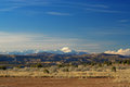
Originally posted by justin_hewlett:
Use raking light? |
The light is reasonably good. Certainly, lower light, especially near sunset, might be very nice, but the light's not totally flat or anything here; the mountains, the clouds, the vegetation all show some relief and texture.
R.
|
|
|
|
04/08/2006 12:34:55 AM · #110 |

Took this last night. Pretty flat shot over a marsh. Took it 'cause I liked the cattails.
|
|
|
|
04/08/2006 12:35:54 AM · #111 |

This is a few months old but I think it fits your description well enough.
|
|
|
|
04/08/2006 12:37:03 AM · #112 |
Originally posted by Cyndane:
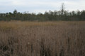
Took this last night. Pretty flat shot over a marsh. Took it 'cause I liked the cattails. |
Same question for you; how can you make that image better? And, also, in the context of our first lesson, how would you define the light on this image?
R.
|
|
|
|
04/08/2006 12:39:14 AM · #113 |
Originally posted by justin_hewlett:
This is a few months old but I think it fits your description well enough. |
That's a reasonable example of "landscape without subject", more about the light than about the strong landforms. Now how can it be improved? What does it need?
R.
|
|
|
|
04/08/2006 12:41:25 AM · #114 |
Originally posted by Bear_Music:
Originally posted by justin_hewlett:
This is a few months old but I think it fits your description well enough. |
That's a reasonable example of "landscape without subject", more about the light than about the strong landforms. Now how can it be improved? What does it need?
R. |
Foreground objects?
|
|
|
|
04/08/2006 12:44:30 AM · #115 |
Must admit I'm fairly stumped as to what further post-processing I could do without a particular effect in mind...
This was the original (resized from the raw conversion), I already had to do a good bit since it wasn't exactly the greatest photo.. hehe
 |
|
|
|
04/08/2006 12:44:32 AM · #116 |
Originally posted by justin_hewlett:
Foreground objects? |
No, THIS image as it is captured; how can you improve it in post-processing? What are its strong points and weak points, and how can you emphasize the former and eliminate/downplay the latter?
R.
|
|
|
|
04/08/2006 12:49:14 AM · #117 |
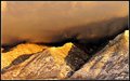
OK, let me give you an example; here's a 5-minute remake of Madman's shot, in a more dramatic rendition. It's only one of several directions one might go in, but it has more visual punch now; some might argue it's "overcooked", but I tend to exaggerate when doing demonstrations:
This was done from the first-posted image; I could actually do it cleaner from the straight-from-raw version because the blues haven't been monkeyed with yet in that one, and once blues are pumped they are hard to change...
R.
|
|
|
|
04/08/2006 12:52:45 AM · #118 |
Originally posted by Bear_Music:
Originally posted by justin_hewlett:
Foreground objects? |
No, THIS image as it is captured; how can you improve it in post-processing? What are its strong points and weak points, and how can you emphasize the former and eliminate/downplay the latter?
R. |
Ok.
I think that this image's strongest feature is the dramatic lighting and the golden color of the late-day sun and its effect on the mountain forms. I tried to emphasize this color by boosting the saturation, but did I go too far?
On the downside, the sky's a little noisy and could probably be ran through neat image. The mountains appear soft in some spots and could probably use a little USM. The sky could probably use a boost in contrast to emphasize it a bit more.
Closer?
|
|
|
|
04/08/2006 01:03:37 AM · #119 |
Thanks for doing that one, I'll redo it and try to do a similar style.
This is the 1600px version (~400kb) if it'd work better - I think the lack of edge sharpness is from my polarizer, it seems like the filters I have are really terrible when I use them on my 28-75.. maybe because with my other lenses I use step up rings and only use the center of the filters.
//jonbuder.com/images/canyons_orig2.jpg |
|
|
|
04/08/2006 01:04:41 AM · #120 |
Originally posted by justin_hewlett:
I think that this image's strongest feature is the dramatic lighting and the golden color of the late-day sun and its effect on the mountain forms. I tried to emphasize this color by boosting the saturation, but did I go too far?
On the downside, the sky's a little noisy and could probably be ran through neat image. The mountains appear soft in some spots and could probably use a little USM. The sky could probably use a boost in contrast to emphasize it a bit more.
Closer? |
Those are all valid observations. I'd add to them that there's a certain harshness to the current rendering that seems at odds with the voluptuousness of the light & forms you are working with. The image strikes me very much as an uncompleted work. I have the sense that there's untapped potential in it. Can you post the unmodified original?
R.
|
|
|
|
04/08/2006 01:17:24 AM · #121 |
Originally posted by MadMan2k:
Must admit I'm fairly stumped as to what further post-processing I could do without a particular effect in mind...
This was the original (resized from the raw conversion), I already had to do a good bit since it wasn't exactly the greatest photo.. hehe
 |
What about using levels on it? I played also with it and went into Levels then did each channel individually.
I thought it was good before, but after playing, to me, adjusting the levels made it 'pop' even more, colorwise. All I did was move the sliders to the toward where the histograms ended. (Not sure if I am saying that correctly. On each channel, I brought the dark up and the light down.)
Then I did a very slight high-pass sharpen on it(0.4).
-Christine |
|
|
|
04/08/2006 01:28:53 AM · #122 |
Originally posted by Bear_Music:
Can you post the unmodified original? |
Yes. I'll post a 640 version in my port for reference but I'm also emailing you a 1000px version that will be eaiser to work with.
Original:

Message edited by author 2006-04-08 01:39:22.
|
|
|
|
04/08/2006 01:29:28 AM · #123 |
Thanks, I haven't been using levels very much except for BW pictures but I'll try it.
This is my attempt at the style that Bear did it in -  |
|
|
|
04/08/2006 01:35:02 AM · #124 |
Originally posted by Bear_Music:
Originally posted by justin_hewlett:
Foreground objects? |
No, THIS image as it is captured; how can you improve it in post-processing? What are its strong points and weak points, and how can you emphasize the former and eliminate/downplay the latter?
R. |
Maybe work on the blue channel in Levels?
If you bring the right slider in toward the histogram, it actually makes the 'golden' colors on the mountains brighter because there is a small definition between them and the sky. Then a smidge of neat image made the billowy (is that even a word?) mist/clouds seem ethereal almost.
**If you use Photoshop - click on your Histogram palette - then click the arrow to the right of it to open up your options. Then click on the ALL Channels View, it will show which channel needs a little work. :)**
-Christine |
|
|
|
04/08/2006 01:45:01 AM · #125 |
OK, this one is worked from the 400K, large original. It's a little less extreme.
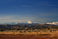
MadMan, your blues are going out of control. I'm using contrast masking on mine (see earlier in this thread) and using "soft light" mode on the shadow mask instead of "screen mode". Then I have a sky/mountains selection and a foreground/hills selection, and am applying hue/sat separately to each. In the sky, I'm actually DEsaturating both blue and cyan slightly. I also have a gradient overlay from blkue to transparent out of the left corner of the sky at a slight angle, and faded after application, to even the sky out.
IN the foreground I am increasing saturation of both yellow and red, and lightening yellow and darkening red; this is creating a greater luminosity-step between the two.
It's important to be aware of the relationship between saturation and lightness/darkness; the more you lighten a channel, basically, the more you need to saturate it to keep color in it, and to some extent this is also true when you darken it.
R.
Message edited by author 2006-04-08 01:47:43.
|
|
Home -
Challenges -
Community -
League -
Photos -
Cameras -
Lenses -
Learn -
Prints! -
Help -
Terms of Use -
Privacy -
Top ^
DPChallenge, and website content and design, Copyright © 2001-2024 Challenging Technologies, LLC.
All digital photo copyrights belong to the photographers and may not be used without permission.
Current Server Time: 04/16/2024 03:46:44 AM EDT.


