| Author | Thread |
|
|
05/19/2010 07:36:02 AM · #1 |
I was not expecting a high score and I don't think the image is a stunner, to me it is an average shot and I see a few things that could have been fixed in post processing! I am disappointed that I have not received much of a critique. So, would you comment on my pic?
|
|
|
|
05/19/2010 08:07:32 AM · #2 |
| my comment is with the origional challenge photo. |
|
|
|
05/19/2010 08:11:04 AM · #3 |
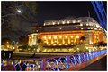
| For me there is too much to take in. Maybe without the blue rail and the blue in the upper rt corner to concentrate more on the building. |
|
|
|
05/19/2010 08:14:48 AM · #4 |
| I agree with mike. I gave it a 6, but would have given it one higher if the bridge wasn't seen. |
|
|
|
05/19/2010 08:19:45 AM · #5 |
A beautiful landmark and often photographed! I like your version of it, but agree that the blue lines in the upper right are too much!
If you had stepped a bit to the left and tried to get the building without cutting it off and without getting that upper bridge part in it, it would have been much better!
The lower blue railing is very pretty, so are the recognizable hint of the Singapore-Flyer and the stars of the street lights!
(I voted 7) |
|
|
|
05/19/2010 11:21:32 AM · #6 |
| Thank you all. Does anyone feel that the horizon is tilted? |
|
|
|
05/23/2010 03:51:57 PM · #7 |
Originally posted by maggieddd:
Thank you all. Does anyone feel that the horizon is tilted? |
I don't have any negative impression of a horizon tilt. I felt the shot had perspective. I agree with everyone else that the primary distraction is the blue bridge truss. |
|
|
|
05/23/2010 04:20:17 PM · #8 |
Composition seems a little awkward to me. Technically, I'd say the main subject is centered top to bottom and shoved over to the right too far. I also wonder how it might work as a b/w. That could make the interesting details of the building into the star of the shot, rather than the bold colors.
I didn't vote 100% and it didn't come up for me, or I'd tell you what I gave it.
Message edited by author 2010-05-23 16:21:06. |
|
|
|
05/24/2010 07:41:29 AM · #9 |
Originally posted by maggieddd:
I am disappointed that I have not received much of a critique. So, would you comment on my pic?
|
There is a lot to like about this image...
The main building is attractive and there is strong supportive BG interest in the frame, especially the moon shining through the tree of the left side which draws visual attention by its prominent placement within the frame. It is a great addition without competing to much with the building for viewer attention. The moon-tree inclusion is a great addition. The distant Ferris Wheel and star-patterned streetlights below the left-side tree also add nicely to the composition.
The Problem:
Clearly, as everyone else has remarked, the blue bridge support in the upper right, though pretty, competes to much for eye attention thus turns into an overall distraction in the composition. In essence, its inclusion makes the image to busy.
The Dilemma:
You faced a problem that most subjects don't have, there way to many interesting things present to work with. When that happens it is natural to want to include all of them as you've done here. Your dilemma is that the bridge with its great blue tones makes a great subject in its own right so you want the viewer to see it. But, unfortunately, including the bridge is the undoing of the image. It draws to much attention away from the building and competes so strongly for viewer attention that it makes the composition overly busy and confusing.
Suggestions:
Facing a dilemma like yours begs the question - How can I share all the great things I see with the viewer? The simple answer is to take more than one picture. In photography simplicity is often better and probably would be in this case.
For example, you could take one picture that highlights just the bridge with its great lines, railing and blue tones that uses the building as a more distance supportive BG object. In that image the building would act to add interest to the image much like the tree-moon adds to this one.
Another, and perhaps the strongest composition, would be to step closer to the edge and take the picture cutting out the bridge railing and support entirely from the framing. By removing the bridge you would include and highlight the superb reflection of the lighted building in the river below as VERY strong foreground support to the main subject. It would make a clean composition and you might be able to include the entire building to the left along with its nice leading line geometry.
|
|
|
|
06/15/2010 10:11:11 PM · #10 |
| Simplify, and recompose. I can't disagree with the foregoing comments. |
|
Home -
Challenges -
Community -
League -
Photos -
Cameras -
Lenses -
Learn -
Prints! -
Help -
Terms of Use -
Privacy -
Top ^
DPChallenge, and website content and design, Copyright © 2001-2024 Challenging Technologies, LLC.
All digital photo copyrights belong to the photographers and may not be used without permission.
Current Server Time: 04/18/2024 09:51:49 AM EDT.


