| Author | Thread |
|
|
11/28/2010 09:39:56 AM · #1 |
Lately, I am using borders a lot, specially black ones, and most of the time just horizontal instead of all around. And I must say, there is something to it that I like a lot and let me explain why.
First, we don't see photos here in frames, like we see on the walls. I like to look at a picture on the wall, and if frame matches to the photo, it looks much nicer. So, putting some sort of framing looks better IMHO.
Second, depending on the photo, either black or white borders focuses my attention to the middle of the image. I am not talking about bright colors or few layers of frames, but only black or white, and maybe a thin layer of canvas before a thicker layer border to give more depth to an image.
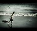
Sample

Third,Some of the photos contains subjects that are cut. Just like you're looking form a viewfinder, and ready to shoot. Creating horizontal (or all around) framing tells me that's the finished product, instead of wondering if there could be more or less. It just tells me "that's it, and that's what I want to show you".
Sample

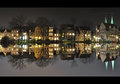
Fourth, especially black and white photos, black thick borders (horizontal only) gives me the "film" affect. Just like I am looking at roll of film, without any holes on it though. Also aims my attention to middle of the image as well.
Sample
Fifth, some of the thicker borders actually completes the size of an image overall.
Sample
Message edited by author 2010-11-28 09:56:05. |
|
|
|
11/28/2010 09:44:34 AM · #2 |
i don't like to add frames.
im not sure why, i just don't like the look on my photos, it might be that i feel im going to screw it up with the frame. |
|
|
|
11/28/2010 10:37:42 AM · #3 |
Originally posted by mike_311:
i don't like to add frames.
im not sure why, i just don't like the look on my photos, it might be that i feel im going to screw it up with the frame. |
You can never go wrong with a simple black frame around the photo. I usually find 5 pixels is a nice size. I find letterbox (thick top and bottom) to be mostly mis-used. They can occasionally add to a certain types of paneled landscapes, but I find them to be a distraction most of the time.
Basically if the frame accents your photo nicely then well done. If the frame is very noticable and draws the eye away from the photo then you should realize that some may vote a point or two off on your photo. It is a photo challenge after all not a border challenge.
Message edited by author 2010-11-28 10:38:17. |
|
|
|
11/28/2010 11:35:24 AM · #4 |
Frames can help a little, or they can hurt a lot. If you see what the viewer sees in your image then good framing can add that finishing touch. If they see something different in your image, then the wrong frame can ruin their viewing experience. I have seen nice images where over half of the comments were on the bad framing, the frame had essentially eaten the image for most people.
Message edited by author 2010-11-28 13:25:01. |
|
|
|
11/28/2010 11:43:12 AM · #5 |
| I seem to appreciate other peoples efforts with framing, but i'm a bit hesitant to do it myself, I have done in the past but i'm currently going through a none framing period, it will come back i'm sure. |
|
|
|
11/28/2010 01:15:59 PM · #6 |
| Frames on. Frames off. I'm in the off mode right now. But in general, I think frames should be considered on a case by case basis. |
|
|
|
11/28/2010 01:35:16 PM · #7 |
Originally posted by FocusPoint:
framing tells me that's the finished product, instead of wondering if there could be more or less. It just tells me "that's it, and that's what I want to show you". |
I like to use a border as well, and I like the way you put this Leo. That's what it does. It makes it clear this is the finished product and that the composition was not a casual result of where the camera was aimed. I also like the way a frame makes an image look like a printed image on a wall or in my hand.
Sadly, I have decided to avoid using frames on my entries because there are so many member that low vote when they see a border and leave comments about what a "disturbing trend" the borders are. I only rarely use a border now when I feel the image is strengthened by the border. Sometimes it reinforces the feel I am going for. Even then I expect to get some comments and low votes from it.
You can make the point as  tanguera did, that it should be on a case by case basis, and frames are ok when used appropriately. Fact is though, that just like opinions on the photo itself, opinions on borders will vary from person to person. Nobody will consciously low vote an image for not having a border. tanguera did, that it should be on a case by case basis, and frames are ok when used appropriately. Fact is though, that just like opinions on the photo itself, opinions on borders will vary from person to person. Nobody will consciously low vote an image for not having a border.
I'm still waffling on whether to use a border on my freestudy entry, even though I prefer it that way.
|
|
|
|
11/28/2010 02:05:18 PM · #8 |
I don't use borders because there are too many border police.
However, I'll use the letterboxing. Even though some people find it distracting, they actually make a huge difference. This shot looked incomplete and a little bit funky. I think it was  bear_music that suggested the letterbox, and it made a huge difference. bear_music that suggested the letterbox, and it made a huge difference.

When photos are very wide, but short because of the crop, it's a ratio that can be uncomfortable. The letterbox helps it.
|
|
|
|
11/28/2010 02:48:44 PM · #9 |
Originally posted by vawendy:
...there are too many border police... |
We need some more here down in AZ.. not enough :P
Originally posted by vawendy:
...However, I'll use the letterboxing... |
Is that what it is called? I called it "horizontal framing" I think it's like "Pototo, potato" thing! |
|
|
|
11/28/2010 03:44:14 PM · #10 |
Originally posted by FocusPoint:
Originally posted by vawendy:
...there are too many border police... |
We need some more here down in AZ.. not enough :P
Originally posted by vawendy:
...However, I'll use the letterboxing... |
Is that what it is called? I called it "horizontal framing" I think it's like "Pototo, potato" thing! |
It's potato, potahhto... :D
I have no idea of the real name -- that's just what I call it. :)
|
|
|
|
11/28/2010 04:17:51 PM · #11 |
Originally posted by Yo_Spiff:
Nobody will consciously low vote an image for not having a border. |
That's actually not entirely true. I have, on a couple occasions, voted an image a point lower than it would have gotten with a border, and commented to that effect on the image, as well. Some images just really need to be separated from the pale gray BG, and look a LOT better when they are.
However, for the most part I've stopped putting borders on mine. I'm not sure why. I'll still use a border when I feel the image needs one.
R. |
|
|
|
11/28/2010 07:07:52 PM · #12 |
Originally posted by Bear_Music:
Some images just really need to be separated from the pale gray BG, and look a LOT better when they are. |
An excellent point with which I agree. But you will still have people commenting that they don't like the border and that they voted lower because of it. Can't please everybody and you have to just have faith that the image was stronger for the border and it helped it perform better overall.
|
|
|
|
11/28/2010 07:11:26 PM · #13 |
I like borders both in my DTP stuff and on my images. It's like putting a pillow on a made bed, it makes it look FINISHED. But many others don't feel the same way that I do. To some extent is kinda an old school feeling on photos from the borders or frames on FILM pictures.
Whether it's letter boxing, torn looking or any other frame, it shouldn't be a bone of contention and getting points deducted because you put a border on it or you didn't.
I don't like the 'border police' because some images really benefit from a frame for a more polished look.
So, from the 'border police' why do you hate borders?
|
|
|
|
11/28/2010 07:11:31 PM · #14 |
Originally posted by Yo_Spiff:
... you will still have people commenting that they don't like the border and that they voted lower because of it... |
I have an EXCELLENT idea...
When we submit our images to any challenges, there should be a checkbox asking "Borders? Yes No" which "Yes" upgrades all votes by 1 or 2, "No" keeps the vote as is.
HAH... that's our answer to border haters!
Message edited by author 2010-11-28 19:12:49. |
|
|
|
11/28/2010 07:15:09 PM · #15 |
| I hate frames/borders. I want to see the photograph at the maximum allowable pixels. I have no interest in something added digitally, after the fact. I have rarely seen a border/frame which helps an image. But then, I'm older than most here. And, some people think their images are somehow enhanced with adornments. If I had any say, I'd ban all digital after-effects. Okay to ignore me, but I do vote on every challenge. |
|
|
|
11/28/2010 07:32:12 PM · #16 |
Originally posted by cowtownmom:
Whether it's letter boxing, torn looking or any other frame, it shouldn't be a bone of contention and getting points deducted because you put a border on it or you didn't.
|
I don't think it is as simple as you describe. While there may be a few voters who vote down any border at all, I suspect most vote on the image/presentation. A border that enhances the presentation of the image, or enhances the image itself, will likely not get dinged by voters in general. A border that dominates the presentation, distracts from the image will certainly lower the impact and positive response to the image, and that will hurt the scores.
I don't have an automatic score consequence for bordered images. Probably the best borders are the ones that one hardly notices--they help the image without attracting attention to the border itself. On the other hand, sometimes there are borders added that are inexplicably bright and colorful--they seem to be intended to "match the sofa". In cases like these, the presentation is clearly deliberate, so I consider it when voting. If the image or the PRESENTED image is flawed (with the use of a "damaging" border), then it will end up getting a lower score (or at least not be considered for a higher score).
Application of a border is a deliberate choice in how the image is to be presented. One is using up image real-estate area for the border. So I would assume that the photographer feels the border is a value added component for the viewing of the image. So I think it must be considered. If you put a border on the image, hoping that it will cause me to feel more positive about your image and affect my score in a positive manner, then you must also allow for those folks who find it a distraction, a subtraction from the image viewing experience. It is inappropriate to expect viewers to only add points for well-done borders, but never subtract for poorly done borders. And the definitions of well-done and poorly-done are individual and subjective.
However we choose to present our images in a challenge, we should expect some reaction to it. With or without borders, maximum size limit or not, subject matter, technicals, all of it are what we each choose for ourselves as the image we submit for voting. You plays the game, you takes your chances.
Playing the game, trying to tell people how to vote, is not playing the game at all really. It is trying to put your finger on the scales, use weighted dice. Everyone should take responsibility for the image they present, and everyone should vote they way they want to vote.
If you suspect that borders will hurt your score, and you care more about the score than the way your image is presented, lose the border. Don't tell everyone they should Ignore the border, and just look at the image inside.
Message edited by author 2010-11-28 19:34:15. |
|
|
|
11/28/2010 08:40:36 PM · #17 |
Originally posted by chromeydome:
... sometimes there are borders added that are inexplicably bright and colorful ... |
Why, whatever are you talking about? ;-) 
I used to use borders a lot, but have done so much less frequently of late. As others have mentioned, if a particular image is enhanced by a border then it should be used -- as should any other legal technique; the whole point of post-processing is to use all available tools to make the image look as good as it can.
Some people have mentioned not wanting to sacrifice image area. My entries are often a bit smaller than the maximum size, because I try to downsample exactly 25% when possible. I think that not having to use "fractional pixels" in the downsampling algoritm gives the best chance of retaining image details; 25% of my camera's maximum image size is 704 pixels, so I can easily add a moderate border without pushing the maximum dimensions, and for portrait-oriented images I want them shorter than 800 pixels anyway, to minimize scrolling when viewing.
Having the image slightly smaller than the 800 pixel limit will also usually allow me to save at a higher JPEG quality level. Here are a couple of recent examples where I chose to use a border. With the crystal, adding the solid black shows that there is actually some tone/detail in the cloth background. In the case of the corn I thought the border helped make the detail in the cheesecloth stand out, instead of blending into the gray background.
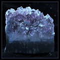 Entry: Entry: 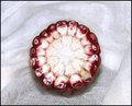 Alternate: Alternate: 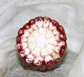
Most of the time I don't like letterbox borders, especially really fat ones. I don't mind looking at an image which is panoramic if it suits the composition/subject. The term comes from film/video (as is the basis of most digital photography, hence all the 4:3 sensors).
When a widescreen movie was/is transferred to video(tape) for viewing on normal TVs, there is a choice of three techniques: crop the sides, pan from side to side depending on the composition, or "shrink-to-fit" in the wide dimension, leaving blank/black bands above and below the image. The same technique is now also common in live (e.g. sports) telecasts. |
|
|
|
11/28/2010 08:49:05 PM · #18 |
| I love borders, and have been criticized by them on a few occasions, so I tend to not add them as much because of that reason. I feel adding vignetting is better sometimes. |
|
|
|
11/28/2010 08:55:20 PM · #19 |
Originally posted by GeneralE:
Originally posted by chromeydome:
... sometimes there are borders added that are inexplicably bright and colorful ... |
Why, whatever are you talking about? ;-)
|
Dude, you must have one butt-ugly sofa! :D |
|
|
|
11/28/2010 09:08:25 PM · #20 |
Originally posted by chromeydome:
Dude, you must have one butt-ugly sofa! :D |
In this case I was supposed to be matching the school's Blue & Gold colors ... I also took that 7-1/2 years ago. :-) |
|
|
|
11/28/2010 09:10:42 PM · #21 |
Originally posted by GeneralE:
Originally posted by chromeydome:
Dude, you must have one butt-ugly sofa! :D |
In this case I was supposed to be matching the school's Blue & Gold colors ... I also took that 7-1/2 years ago. :-) |
I suspected as much. But couldn't resist the insult to imaginary furniture. ;-) |
|
|
|
11/28/2010 09:25:04 PM · #22 |
So, from the 'border police' why do you hate borders? [/quote]
1. flippantly, I could just answer with this: we are judging photography not some frame shop's skills in matting/framing;
2. my experience in several years here is that approx 85% of borders overwhelm the art; distract from the art; cause undue attention to parts of image near the borders; truly hurt the image presentation and thus I will drop it a point for those reasons. the pencil thin black stroke is one thing, but the fussy borders are quite often simply tasteless and cause me to think that I am not judging an artist but a showman/woman.
3. I only dump a point or two off if the border truly hurts the image and/or I need a tie breaker with an equal merit clean presentation.
4. I understand the concept of "finished" that is expressed here; and from time to time (on a image by image basis) actually agree, but ...my questions are two-fold:
1. if your art is good to excellent, why detract from it; why give the so-called border police "amo"? where is the self confidence in your art?
2. isnt all this about "challenges"?
onward thru the fog!
obc |
|
|
|
11/28/2010 09:59:22 PM · #23 |
Originally posted by Bear_Music:
... Some images just really need to be separated from the pale gray BG, and look a LOT better when they are. ...
R. |
That's the primary reason I'll add a border; to give the photo some separation from the neutral DPChallenge grey background on the voting page.
I made a suggestion some time ago that I'd still like to see happen. Here's what I tossed out for consideration:
Originally posted by glad2badad (from a prior thread):
"There are times when the 18% grey background isn't the best choice to show a challenge entry in it's best "light". Many times I've wished for black or a charcoal grey.
Here's what I would like to see. An option when submitting a challenge entry for selecting the background color that will stay with my challenge entry photo regardless of who is looking at it. A simple color pallete group could be used to choose, or the three RGB fields, heck even a html color code field would work.
The key part of this is having the background be a photographers decision that stays with the image. Consider it a color matting decision that the photographer can make that works best for their photo.
This decision would impact viewer/voter perception of an image the same way selecting the right image and title currently do." |
(Prior thread link) |
|
|
|
11/28/2010 10:12:27 PM · #24 |
Originally posted by oldbimmercoupe:
1. if your art is good to excellent, why detract from it; why give the so-called border police "amo"? where is the self confidence in your art? |
If that's the case, why do any editing at all? Shouldn't your art be able to stand on it's own?
|
|
|
|
11/28/2010 10:21:59 PM · #25 |
Originally posted by glad2badad:
Originally posted by Bear_Music:
... Some images just really need to be separated from the pale gray BG, and look a LOT better when they are. ...
R. |
That's the primary reason I'll add a border; to give the photo some separation from the neutral DPChallenge grey background on the voting page.
I made a suggestion some time ago that I'd still like to see happen. Here's what I tossed out for consideration:
Originally posted by glad2badad (from a prior thread):
"There are times when the 18% grey background isn't the best choice to show a challenge entry in it's best "light". Many times I've wished for black or a charcoal grey.
Here's what I would like to see. An option when submitting a challenge entry for selecting the background color that will stay with my challenge entry photo regardless of who is looking at it. A simple color pallete group could be used to choose, or the three RGB fields, heck even a html color code field would work.
The key part of this is having the background be a photographers decision that stays with the image. Consider it a color matting decision that the photographer can make that works best for their photo.
This decision would impact viewer/voter perception of an image the same way selecting the right image and title currently do." |
(Prior thread link) |
I like this idea, I think we would see less borders if we had an option to pick the background color. Of course then there would always be those who would give you a 1 for choosing a background color they didn't like.:)
|
|


