| Image |
Comment |
| 09/13/2012 08:52:04 PM |
|
 Photographer found comment helpful. Photographer found comment helpful. |
| 08/06/2010 08:07:15 PM |
|
| 08/05/2010 04:33:12 PM |
|
| 08/02/2010 09:14:47 PM |
|
| 07/05/2010 07:25:57 PM |
JBby avalanche1030Comment by giantmike: Overall, a nice photo. Good lighting and personality. One small thing is what looks like a grocery store keycard by his right hand. Since that's such a contrast to the black, it really sticks out. Maybe cloning it out would be good? |
| Photographer found comment helpful. |
| 07/04/2010 07:34:01 PM |
JBby avalanche1030Comment by bassbone: nice portrait - i just wonder what is in his right hand - it seems out of place |
| Photographer found comment helpful. |
| 06/01/2010 02:11:50 AM |
Unfinished Projectby avalanche1030Comment by jomari: I can relate to that. Not that it's what you probably meant, but if I have mastered any art, it is the unfinishing of projects, lol. |
| 05/26/2010 11:00:07 AM |
|
| 05/26/2010 04:18:15 AM |
Unfinished Projectby avalanche1030Comment by mrbig65: nice pic,,,, but not very interesting,,,,,,, |
| 05/06/2010 08:12:44 PM |
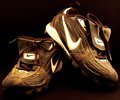
Worn Outby avalanche1030Comment by EL-ROI: Lighting and sepia tone is good. You used some depth of field and it gives it an old fahsioned feel. One troubling spot on the heel of the shoe where it is bright white with a significant loss of detail. It also appears along the top edge of the other wite spots on the same shoe. I like the image but the troubled spots keep it from being a high scorer in my voting range. |
| Photographer found comment helpful. |
Home -
Challenges -
Community -
League -
Photos -
Cameras -
Lenses -
Learn -
Prints! -
Help -
Terms of Use -
Privacy -
Top ^
DPChallenge, and website content and design, Copyright © 2001-2024 Challenging Technologies, LLC.
All digital photo copyrights belong to the photographers and may not be used without permission.
Current Server Time: 04/25/2024 09:14:50 AM EDT.