| Image |
Comment |
| 07/04/2009 04:48:57 PM |
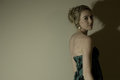
Madame Peacockby SibbieComment by Alicia: This has great potential, but it is much too dark (in the wrong ways), and the tones are very flat. |
| 07/04/2009 01:03:15 AM |
|
| 07/01/2009 06:50:03 PM |
|
| 07/01/2009 04:51:09 PM |
Madame Peacockby SibbieComment by Leo: The image looks muted. The model "blends"/gets lost into the background. For me, there's too much dead space to the left. Maybe a tighter crop from her shoulders up and different lighting would have helped in this image. Just not a lot of visual interest... IMHO. |
| 07/01/2009 02:56:42 PM |
Madame Peacockby SibbieComment by Ja-9: your lighting is to dark on this...although I like the shadow on her face the color on the back is just dull in tone....like this was lit by a lamp on the floor and all the blank wall behind her does not add to the picture |
| 07/01/2009 01:33:02 AM |
Madame Peacockby SibbieComment by LadyK: man i wish that shadow wasnt there. nice model positioning, but her neck looks a little strained |
| 06/07/2009 01:15:13 AM |
|
| 06/05/2009 06:15:46 PM |
|
| 06/03/2009 06:37:06 PM |
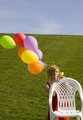
Bashfull Summerby SibbieComment by Ja-9: colors could pop more - the balloons are in an odd placement over her head, not sure what the "story" is |
| 06/01/2009 10:31:17 PM |
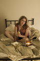
Dear Jane Letterby SibbieComment by rhadshaw: Your image does project a suitably "depressed" tone, but I don't necessarily see "I quit" in the image. You might be able to improve the image by shifting the camera to the right to provide more negative space for the model to look wistfully into. |
Home -
Challenges -
Community -
League -
Photos -
Cameras -
Lenses -
Learn -
Prints! -
Help -
Terms of Use -
Privacy -
Top ^
DPChallenge, and website content and design, Copyright © 2001-2024 Challenging Technologies, LLC.
All digital photo copyrights belong to the photographers and may not be used without permission.
Current Server Time: 04/19/2024 12:26:51 PM EDT.