| Image |
Comment |
| 11/11/2003 10:13:19 PM |
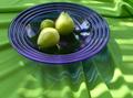
Green on Blue on Greenby sonasandComment by dertyklobb: Good concept. Patchy execution. I'll elaborate. It's not very clear in terms of resolution, and I don't think that's what you were going for. The textures that mix together in this photo could very well spell the difference between your 6 and, say, an 8. Not a huge fan of the dish, although I like the transposition of wrinkled blue on wrinkled green. You should be commended for making green and blue look good together as well; not many people do that correctly. |
| 11/11/2003 08:01:50 PM |
|
| 11/11/2003 07:18:10 PM |
|
| 11/11/2003 04:58:51 PM |
Green on Blue on Greenby sonasandComment by Kavey: Interesting use of two strong main colours. Non centred composition is a good idea but the bowl sits too close to edge of frame at left and even more so at top for my tastes - needs space within the frame. |
| 11/11/2003 02:54:58 PM |
Green on Blue on Greenby sonasandComment by Fayech: nice color use. love the interesting effects and patterns caused by the reflections , the ripples and the plate. given the cropping, perhaps having the bottom folds of the table cloth at more of a diagonal would 'lead' one into the picture more. |
| 11/10/2003 10:22:35 PM |
Green on Blue on Greenby sonasandComment by jackditch: great colour contrast , i think the colours may have been slightly oversaturated. I can see a touch of purple in the pears. the light ripples over the cloth nicely |
| 11/10/2003 08:27:12 PM |
Green on Blue on Greenby sonasandComment by dr rick: The blue plate is a nice contrast with the green and I like its refracted image on the tablecloth. But the overall image is too soft and I find the noise distracting. |
| 11/08/2003 07:18:53 PM |
|
| 11/08/2003 02:46:09 PM |
Green on Blue on Greenby sonasandComment by amazoneea: The idea is good. Picture looks a bit grainy. I wish I couldn't see the windows and the sky in the reflections but I still like the photo. 7 |
| 11/07/2003 08:54:02 PM |
|
Home -
Challenges -
Community -
League -
Photos -
Cameras -
Lenses -
Learn -
Prints! -
Help -
Terms of Use -
Privacy -
Top ^
DPChallenge, and website content and design, Copyright © 2001-2024 Challenging Technologies, LLC.
All digital photo copyrights belong to the photographers and may not be used without permission.
Current Server Time: 04/23/2024 06:38:56 AM EDT.