| Image |
Comment |
| 08/25/2012 12:42:06 PM |
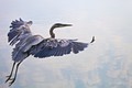
Feathers and Cloudsby cloudsmeComment: I like the sharpness in the leaves and the flurry aspect of them. It makes me feel like if I were looking at an untidy bird. It gives a lot of personality to the bird. I miss to have some more defined background, the reflection of the featureless sky and all highlights blown up give me the impression that the bird was cut from another image and pasted in this background (I am not saying that that is the case) I am sure is a result of the post-processing. |
 Photographer found comment helpful. Photographer found comment helpful. |
| 08/25/2012 12:13:56 PM |
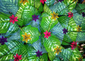
Tropical Cocktailby JudiComment: I think that the symmetry would have better highlighted with some more triangular leaves and petals (If such thing exists).
I think that is borderline meeting the challenge due to the presence of the leaves. I found interesting that the triangles are decreasing in size as the image progresses to the right, I wonder if it would have been possible to continue this farther to smaller and smaller sizes that would have been another representation of a fractal. Although I am not sure how the image was done so this might not be possible, sadly the fractal properties tend to be more evident when there are many order of magnitudes between the larger and smaller length scales. |
| Photographer found comment helpful. |
| 08/25/2012 12:05:50 PM |
Last Vineby giantmikeComment: I like the overall felling of this image although not sure how much it does meet the challenge. In my monitor there a bit of detail that seem to be wash out in the highlights. I think that I would have prefer a bit more sharp edges in the foreground. Also the bluish tone at the corners gives me a general feeling as if there where some chromatic aberrations (probably just is my imagination). |
| Photographer found comment helpful. |
| 08/25/2012 11:54:13 AM |
Fractalius Temporalibus, the unseen dimensionby CoryComment: Don't see the fractality here. There is the repetition of the pattern but there is no change in the spatial scale that would give raise to the self-similarity. Maybe starting with a close up ans subsequently zoom out so the light bulb decrease in size as the pattern goes around.
Personally I don't find the colors pleasant, the blue/grey contrast it reminds me more of a heavily unbalance color palette than anything.
Hope you find this helpful, |
| Photographer found comment helpful. |
| 01/22/2011 08:05:55 PM |
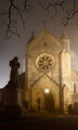
La Collégialeby MistyMuckyComment: The effect of the mist looks really nice, a pity the scaffolding in the background. Nicely done. |
| Photographer found comment helpful. |
| 01/22/2011 08:01:42 PM |
|
| Photographer found comment helpful. |
| 01/22/2011 07:59:08 PM |
|
| Photographer found comment helpful. |
| 07/11/2009 02:39:37 PM |
|
| Photographer found comment helpful. |
| 07/11/2009 02:35:43 PM |
No Retreat, No Surrenderby klkitchensComment: I only see a couple draw backs on this picture: a little higher contrast might be better and that he king had an optional movement so actually the white player has given up. |
| Photographer found comment helpful. |
Home -
Challenges -
Community -
League -
Photos -
Cameras -
Lenses -
Learn -
Prints! -
Help -
Terms of Use -
Privacy -
Top ^
DPChallenge, and website content and design, Copyright © 2001-2024 Challenging Technologies, LLC.
All digital photo copyrights belong to the photographers and may not be used without permission.
Current Server Time: 04/23/2024 05:18:57 AM EDT.