| Image |
Comment |
| 10/09/2003 09:59:31 PM |
|
 Photographer found comment helpful. Photographer found comment helpful. |
| 10/09/2003 06:29:25 PM |
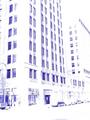
Indigo City Morningby DebN2003Comment by JC_Homola: This is just a bit too light/washed out. I'm a big fan of desaturation etc. but this went just a tad far. I like the perspective and subject. |
| Photographer found comment helpful. |
| 10/09/2003 11:54:32 AM |
|
| Photographer found comment helpful. |
| 10/09/2003 10:45:46 AM |
Indigo City Morningby DebN2003Comment by Neuferland: I think this shot would work much better in it's original form. The effects you added really ruin the overall picture for me. It meets the challenge without a doubt. |
| Photographer found comment helpful. |
| 10/08/2003 02:45:36 PM |
|
| Photographer found comment helpful. |
| 10/08/2003 05:37:05 AM |
|
| Photographer found comment helpful. |
| 10/08/2003 01:51:07 AM |
|
| Photographer found comment helpful. |
| 10/08/2003 01:03:16 AM |
|
| Photographer found comment helpful. |
| 09/29/2003 11:44:50 AM |
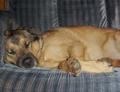
Sleepy Time Palby DebN2003Comment by emorgan49: THis picture is very similar to one entitled Lazy Dog. If you look at that picture you will see how yours fell short. This is really a bad picture and I gave it a 2. THe focus is offf, I'm not sure what, if anything is in focus. Sometimes the problem with focus is that the focal plane is not where you meant it to be (utofocus choses what it wants to focus on, not what you want). But when nothing is sharp the problem can be camera shake. It is surprisingly hard to hold a camera steady at the shutter speeds that digital cameras allow us to use. A tripod is hgihly recommended, especially in low light sitations like this indoor shot. Read the tutorial on the Rule of thirds - human nature, probably due to the biology of binocular vision, is drawn to the cross of the thirds lines. Notice what you have place at these points: an out of focus over exposed paw, the bit of couch under the dogs chhek, his ear and some fur on his back. Are those the most important visual items? Did you mean to emphasize them? To me, a dog lover, it is the eyes , face, and yes, those big paws, that I want my attention focused on when I look at a picture. I don't want three fourths of the image to be blurry body, and the cute face all the way to the left. maybe if you had cropped of the right side you would have had a better image. try it. Some post processing would have made a world of difference in making the darks truely dark and the lights less blown out. One thing you did right compositionally was that your leading lines, the stripes of the couch, the slant of the eyes and ears DO lead into the dogs face. Try it again, I bet this dog loves to pose like this. |
| Photographer found comment helpful. |
| 09/28/2003 02:59:18 PM |
Sleepy Time Palby DebN2003Comment by Fayech: i don't think he/she likes how u are disturbing its rest. hehe. this shot feels too much like a snapshot. perhapst a different angle/perspective would have made this more interesting. taken too straight on. a softer light source would also be nice too versus the flash(?) used that flattens all the interesting shadows, etc. |
| Photographer found comment helpful. |
Home -
Challenges -
Community -
League -
Photos -
Cameras -
Lenses -
Learn -
Prints! -
Help -
Terms of Use -
Privacy -
Top ^
DPChallenge, and website content and design, Copyright © 2001-2024 Challenging Technologies, LLC.
All digital photo copyrights belong to the photographers and may not be used without permission.
Current Server Time: 04/18/2024 09:11:26 PM EDT.