| Image |
Comment |
| 01/26/2003 07:01:39 AM |
|
 Photographer found comment helpful. Photographer found comment helpful. |
| 01/26/2003 04:42:02 AM |
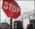
the Madnessby moondoggieComment by vestanpance: Nice photo. I think it would have been better to include the top of the sign rather than cropping it off but it's still a good shot. I like the lack of colour in the background buildings but I keep being drawn towards the little red light on the building on the left. |
| Photographer found comment helpful. |
| 01/24/2003 11:34:16 PM |
the Madnessby moondoggieComment by Gekker: I like how you took out all of the colors except red. little dot under sign on building doesn't really make a difference to me. Great message as well. |
| Photographer found comment helpful. |
| 01/24/2003 03:39:23 PM |
the Madnessby moondoggieComment by bod: Excellent. Great composition, nice colour desaturation and a good message. Top work. 10 |
| Photographer found comment helpful. |
| 01/24/2003 01:44:22 PM |
the Madnessby moondoggieComment by Konador: really nice photo, good message too. like the fact the stop sign is red against a very muted background. only thing that distracts me a little is the sign cut off at the top. still, a 10. |
| Photographer found comment helpful. |
| 01/24/2003 11:45:33 AM |
the Madnessby moondoggieComment by jodiecoston: Very nice graphical composition. It seems several people (including myself) chose to have colored signs with desaturated backgrounds in this challenge, but I think I like yours best of all so far. The steam or smoke adds a nice dynamic to ths shot and the b/w has very nice tonal qualities. (8) |
| Photographer found comment helpful. |
| 01/24/2003 06:59:49 AM |
the Madnessby moondoggieComment by Artifacts: Well composed message shot. Creative, especially with the red against the grey sky and colorless buildings. Excellant |
| Photographer found comment helpful. |
| 01/22/2003 12:59:47 PM |
the Madnessby moondoggieComment by joshua: wow the contrast of red on black and white is cool. nice sharpness throughout, and good capture of the acid rain damage on the sign |
| Photographer found comment helpful. |
| 01/21/2003 05:27:50 AM |
the Madnessby moondoggieComment by kiwiness: Very good capture and the idea is great. The background seems to be black and white which enhances the stop sign greatly. This photo is one of my favourites and gets a 10 from me. |
| Photographer found comment helpful. |
| 01/21/2003 12:20:37 AM |
the Madnessby moondoggieComment by Lustre: Nice use of selective colouring - there's just one tiny red light on the leftmost building. I like the title as well - very smart. The simple border is nice - just enough to frame the image without taking it over. Well done. Any reason why the sign is partially cropped? Is it just to stop the sign from totally taking over the image? |
| Photographer found comment helpful. |
Home -
Challenges -
Community -
League -
Photos -
Cameras -
Lenses -
Learn -
Prints! -
Help -
Terms of Use -
Privacy -
Top ^
DPChallenge, and website content and design, Copyright © 2001-2024 Challenging Technologies, LLC.
All digital photo copyrights belong to the photographers and may not be used without permission.
Current Server Time: 04/25/2024 12:12:44 AM EDT.