| Image |
Comment |
| 01/25/2003 01:12:09 PM |
Red Rock, Red Stopby YomiComment: The red sign against the red of the rock and the blue of the sky create a nice effect. The colors seem a tad oversaturated for my liking, but still very attractive. Positioning of the sign seems a bit off - maybe higher and to the right just a bit might have helped. Very nice how the sign post gets lost against the rock - makes it seem as if it is floating. Nice photo, good job. 7 md |
 Photographer found comment helpful. Photographer found comment helpful. |
| 01/25/2003 01:08:45 PM |
Last Stop in Lifeby GordonComment: Interesting effect. Waiting to see how you achieved it. Composition is good given the subject and effect. You achieved a nice, eeire, vaugely ethereal feel with this photo, which I am sure was the intent. Good job. 7 md |
| Photographer found comment helpful. |
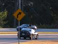
| 01/25/2003 02:01:41 AM |
Total Eclipseby bil99Comment: Neither car is entirely in focus. They both seem kind of out of place in this image. Composition is essentially OK, but overall the photo really lacks a clear subject. 4 md |
| Photographer found comment helpful. |
| 01/25/2003 01:57:56 AM |
Waiting aroundby decoteauComment: Nice photo. Good composition and color. Shadow falling on the sign darkens it a bit, but not too much to be distracting. Nice entry. 7 md |
| Photographer found comment helpful. |
| 01/25/2003 01:50:16 AM |
Private road only.....by kiwinessComment: Very simple photo, but it has a lot of character. Nice clarity on the sign. Composition good, with the sign resting just above the horizon. Maybe a little too closely cropped - a little more breathing room around the sign may have helped. All in all a very nice entry. 7 md |
| Photographer found comment helpful. |
| 01/24/2003 11:51:00 PM |
Chaoticby mliborioComment: Optimization could be better - too many jaggies. Subject is Lacking. Nothing really grabs my attention here, least of all any road signs. 3 md |
| Photographer found comment helpful. |
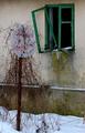
| 01/24/2003 11:49:17 PM |
Abandonedby miracComment: Sad, compelling, quiet and a little creepy. Very evocative photo. Nice composition and mood. Green window pane balances the image well. Very nice. 9 md |
| Photographer found comment helpful. |
| 01/22/2003 02:57:08 AM |
Stopby rj324Comment: Ouch! The red border really detracts from the image. The photo itself poorly focused and composed. Maybe if the sign were a little smaller and moved to one side or the other of the image. See the Rule of Thirds in DPC Learn/Tutorials. Better luck next challenge. 3 md |
| Photographer found comment helpful. |
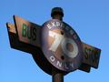
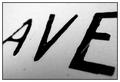
| 01/21/2003 11:29:29 PM |
Avenueby mciComment: Curiously engaging photo. Simple, but not quite boring. Kind of an early 90's cyber-culture meets 2003 warchalking feel to it. OK, I'll bite. 8 md |
| Photographer found comment helpful. |
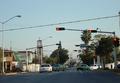
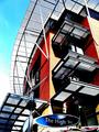
| 01/21/2003 11:19:48 PM |
The High Streetby GinaRothfelsComment: Very interesting, tchno modern feel about this. Oversharpened, exaggerated colors, funky high street sign. All makes for a very unique, enjoyable image. Good job! 9 md |
| Photographer found comment helpful. |
Home -
Challenges -
Community -
League -
Photos -
Cameras -
Lenses -
Learn -
Prints! -
Help -
Terms of Use -
Privacy -
Top ^
DPChallenge, and website content and design, Copyright © 2001-2024 Challenging Technologies, LLC.
All digital photo copyrights belong to the photographers and may not be used without permission.
Current Server Time: 04/18/2024 09:05:33 PM EDT.