| Image |
Comment |
| 04/08/2003 01:44:01 AM |
|
 Photographer found comment helpful. Photographer found comment helpful. |
| 02/09/2003 11:11:31 PM |
|
| Photographer found comment helpful. |
| 02/09/2003 11:10:58 PM |
|
| Photographer found comment helpful. |
| 01/27/2003 04:22:45 PM |
Calculating the Risksby briphotoComment: Very nice DOF. The dice almost seem to reach out to you. Composition is a bit too symetrical for my liking. Seems like the dice could be a bit higher. Veyr nice shot. 8 md |
| Photographer found comment helpful. |
| 01/27/2003 04:21:01 PM |
Abstractby stephanComment: Very ingenious! Using the pixels themselves as the subject for this challenge. I think it needs to be sharpened a little - ha ha. Really though, very creative effort and it definitely stands out form the crowd in a good way. 8 md |
| Photographer found comment helpful. |
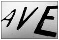
| 01/27/2003 04:04:16 PM |
Avenueby mciComment: Wow, very very surprised this did not do better. This was one of my top 5 from the challenge. And dont get all pissy about the validity of the photo. The only measure of success that matters is your own. And, uhhh, mine. And I like it, and most of your other photos as well, so keep 'em comin, and screw the mindless masses! |
| Photographer found comment helpful. |
| 01/27/2003 12:49:45 AM |
Loading Onlyby GotchaComment: Congrats on 5th, I think this was my favorite of the challenge! great work, keep it up! |
| Photographer found comment helpful. |
| 01/25/2003 05:44:06 PM |
Look Up Before Passingby GolferDDSComment: Nice catch. Good clarity on the plane. If the plane could somehow be positioned in the image a little lower and to the right, that might help the oerall composition. Nice entry. 7 md |
| Photographer found comment helpful. |
| 01/25/2003 05:38:01 PM |
First Stopby emagenComment: A nice clarity and colors. Nice use of a little negative space. Good Composition, though I think having the sign a bit to the right and up just a little might have improved the balance of the shot. All in all though, nice entry. 7 md |
| Photographer found comment helpful. |
| 01/25/2003 01:14:31 PM |
Start Spreadin' the News by magnetic9999Comment: Very nice composition. B&W works well here. Good use of border. The more I have looked at this, the more I like it. May be a bit too much contrast though as the details of the lamp post get a bit lost in the darkness. A very nice entry - good job! 8 md |
| Photographer found comment helpful. |
Home -
Challenges -
Community -
League -
Photos -
Cameras -
Lenses -
Learn -
Prints! -
Help -
Terms of Use -
Privacy -
Top ^
DPChallenge, and website content and design, Copyright © 2001-2024 Challenging Technologies, LLC.
All digital photo copyrights belong to the photographers and may not be used without permission.
Current Server Time: 04/25/2024 11:13:09 AM EDT.