| Image |
Comment |
| 09/02/2006 09:44:57 PM |
|
 Photographer found comment helpful. Photographer found comment helpful. |
| 09/02/2006 05:46:11 PM |
|
| Photographer found comment helpful. |
| 09/02/2006 01:55:39 PM |
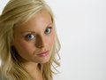
Windblown Whiteby KevinRiggsComment by ShannonLee: Some thoughts:
-I usually don't like pictures where the subject is centered but I think it works really nicely here!! Good choice
-Cute girl, beautiful expression!
-Nice lighting!
-Score: 7 |
| Photographer found comment helpful. |
| 09/02/2006 01:38:46 PM |
Windblown Whiteby KevinRiggsComment by cloudsme: Very nicely done. Minor detail...not crazy about the knee right in her mid section. Over to the side might be better? 7 |
| Photographer found comment helpful. |
| 09/01/2006 07:45:59 PM |
0256 - recroppedby KevinRiggsComment by KiwiChris: I think this is a nice portrait, but I find the small catchlights in her eyes really distracting for some reason...
When I do headshots I like to use a 60" octabox or 48" square box as close as I can get it for the fill/catch light.... Gives nice diffuse catchlights, although it might be a bit difficult in your case, I see you're already shooting at F/11, so I imagine you have the same problem I do with lights too powerful for filling sidelit headshots. (Must resist urge to buy more gear...)
The catchlights in image id 386973 are about as small as I'd have them, and that was a 40" brolly about 3 ft in front of my Daughter, but it's the key so I have it turned up a bit. (Must post some of my studio work on here).
To solve this problem for me I'm in the process of building a huge (8ftx6ft) scrim. Out of PVC pipe and white nylon.. Going to make some gobos for it that look like windows/trees/buildings and light it (bounce or through) as a fill for moody headshots... It's a good plan.. |
| Photographer found comment helpful. |
| 09/01/2006 05:31:34 PM |
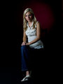
0027 - on black with red highlight BGby KevinRiggsComment by kiwiness: The jeans and the chair are drowning into darkness. The lighting balance, well I wrote it before, although here it is a little better with the right side a touch darker. Can you see the difference compared to the other two photos? Try out some lighting with strip lights, you get some good results by placing them correctly. Also a hair light from an angle behind will bring in a slight aura which is muchly needed here. This would make for a good portrait, but the bottom half doesn't do anything for me. |
| Photographer found comment helpful. |
| 09/01/2006 05:21:28 PM |
|
| Photographer found comment helpful. |
| 09/01/2006 05:19:30 PM |
0175 - Sexy Loungingby KevinRiggsComment by kiwiness: I don't think you will like this critique Kevin but I have never commented on your photos before so just take it as constructive okay. The complete impact is lost in the composition, you've cut it too close on the left side. I know the chair is not falling but this image is giving the impression it is, therefore you need room in the falling direction. The viewer needs to see where she is falling.
The chair at the bottom is cropped in a way you just see unneven parts of the chair wood and chair cushion together. I would have put some more of the front chair legs into it, as it is it just confuses me.
The lighting from the right side is okay, but the lighting on the left doesn't bring in the necessary effect to balance out the image, it should be a lot darker to bring in more contrasts. As it is the total lighting comes over rather flat. You can see it in the eyes, as they are they seem kind of lifeless in that lighting. But would the left eye be more in darkness (and the left side of the face) you would bring out more impact and contrast and therefore boost the complete image quality.
|
| Photographer found comment helpful. |
| 09/01/2006 02:02:44 PM |
|
| Photographer found comment helpful. |
| 09/01/2006 12:29:17 PM |
|
| Photographer found comment helpful. |
Home -
Challenges -
Community -
League -
Photos -
Cameras -
Lenses -
Learn -
Prints! -
Help -
Terms of Use -
Privacy -
Top ^
DPChallenge, and website content and design, Copyright © 2001-2024 Challenging Technologies, LLC.
All digital photo copyrights belong to the photographers and may not be used without permission.
Current Server Time: 04/19/2024 06:12:02 AM EDT.