|
|
| Image |
Comment |
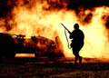
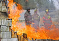
| 11/28/2010 11:41:36 AM | Just another day at the office by Yo_SpiffComment: I don't want this to come out the wrong way... I've not entered a challenge in a long time, but this seems to be one of the reasons why... Although the image is amazing, it is a great copy and a great edit. I don't think that the editing preserved the "image integrity." In fact the editing to me added an element that was not in the photo to begin with. I mean if anyone can look at the original and say 'I see fire in it', or looked at the post image and say, 'I see smoke in it', I will withdraw this post and apologize most profusely. Had this been advanced editing I wouldn't have as much problem (although still some). To me the editing didn't just change the color of the smoke, it changed it into fire which was not there originally. As I look at the comments the vast majority talk about either the editing or the post-processing of the image. But fantastic image outcome.
I did create a thread on the challenge outcome forum for this discussion, so don't reply here. Message edited by author 2010-11-28 12:49:58. |  Photographer found comment helpful. Photographer found comment helpful. |
| 05/02/2007 09:11:25 AM | Through the Blazeby ZoomdakComment: Wow, this is a great shot.... I like it better than your ribbon winner... You should print, frame and give to the firestation. Just an amazing shot. | | Photographer found comment helpful. |
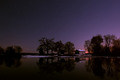
| 12/20/2005 02:13:04 AM | Absolute Stillby SkipComment: Wow, this is a truly amazing photograph. It has such a masterpiece painting feel to it. The colors, composition, reflections, and the starlights in the sky just all work together to make a photo that begs to be blown up to poster size and mounted in a really nice frame ona wall someplace. Honestly, if this doesn't ribbon, there is something wrong with this site. Thanks for taking a picture that is truly inspiring. | | Photographer found comment helpful. |
| 10/16/2005 11:35:57 AM | My Mountainsby AarthekComment: Greetings from the Critique Club
Let me first of all echo the comment about the fabulous sky. The clouds and the sunset are just fabulous. Now with such a fabulous sky, why did your photo only score a 5.1872.
Let me try to point out a few things that give me a lower impression on this photo.
First: Sky. Now wait a minute, you just said the sky was fabulous. Let me amend that and say, most of the sky is fabulous. That clear section of blue sky at the top is so strong, that it detracts from those fabulous clouds and lighting. I would definitely crop that blue strip out from the top. This would remove that distraction and also reenforce the drama of the clouds and sun.
Second: Sky. Wait, that was first one. Many people say that they do not look at the title of the photo, but in truth we all let the title effect us. Your title of "My Mountains" is sort of deceptive, as when I am looking at the photo, I do not see much of the mountains. Now some of this is the size of the photo, some that the mountains are so dark and some because the clouds extend down into the mountains and is hard to see what is cloud and what is mountains. Instead of the mountains, my eyes are looking at the sky.
This also goes towards the challenge theme itself. This does not show much in the way of a distinctive that would enable us to say, yes, that is exactly what I think of when I think of Orem, Utah, or some other location. Instead it almost seems to be a generic (although pretty and dramatic) sunset/rise picture.
Possible solution: Tighter crop, cropping out the parts that are not important to the photo. This would be the top and some of the bottom to almost give it a panoramic feel. This would also put us closer to the mountains and enable us to see them just a little bit better. It would also get rid of the empty blue sky at the top and some of the empty black space at the bottom.
If you have any questions or comments about this critique, feel free to pm me. | | Photographer found comment helpful. |
| 09/27/2005 04:22:15 PM | Tunnel Funby rwouthuisComment: Greetings from the Critique Club
What a gorgeous photo of this young man. The colors and textures of the tunnel really give him a sense of distance and perspective. The straight black and white lines mixed together with the spiral of the supporting wire produce good interest and lead in to the photo. His arms being held the way the are also produce lines to lead the eye in to the boy.
The square crop works great for this photo, giving it good balance. I would like to see one try with him at a 45 degree angle with his hands reaching toward the top left and bottom right corners (this may not be an improvement, rather just an idea for a different look).
The only suggestions I have for this are those that have already been said.
1. Reflection off the floor. This could easily be fixed by having him stand on a black cloth of some kind. This would give him more of a fade into the background look of where he is standing. It would also remove the distraction of the bright reflection taking attention away from him.
2. Contrast in the stripes. This probably cannot be fixed with levels and curves without effecting the boy's exposure (which I think is right on). Rather, this will take some judicious use of the burn and dodge. Burn the black, dodge the white. Time consuming, but to make the stripes have more even lighting would be much better.
3. Wrinkles in tunnel. This suggestion may not be able to be fixed, but I do find distracting the very strong wringkles in the cloth toward the top of the photo. Interestingly, the bottom doesn't show those same wrinkles. Maybe some cloning out of some of the more stark wrinkles would help.
Overall Impression: I do feel that your score is a little lower than it should be. This may be as a result of the picture being a 'cute kid' type of picture. This is unfortunate. I do believe that without the reflection on the floor, this would have certainly been another 6 picture.
(By the way, I really love your Black Eyed Abstract photo, I scored it a 10 when I voted it, and just now added it as a favorite)
Anyway, if you have any questions or comments about this critique, feel free to PM me. | | Photographer found comment helpful. |
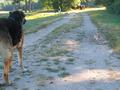
| 09/27/2005 03:41:28 PM | The biggest dogs in town...by basia03Comment: Greetings from the Critique Club
Perspectives really help to accentuate the size difference between the two dogs. I keep finding myself going back and forth between them wondering how on earth is that little dog so little in comparison to the big one. The difference is amazing, and is the good start for a photo.
However, it seems as if this is a 'snapshot' type of photo, or one that you took that just seemed to fit the challenge. There doesn't seem to have really been any forethought to the photo. This is probably the biggest reason for the lower score.
Let me offer just a couple of suggestions that may help the photo:
1. Composition - What an awesome opportunity to put these two dogs closer together to give them more interaction. I don't know if you can control these two dogs or not, but I think a fantastic shot would be the little one sitting there, looking up at the big one with that same look on his face. As it is in this photo, the big dog on the left needs to be more into the photo. Try to frame the shot so that the dogs are much closer together. Maybe use a higher angle to focus solely on the two dogs (see suggestion #2).
2. Simplicity - If you notice, those photos that do well on DPChallenge are really ones that are simple. They remove anything from the photo that might be a distraction or doesn't really add anything to the photo. Notice that it is not just detract from, but the elements in the photo need to add something to it. Here, we have several items that serve as detractions to the main idea of the interaction between the two dogs. Things like: the woman and the other dogs in the background, the tractor/truck, the sign sticking up over the dog's head, and even the bright sunshine (the trees and shrubs can be added as well, since the brightness of the sunlight on them draws the eyes to them). Removing those elements will make the people focus in on what you want them to pay attention to, and that is the two dogs.
3. Lighting - Use of a (stepped down) fill flash in this case would help to even out the lighting on the dogs and bring a little more contrast to them.
Overall Impression: The potential is there in this photo. The interaction between the two amazingly different sized dogs (especially the look on the smaller ones face) is amazing. It begs to be photographed. Good eye in seeing that. A little more time in setting up the shot and paying attention to the background will help move the picture up from the mid 4's up to a solid 6.
Feel free to PM me if you have any questions concerning this critique. | | Photographer found comment helpful. |
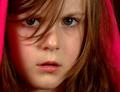
| 09/20/2005 10:49:31 AM | Innocenceby JudiComment: Greetings from the Critique Club
This is a good portrait. In every portrait, the eyes are the most important aspect. Here her eyes draw us into the photo as we ask ourselves what thoughts and emotions lie behind them. I think the strength of her eyes alone make this photo rise above the 6 mark in the voting.
Possible (stress on possible) suggestions for improvement:
1. Hot Spots/Highlights: This was an advanced challenge, so you could easily clone out the 2 hot spots on the tip of her nose (kind of like a second set of nostrils). I would also at the same time remove/fix the highlights in her right eye (only want one). At the same time, you might see if you could fix what seems to be the beginnings of a spit bubble at the corner of her mouth.
2. Crop: This also deals with the use of the scarf to frame the person. There is a certain formulaic use of the scarf (especially recently on DPC) which works. In this instance, I think you didn't realize the full potential of it because of the tightness of the crop. The scarf needs a little more room around it to really effectively frame the face. As it is, especially on the left side, it is just some red cloth.
3. Lighting: I do think a little more in the way of diffuse lighting would help, maybe a reflector to reflect some white light back up into her face would help as well. This would really help the right side of her face where the shadows have a reddish tint to them from the cloth.
Overall Impression: I do agree with the voters, this would have been a 6 for me had I voted, with the catchlights/highlights fixed may have bumped up to a 7. I really think you did an excellent job on this portrait, and with a few quick fixes would be even better.
If you have any questions on this critique, feel free to PM me. | | Photographer found comment helpful. |
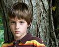
| 09/20/2005 09:49:55 AM | RYANby mandyturnerComment: Greetings from the Critique Club
This is a good portrait of your nephew. I do think you got 'him' almost exactly right. The eyes are bright and wide, focused and sharp. Skin tone is right on, with just enough softness to be smooth without plasticky feeling. Hair has great detail as well. The colors in his shirt also work well with his hair and eyes, good coordination with that.
Now to look for areas that could be improved on. Most of these have been mentioned in others comments.
1. Background/Subject: The way the photo is, there is a seeming competition between the subject (your nephew) and the background. While the boy is fantastic, the background being so sharp makes us want to look at it more than the boy. The detail in it is fascinating, including the leaf. In fact, take away the boy, and you will still have an interesting photo. This shouldn't be if this is really a color portrait.
2. Depth of Field: I think the DOF could be moved toward the camera just a little bit. This would give his chin and lips a little more sharpness to remove the sense of blurriness there. It would also blur the tree into the background a little more so it wouldn't be in as much competition with the subject.
3. Pose: Look at the line of his shoulders. Because of the way he is positioned, the shoulders slope out to the left and down. This gives the closer one a feel of being out of proportion with the rest of his body. It also leads the eyes out of the picture. A slight change in pose turning his body more toward the camera and moving him a little forward from the tree may help with this.
Overall Impression: I did not vote in this challenge, but had I voted, I would have scored this a 6. If the tree was not in such competition with the subject, would be bumped up to a 7.
If you have any questions about this critique, feel free to PM me. | | Photographer found comment helpful. |
| 09/20/2005 08:19:59 AM | Blueby SJCarterComment: Greetings from the Critique Club
On first glance, this photo really stands out. It has some very good potential. The way you used the sunglasses almost as a filter to give the eyes the normal exposure while blowing out the rest of the face is a great technique. The eyes themselves have come out very good.
In saying that however, it falls short of becoming a good photo. Here are some suggestions that may help:
1. Polarizer Filter: The eyes as I said before are fantastic, but the reflections off of the sunglasses really ruin their impact. While they should be nice and clear, both eyes suffer from something reflecting right in the middle of them. A polarizer would remove this reflection and give them added impact. It would also allow the color of the eyes to come out a little stronger.
2. Exposure: While I appreciate what you've done with this, a couple of things would help. First the lips. If you added a little lipstick (I know, you're a guy) to make them darker to start off with, they wouldn't be quite as washed out in the final. Second is the forehead portion to the top left. Most of the face is left without any details, but then the forehead in the top left produces a fairly dark (respectively speaking) section that is disjointed from the rest of the face, which produces another focal point which then detracts from the real focus of the eyes. Dodge it out or clone it out, so that it matches the rest of the 'missing' left side of the face.
3. Facial hair: I've read the comments that others have said, and I must say that I personally think the facial hair helps to give it more texture. However, it needs to have a more defined shape to the beard or a little more to fill it in. Also, it does seem to add some focus to the nasal hairs in your nostrils which is not a good thing. The hair to the left of the mouth (as we are looking at it) gives your face a little bit of a 'chipmunk' look as we have no other dimensions to the face except that little bit of facial hair.
All in all, this was a very creative take on the challenge. However, I think that this being a "Color Portrait" challenge and by removing almost all of the color from your face in the overexposure really hurt the score overall.
I did not vote in the challenge, but if I had, I would have scored this a 5. With the polarizer in place to remove the reflections, may have been bumped up to a 6.
Feel free to PM me with any questions you might have. | | Photographer found comment helpful. |
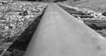
| 09/20/2005 03:35:27 AM | Northern Branch of the L & N Railroadby rayg544Comment: Greetings from the Critique Club
I must say that this is one of the most unusual perspectives for a railway shot that I have seen. I do think that unusual perspective helped keep your score above 5.
The black and white conversion is good with tonalities going through full black to full white across the picture.
A few things that would help this picture:
1. DOF choice: In a shot like this with the one STRONG line leading through the picture, it would be better to start it out tack sharp and let it then fade out as you go through the picture. The line should produce the dynamic movement through the picture. Here, when you look at the picture, the eye has to struggle through the out of focus at the bottom of the picture to get to the part that is sharp.
2. Focal Point: Where does the leading line lead me to? What am I supposed to be looking at in the picture? Especially in this as a black and white photo, I need something to be looking at, and not just the line (the track) leading me through the photo. This also relates to the choice of DOF, as I get to the tack sharp point and want to be able to look at something there, but nothing appears and my eye wanders right off the top of the photo without being able to stop and 'rest'.
3. Clutter/Background: You already noticed some of this as in your comments, you had cloned out the grass blade and then noticed it was basic editing. What would help in this to start off with is to just go and pull the grass from the track before you take the shot, then you don't have to worry about it. Look at the background and ask, "Is there any way I can remove distractions from the background before I take the photo?"
4. Crop: Most photos of railway tracks are done in the vertical/portrait orientation rather than horizontal. A vertical/portrait orientation gives a sense of distance of the track seeming to extend to infinity and beyond. With this orientation in the photo, there is a sense of truncation, of stiltedness. There is too much space to the left and right of the track for my eye to drift back and forth.
Overall Impression: While I did not vote in this challenge, I would have scored this picture a 4. Removing the distractions from the background would bump it up to a 5. Correcting the DOF/orientation would possible bump it up another point to 6. I do think that your conversion to B&W is very good and your eye for a different perspective is commendable as well.
If you have any questions about this critique, please feel free to contact me via the PM system. | | Photographer found comment helpful. |
Home -
Challenges -
Community -
League -
Photos -
Cameras -
Lenses -
Learn -
Prints! -
Help -
Terms of Use -
Privacy -
Top ^
DPChallenge, and website content and design, Copyright © 2001-2024 Challenging Technologies, LLC.
All digital photo copyrights belong to the photographers and may not be used without permission.
Current Server Time: 04/18/2024 04:22:55 PM EDT.
|