|
|
|
Showing 391 - 400 of ~1240 |
| Image |
Comment |
| 09/27/2004 06:49:53 AM | Kamakura Buddha Statueby PhilipDyerComment: I really like the framing of this shot. However, it does take away from the sensation of the Kamakura Buddha. If a human had been allowed to enter the frame, that sense would have been preserved. The bland sky also detracts somewhat. You live only a few train rides away. You can go back on a beautiful day if the mood takes you. |  Photographer found comment helpful. Photographer found comment helpful. |
| 09/27/2004 06:39:57 AM | | | Photographer found comment helpful. |
| 09/27/2004 06:25:12 AM | | | Photographer found comment helpful. |
| 09/27/2004 06:16:14 AM | |
| 09/27/2004 06:14:44 AM | Phone touchby morpurgoComment: I take it that the effect is deliberate, but I'm left relying on the title too much to get the connection to the challenge theme. | | Photographer found comment helpful. |
| 09/27/2004 06:07:32 AM | Whisperby digistouneComment: I like the effect a lot. However, on my screen, it's just a touch too brigh for perfection. 8 | | Photographer found comment helpful. |
| 09/24/2004 12:31:58 PM | Beep Beepby elru21Comment: *critique club*
Greetings!
First of the bat, I'll bet you're wondering why you got 4 positive comments yet a score of under 5. I'll try and answer that here. But before we begin, I looked at your 'baby botanist' tryptich and my wife said 'kawaii' and 'toriaizu, taberu ne', which means 'cute, I like that' and 'just for the moment, I'll try eating it (as babies do)'. Fun shots, and they'll be a welcome addition to your family album.
Compositionally, your photo is fine. You've got two very clear sections, the one with the action and the other, neatly set off by the background grass, showing the reflection. You've shown the challenge theme well here. You needed to realise the negative strength of the top left side: having so much out of the main focal range and in such an important area makes the whole photo feel like a snapshot, not a winning DPC entry. The arm, placed where it is bang right in the centre, brightly coloured and having such a strong line, is a clear candidate for the main subject, even though it's not. So, compositionally, you needed to deal with that problem by cropping. If I had had the same file, I might have used a horizontal cropping, using only a touch of the unreflected head, extending rightways to the mirror and deleting everything unhelpful.
I feel that the greenery is too dark for the bright mood intended. I don't know which software you use, but all allow for overall brightening and some allow for spot brightening. I'd brighten and blur the grass a bit.
Computer processing is obvious on the shirt sleeve on the bottom left. It looks unnatural. (Cropping it out would save a lot of heartache) but otherwise, you need to be careful how you deal with pure whites in digital photography.
The last point I'd like to make is about the face in the mirror. Simply put, the more the better.
I'll put up an edited version of your photo in my portfolio for a while. Look at it and tell me what you think. It's 'elru1.jpg'.
Best wishes,
Jim
ps. My edit isn't at all perfect, just a few strokes to show the ideas I've mentioned here. | | Photographer found comment helpful. |
| 09/24/2004 11:51:15 AM | Back Yard Funby Crafty SueComment: When the challenge is over, ask in the forums about this. You'll get a lot of help. | | Photographer found comment helpful. |
| 09/24/2004 11:48:13 AM | Breakfast kaleidoscopeby JinjitComment: *critique club*
Greetings!
There's obviously been a lot of thought put into this photograph. Well done on a neatly arranged piece.
My only real comment is about the colour scheme you chose. Mirrors darken on reflection. Darkening is usually the opposite of the 'wow' feeling DPC requires for their winners. Rather than feel at ease with the presentation, I feel depressed by it, due to the darkening scheme moving rightwards.
Also, mirrors reflect. In a photographic frame, we need to consider the total effect, yet when we know that mirrors are involved, it becomes difficult to look beyond the reflection. The line that the eggs, in total, make is negated by the knowledge that it's just a reflection, intensified by the darkening of the furthermost eggs.
I'm not sure why you choose your colours as you did. The lighting is skillfull and indicates an awareness of lighting possibilities. But I can't see any impact of your technique on the impression. Sorry.
If you have any comments on this critique, please feel free to contact me.
Best wishes,
Jim
| | Photographer found comment helpful. |
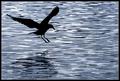
| 09/24/2004 11:35:48 AM | Larus fuscusby AmasonComment: At first I thought, 'nice'. But after looking, I began to feel confused. 1 The silhouetted bird needs a proper reflection, and 2 the horizontal lines are very dynamic, adding movement to the bird's stopped action. However, the waves inhibit a clear water-based reflection, which ultimately impedes the overall composition. Still, a very good photo. 7 | | Photographer found comment helpful. |
|
Showing 391 - 400 of ~1240 |
Home -
Challenges -
Community -
League -
Photos -
Cameras -
Lenses -
Learn -
Help -
Terms of Use -
Privacy -
Top ^
DPChallenge, and website content and design, Copyright © 2001-2025 Challenging Technologies, LLC.
All digital photo copyrights belong to the photographers and may not be used without permission.
Current Server Time: 08/06/2025 04:08:13 PM EDT.
|