| Image |
Comment |
| 11/02/2007 12:11:48 AM |
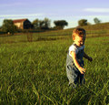
blissby PhilComment: Clearly a shot that means a lot to you, so no amount of criticism here should take away from what is a lovely shot for the family album.
However, I'm not sure a square crop really works, I feel that it has been an attempt to rescue a crop out of the camera that didn't work. A square crop IMO needs to be really compelling and look as if it was planned the moment you pressed the shutter. The focus is not on the subject, but in front on the grass. The depth of field would ideally have been much narrower, you either need to open up your aperture, or buy a faster lens. A good 50mm would have done the job, and is very affordable. The quality of light on the face is lovely, and really gives the shot a lot of atmosphere. The timing isn't perfect though, there's nothing exceptional about a small child reaching for something. A little glance at the camera would really have clinched this. The main problem with the photo to my mind is that the point of focus is weakened by the amount of negative space on the left of the shot, which is sharply in focus. Some Photoshop work to subtly blur the rest of the shot might have helped. Anyway, thanks for sharing with us. |
 Photographer found comment helpful. Photographer found comment helpful. |
| 11/01/2007 01:23:30 AM |
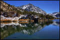
Fresh Airby slickchikComment: Looks like a beautiful location, but the shot makes me want to yawn (sorry!). It's the obvious shot, I'd have tried much harder to look for something a little different. Also, it's really important to take this kind of photo in the very early morning so the reflection is absolutely still, which gives this composition much more impact. The quality of light isn't amazing here, it doesn't look like you caught it anywhere near dawn or dusk. There are some strange textures in the water in the foreground near the bottom of the frame, are they deliberate? Is it deliberate that the shot is not absolutely... but almost symmetrical? |
| Photographer found comment helpful. |
| 11/01/2007 01:18:57 AM |
Nemo the dogby robstComment: Crazy, but I like it! You have chosen a very ambitious subject (black dog against sky), and done pretty well although I think your shot is a little washed out now as a result, I'd add a little more contrast at the darker end of the shot to fix it while still keeping plenty of detail in the fur. Not sure I like the tree growing out of your dog's head. Some very strange bokeh, I feel like you may have had to sharpen like crazy a shot that wasn't quite sharp to start with. Having said all that, this is a bit different and it has loads of character. |
| Photographer found comment helpful. |
| 11/01/2007 01:13:48 AM |
To the Nightby fotomann_foreverComment: Nice family portrait. Well lit. Would work much better for me if she was looking at the top of the glass... here it just looks like she's posing for the photo as she's staring in a bored fashion at her hand. Perhaps burning the bottom of the shot (as it looks like you have done with the other edges) would help the composition? Ultimately, this is too much like a family portrait to really have much appeal for me personally. |
| Photographer found comment helpful. |
| 11/01/2007 01:11:17 AM |
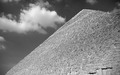
Pyramidby flavioalimaComment: Strange conversion to b&w, almost like you just used an oversaturated red channel. I'm sure you could have done a much better job using the channel mixed... or by using a filter on your camera. If the pyramid itself was much darker (which you can control when you convert to b&w), this could have been a very simple, classy composition. |
| Photographer found comment helpful. |
| 11/01/2007 01:08:48 AM |
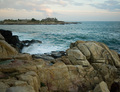
Walker Pointby alanfreedComment: Composition feels very unbalanced, way too much foreground, too much negative space on the right, too little sky. I don't really understand what you want to communicate with this photo, no colours, textures or forms jump out at me. There's not much mood to this photo. |
| Photographer found comment helpful. |
| 11/01/2007 12:59:46 AM |
Shuffling Into Oblivion Reduxby timfythetooComment: Lovely shot! I wish there was a tad more detail in the face, at the moment, the stripes of the shorts are the sharpest part of the shot which tries to make it the point of focus. Otherwise, you could blur the detail there which would allow the eye to focus more naturally on the face. I like the tilt. Red umbrella works well. |
| Photographer found comment helpful. |
| 11/01/2007 12:47:24 AM |
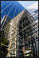
Reflections endby cryingdragonComment: A competent shot, but needs something extra to lift it above every other 'buildings reflected in windows' shot. Nice blues. Not sure about the tree at the bottom left. Not quite sure what you're trying to communicate with this photo... perhaps the flag needs more prominence if you want it to be the focus. |
| Photographer found comment helpful. |
| 11/01/2007 12:45:21 AM |
As the Sun Rises in Glory....by Nikolai1024Comment: Horizon doesn't look straight. Not that keen on the colour balancing. Composition doesn't quite work for me... rule of 3rds? Too much foreground. Foreground not lit well. Composition of foregound not compelling. |
| Photographer found comment helpful. |
| 11/01/2007 12:43:38 AM |
-Friday Night Lights-by tfarrell23Comment: Composition doesn't do much for me here, too much to look at. No clear point of focus. Nothing really special seems to be happening at this moment in time. |
| Photographer found comment helpful. |
Home -
Challenges -
Community -
League -
Photos -
Cameras -
Lenses -
Learn -
Prints! -
Help -
Terms of Use -
Privacy -
Top ^
DPChallenge, and website content and design, Copyright © 2001-2024 Challenging Technologies, LLC.
All digital photo copyrights belong to the photographers and may not be used without permission.
Current Server Time: 04/23/2024 06:30:16 PM EDT.