| Image |
Comment |
| 11/02/2007 06:02:02 AM |
Graceby bubeltrubelComment: Beautifully exposed, nice even background and good light, although I don't like the shadow. Composition doesn't work for me though and bothers me the more I look at it. Use of negative space doesn't feel balanced. Not quite enough exploration of light, colour, textures and form to make me see this is a work of art rather than just a photo of flower. |
 Photographer found comment helpful. Photographer found comment helpful. |
| 11/02/2007 05:59:03 AM |
Two of Heartsby noranekoComment: Lovely subject, shame it's overexposed. Background doesn't quite work, the top right corner is too distracting. I feel like you've gone mad with the soft focus blur to disguise some of these issues. Composition doesn't work for me, too much going on at the bottom of the shot. Greens and yellows need some colour balancing. Swans could be sharper. |
| Photographer found comment helpful. |
| 11/02/2007 05:56:11 AM |
Beccaby GatorguyComment: Lovely lighting, but OUCH MY EYES... talk about oversharpening. Professional and competent, but a little commercial for my taste. |
| Photographer found comment helpful. |
| 11/02/2007 05:54:16 AM |
The Netby ilphotoComment: Lovely exploration of colour, texture and lines. Composition feels a little unbalanced, too much grey, I feel that the green and grey should be equal or significantly different. Blues feel a bit oversatured. Wish there was something a little extra to this though, there's a danger of it being just a net on a wall. |
| Photographer found comment helpful. |
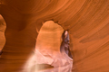
| 11/02/2007 05:51:32 AM |
Mother Nature's Sculptureby The EskimoComment: Very heavily photographed landmark, I feel that this shot is a bit of a wasted opportunity. Usually, photographers are attracted to the stunning plays of light, textures and shapes in this formation, whereas I feel that this looks more like an 'I was there' kind of a shot. I don't see an exploration and an awareness of all the aforementioned issues. Particularly bad is the inclusion of the edge of an arch on the left of the shot, which leads the eye out of the frame, a definite 'no no'. |
| Photographer found comment helpful. |
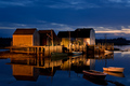
| 11/02/2007 05:46:14 AM |
Blue Rocks at Dawnby tjandjwsmithComment: Beautiful colours, and very striking on first glance. The more I look at it though, the more that things start to bother me about it. The composition doesn't feel balanced and there is no clear point of focus amongst the buildings. The amount of negative space at the top of the shot feels a little superfluous. Although the horizon looks straight, the shape of the buildings in the water makes the photo feel like it is tilting to the left. One of the boats is blurry, I would have tried to make more of a feature out of this by making both boats very blurry. Here, it looks accidental. Nice contrast of warm and cool tones with your use of white balance though. |
| Photographer found comment helpful. |
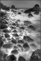
| 11/02/2007 05:42:07 AM |
Ocean rhythmby william88Comment: Breathtaking, literally. Very bold composition, third of rules be damned! I do wonder what it would look like in colour... even artificially applied from black and white, perhaps painted in. I think the score will suffer for being in b&w, it's not pretty but it is striking. |
| Photographer found comment helpful. |
| 11/02/2007 03:56:48 AM |
Sunset in Rhode Islandby kawesttexComment: Some lovely colours, and very sharp. Composition doesn't quite work for me though, it feels unbalanced and right-heavy. There's too much negative space at the top of the frame for my taste, and the left of the shot does nothing for me. I personally would have chosen a longer lens and gone for a detail shot, prefereably from a different vantage point with a more interesting horizon. |
| Photographer found comment helpful. |
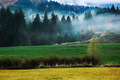
| 11/02/2007 03:45:49 AM |
Autumn mistby ATAPEComment: Composition is messy, way too many textures and colours with no clear point of focus. Sky takes up a small part of the shot, and looks accidental. This photo needs a clear choice as to whether there should be sky or not. Textures seem odd, maybe high ISO or something in Photoshop. Oversaturated to the point that my eyes almost want to bleed. The mist is nice, but because of the composition, it's unclear as to whether it is a point of focus or not. Rule of thirds would definitely help here, the main horizontal line is bang in the middle of the shot which isn't good. |
| Photographer found comment helpful. |
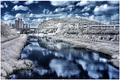
| 11/02/2007 12:16:55 AM |
Infrared Studyby shalrathComment: Very striking shot but I can't say I like it, it feels a bit 'gimmicky'. The boys down on the bank bother me, were they supposed to be in the shot? If so, they feel very small, as if the photographer didn't see them there. I'm not sure what you're trying to communicate with this photo, the modern tower blocks are the first thing to grab my eye, especially as they're in the top left of the shot. Is this a comment on the intrusion of modern urban life to the days-gone-by idyll of childhood by a river in nature? Why in infra red? Is this a comment on the urban modernity? All questions that I feel the photographer never asked, instead of 'hey this looks cool'. |
| Photographer found comment helpful. |
Home -
Challenges -
Community -
League -
Photos -
Cameras -
Lenses -
Learn -
Prints! -
Help -
Terms of Use -
Privacy -
Top ^
DPChallenge, and website content and design, Copyright © 2001-2024 Challenging Technologies, LLC.
All digital photo copyrights belong to the photographers and may not be used without permission.
Current Server Time: 04/24/2024 06:44:07 PM EDT.