| Image |
Comment |
| 11/30/2007 03:09:57 AM |
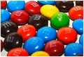
Ever had that "NAKED" dream?by PhotomouseComment: This is great. Its something I can relate to, and it involves peanut m&m's, which are my passion in life (well not really, but are still delicious). The border is a bit too thick for my tastes, 10 pixels is usually enough--8 |
 Photographer found comment helpful. Photographer found comment helpful. |
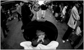
| 11/30/2007 03:08:28 AM |
Black Fridayby EstimatedEyesComment: Post processing seems a little harsh, and the highlights are too washed out in the background. Also, I can see three other black people in the image so he's not exactly alone in a crowd. It would work better to have a model stand for you, and do a timed exposure. Then, you would have your dude isolated not only by your composition but by his race. See  for a good example of what I'm talking about |
| Photographer found comment helpful. |
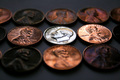
| 11/30/2007 03:04:53 AM |
Being Different Doesn't Make You Worth Lessby IlAshesComment: I like the HDR effect on the penny's, and the idea is really cool. However, the blank spaces on the top and bottom are destracting, and you'd be better off continuing the line of pennys--the depth of focus will keep them from being destracting, but will fill the image--7 |
| Photographer found comment helpful. |
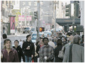
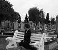
| 11/30/2007 03:03:27 AM |
alone...in...a....CROWD.by bigcheech610Comment: Heh. The 'd' in the upper right is out of focus, as is the 'cr' in the right crowd. Next time, I would go for a better depth of sharpness, and some stronger lighting would also be helpful. Finally, the table on the top and the right is destracting, and should either be cropped out or excluded from the composition. |
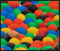
| 11/30/2007 03:00:41 AM |
Taste The Rainbowby goinskiingComment: Nice! It would have looked cool if you had circled the skittle with rings of m&m's of the same color--an orange ring, then a blue ring, then red etc. Regardless, its a good idea and is well executed. |
| Photographer found comment helpful. |
| 11/30/2007 02:58:47 AM |
Market: 7am till lateby MotekComment: Nice use of a fisheye lens, and the black and white looks great. Part of me wishes that there was more shadow detail in the older woman's coat, and the baby's carrage. And in the market. But that may not have been your intent--7 |
| Photographer found comment helpful. |
| 11/30/2007 02:57:04 AM |
I'm like them but I'm not....by Lola_dublinComment: I like the idea but it seems like your highlights are washed out. I would go dor a shadow/highlights mask to tease out the midtone detail. Also, the box on the bottom and the right is destracting--you should crop it out |
| Photographer found comment helpful. |
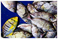
| 11/30/2007 02:55:44 AM |
Always had to be differentby MelethiaComment: I think this would work better if the different fish was either in the center. The mass of fish to the right draws the eye away from the different fish, and it took me a few seconds to see where he was. |
| Photographer found comment helpful. |
| 11/30/2007 02:53:08 AM |
Crowded Outby djoubertComment: Great idea. You could have a better depth of sharpness with a prime focus lens like a 50mm and a high, narrow aperture. Currently, it looks like the back 1/3 of the image is slightly out of focus. |
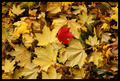
| 11/30/2007 02:50:31 AM |
Lonely Redby scooter88Comment: I love the idea. I think it would have worked better if the other leaves were the same color--yellow or brown. Also, the border seems a little too wide, 10 pixels is usually enought for the effect without distracting from the image itself |
| Photographer found comment helpful. |
Home -
Challenges -
Community -
League -
Photos -
Cameras -
Lenses -
Learn -
Prints! -
Help -
Terms of Use -
Privacy -
Top ^
DPChallenge, and website content and design, Copyright © 2001-2024 Challenging Technologies, LLC.
All digital photo copyrights belong to the photographers and may not be used without permission.
Current Server Time: 04/24/2024 07:13:30 PM EDT.