|
|
| Image |
Comment |
| 04/18/2008 10:47:45 AM | |  Photographer found comment helpful. Photographer found comment helpful. |
| 04/18/2008 10:47:02 AM | Warm Inversionby Bruce_the_RobertComment: wow this is beautiful, looks like a painting almost. I like how the negative almost looks like it could be a real flower | | Photographer found comment helpful. |
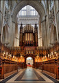
| 04/08/2008 01:23:00 PM | Gloriousby MelethiaComment: This scored over 6!! i'm not commenting, just kidding. I absolutely love the HDR on this image, it almost does not look like HDR. There is really not a whole lot to comment on this image. One thing is that it seems like you were not in the center of the aisle. The darker black thing almost in the center of the frame seems a little tilted to the left and the main arch at the top of the frame is not centered (the tip of the arch is actually quite a bit off center). Those are my only comments, great image. Hope this helped
| | Photographer found comment helpful. |
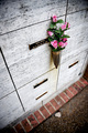
| 04/08/2008 01:17:57 PM | Remembranceby breadfan35Comment: I like your use of the vignette, specially with the title you used, it gives it a very intimate feeling. I like the gritty look you've given to the image. One thing I would change is the crop on the left side, i'd like to see the whole square instead of having it chopped off. Also, i'm not a fan of the brick in the bottom, but there is really nothing you can do about those. I think their colors competes with the flowers since the rest of the frame is sort of monochromatic or with very little color. Maybe you could desaturate very very little the bricks, so that there is still color in them, but a tad less (just a suggestion, it might not do anything for the image). Hope this helped | | Photographer found comment helpful. |
| 04/08/2008 01:06:57 PM | Dying of Thirst!by Dirt_DiverComment: Hi Joseph. I really like this image. I like the rounded vases, the strong and weak roses, the use of a light/flash on the background and the overall composition. I think this didn't do better partly because DPC does not like sad topics, which in your case is the death of a flower. But oh well, that aside, things that could improve the image are that not everything seems tack sharp, the leaves (not petals) of the rose on the right are a little soft. I really like the lighting on the rose to the right, but i really dislike the lighting on the rose to the left. The one on the right is very sharp and the shadows complement its beauty. The one on the left is, well, all shadow. I see why you did that, but you may have taken it a little to far. Maybe using another light coming from below and to the right to light the dying rose would have helped. This light could be weaker than the others to keep the darkness of the left rose. Also, maybe you could have toned down a little the background light so it's not so blown out, and that would let you brighten the the rest of the image. Finally, a minor thing, there are bubbles or dirt on the right vase. Hope this helped. | | Photographer found comment helpful. |
| 04/08/2008 12:57:56 PM | Morning Glowby gwe21Comment: Hi Erica, wait what? there's two flowers here? I thought it looked a little weird, but I wouldn't have thought about there being two flowers. I guess the second flower in the back is distracting then. I really really like the green leaves and the tones the the DOF in that area of the picture, it complements very well the flower. On the other hand, the flower is lacking something, it seems a little too dark and the bright areas of the flower cut very sharply into the less bright areas. Not sure if it was due to the harsh lighting or because you pushed the processing (contrast? curves?levels?) a little too far. What i'm talking about also is visible in the back flower. I really like your use of water to add an extra element to the image, that was really good. The last thing I want to comment on is the frame. I think the red of the frame competes with the red from the flower and is not a good combination. I like to keep frames as simple as possible since the attention should go to your image and not to the frame. I hope this helped. | | Photographer found comment helpful. |
| 04/08/2008 12:30:19 PM | March Madnessby Donna21Comment: Hi Donna, i downloaded your image and cropped it, let me know what you think  . Besides the crop, i like everything in your image, i like the high contrast and the intricate branches. Sorry but I don't have any other criticism. | | Photographer found comment helpful. |
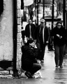
| 04/08/2008 12:16:33 PM | Smoker's Havenby bradshawComment: I like this image a lot actually. I like the smoker's pose and how the guy in the back with the baseball cap seems to be looking at her. Your processing is great also. A couple things i'll comment on just because i can are that I would have cropped a little closer on the left leaving the black thing at the top left of the frame out and also the stones on the wall right behind your subject seem a little too sharp or too bright, not sure what, they seem to take attention away from your subject. Then again, those are really minor things that probably don't matter, I just wanted to leave something you could think about instead of just saying i liked the picture. Hope this helped | | Photographer found comment helpful. |
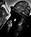
| 04/08/2008 12:10:25 PM | Tilt En Vogueby colorcarnivalComment: Kudos for trying something different, we should all do that more often. As far as the image goes, i like the texture on the building and the glow of the dome thingy. I like how your model seems to come out of the darkness and how his head is almost vertical with the tilted background. The main thing i dont like is the harsh lighting which is causing a couple of blown out regions (top left of frame and left side of subjects face). I guess there's not a whole lot you can do about those except for shooting at a different time of day, so yeah, with the option you had available,, good job. Hope this helps
K | | Photographer found comment helpful. |
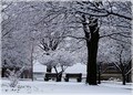
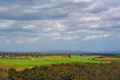
| 04/08/2008 11:59:54 AM | Serenityby ChinabunComment: Besides what has been said before of softness and lack of subject I think what this picture lacks is some sort of dynamism. As the viewer, I see it and I'm like "ok that's a pretty view" but I take the whole frame at once, there is not aspect of it that stands out and there are no lines leading me into the frame to make me feel the depth of the scenery. There are a bunch of horizontal (or almost horizontal) lines in the frame (the darkest clouds, the trees in the foreground, the horizon, the mountain tops, the second set of trees, the brown in the rolling hills). All these lines are isolated from each other, none of them seems to lead you into the next one.
the image by tmorningglory96 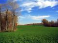 is different to yours in the fact that the first thing you see is the trees to the left, the the trees to the right (which are a little bit deeper into the frame) and lastly the trees in the background. So your eyes just went from left to right to center of the frame, your eyes were just guided through the frame and toured around the scene. In your image, the whole thing hits you at once and you don't know what too look at. Even though tmorningglory96's image does not have a subject there are things in it that grab your attention.
the image by io 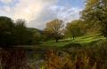 does have a subject (or at least to me it does). It is the tree almost in the middle, which also happens to be lighter than the others attracting your eye to them. This image also has stronger lines like the circular edge of the pond, the diagonal ground to the right, the diagonal of the top of the trees to the left, another diagonal of the top of trees to the right. All of those diagonals converge close to the central tree, again bringing your attention to it. The main thing that distinguishes this image from yours is the diagonal lines and their interaction.
Hope this helped, let me know if you have any questions
| | Photographer found comment helpful. |
Home -
Challenges -
Community -
League -
Photos -
Cameras -
Lenses -
Learn -
Prints! -
Help -
Terms of Use -
Privacy -
Top ^
DPChallenge, and website content and design, Copyright © 2001-2024 Challenging Technologies, LLC.
All digital photo copyrights belong to the photographers and may not be used without permission.
Current Server Time: 04/19/2024 12:25:16 AM EDT.
|