| Image |
Comment |
| 08/25/2005 04:47:43 PM |
Curveby gudbjargarsonComment: Just the tiniest bit too dark (my monitor?), but I like this shot. Sharp focus, subtle light. |
| 08/25/2005 04:46:09 PM |
Solitary Illuminationby pidgeComment: I want to like this more than I do. The problem for me is the focus. Your subject looks blurry, but the rocks, especially at lower left, seem better focused. Composition is really good. B&W works. Would make a great poster if it was clearer. |
 Photographer found comment helpful. Photographer found comment helpful. |
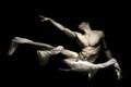
| 08/25/2005 04:42:42 PM |
Play on words.by parrotheadComment: I'll admit it... I don't get the title. Like the shot, though. Good focus, DOF, lighting, composition. |
| Photographer found comment helpful. |
| 08/25/2005 04:39:49 PM |
|
| Photographer found comment helpful. |
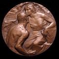
| 08/25/2005 04:38:22 PM |
1906 Nudes In Bronzeby photom1946Comment: Why do I feel a debate coming on about this shot?
Highlights are blown out. Focus is OK, but there is nothing special about the image. 5 |
| 08/25/2005 04:36:30 PM |
Bare Boulderingby hideoutComment: I guess when you go rock climbing you need to hang on with everything you have...
I just don't find anything special about this shot, other than the subject matter. |
| 08/25/2005 04:34:41 PM |
An Angel Waitsby idnicComment: Not a really bad photo, but the composition is weird. Strange pose. No nudity (DFTC). Doesn't fit the title, either, in my opinion. |
| Photographer found comment helpful. |
| 08/25/2005 04:32:15 PM |
" Soft "by tfarrell23Comment: It's TOO soft. In fact, it seems blurred rather than soft-focused. Sorry, but this could be anything. Seems more abstract to me than anything else. |
| Photographer found comment helpful. |
| 08/25/2005 04:29:14 PM |
Nude With Foodby phinbobComment: Nice job. The selective saturation really works well here. Great expression on your model's face. Nice focus, DOF, light. I like the crop, though I expect some will complain that part of the arm & head are cut off. 9 |
| Photographer found comment helpful. |
| 08/25/2005 04:26:30 PM |
Beauty From Within Itselfby SteveSeeComment: I like the richness of the colors, but it looks like you applied too much contrast. The light seems a little too strong; the hightlights are blown out a little. The tltle doesn't make sense to me in relation to the image. |
| Photographer found comment helpful. |
Home -
Challenges -
Community -
League -
Photos -
Cameras -
Lenses -
Learn -
Prints! -
Help -
Terms of Use -
Privacy -
Top ^
DPChallenge, and website content and design, Copyright © 2001-2024 Challenging Technologies, LLC.
All digital photo copyrights belong to the photographers and may not be used without permission.
Current Server Time: 04/24/2024 08:28:33 AM EDT.