|
|
| Image |
Comment |
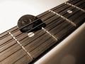
| 11/18/2003 02:44:16 AM | rested noiseby skybelowComment: Greetings from the critique club.
The first thing I noticed when I saw your photo (during the voting) was the composition. I�m a fan of diagonals and the angle you�ve chosen for this image is great. I especially like the placement of the pick. How it�s just above horizontal center and to the left of vertical center. I feel it adds a sense of stability to the strong diagonal lines.
I feel that the choice of sepia tone works well in this instance. I feel that a color version of this shot would have taken away from the simple lines and composition.
The light is coming from an interesting angle, in that it casts some wonderful shadows from the strings and the light glinting off lines on the pick really emphasize the texture.
I like the depth of field you�ve chosen. Not so shallow that it completely obscures the strings in the background, but just enough to give the shot some depth.
The following is strictly my opinion. In a controlled, digital studio shot such as this one, lens flare should be non-existent. The photographer has the ability to position the light anywhere he/she wants it and then review the image to see if there are any anomalies. In the lower right hand corner you have (what appears to be) some lens flare. If you weren�t using one already, a lens hood may have helped reduce the chance of lens flare in this shot. One other thing I noticed is a bit of digital noise in the lower right hand corner, which is a bit distracting, but not anything too major.
I hope this helps,
Quadrajet
|
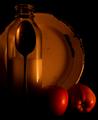
| 11/17/2003 10:32:07 AM | Country Livin'by Spanish_GreaseComment: Greetings from the Critique Club:
Well I was given your image to critique and I have to say that I�m very happy about that. I recall seeing your image in the still life competition and thought that it should finish in the top 10. I was disappointed to see it way down in 73rd.
There are quite a few things I like about this image. First of all, the character of the plate, spoon and milk bottle all strike me as very rural, just like one might find on a farm. Of course the title �Country Livin� � didn�t hurt to perpetuate the image.
The next thing that attracted my attention was the interesting composition of the spoon, bottle and plate. I immediately looked at the spoon silhouetted against the bottle, then followed it up to the plate, then around to the apples. I found your image to be very visually stimulating.
I do have to admit that the lighting is abit dim, but it reminds me of evening time on the farm, with the last bit of sunlight glinting through the window. It really sets a mood for the photo.
I didn�t know exactly what to think about the apples. They look nice there, but imho, they don�t quite fit in with the inorganic feel of the spoon, plate and bottle. What could replace them? Who knows, but what I do know is�I like this shot! I gave you an 8.
|  Photographer found comment helpful. Photographer found comment helpful. |
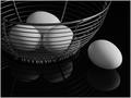
| 11/17/2003 10:13:29 AM | Don't Put All Your Egg in One Basketby SharonSComment: I find this composition and the simplicity of the subject fascinating. The lack of color lends this image well to black and white, great choice. The faint reflection works well because it doesn't draw away from the subject, but enhances it. Excellent shot! | | Photographer found comment helpful. |
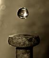
| 11/17/2003 10:10:57 AM | To spike a drink by kosmikkreeperComment: This is a truly amazing shot. Excellent tie in with the literalisim you've chosen as well. The Sepia tone works perfectly, in my opinion, because color would add another dimension to this image...and it doesn't need that. All color would do is draw away from the amazing subject. I feel the depth of field is perfect for this image and the clarity is awesome.
This is a great shot and deserves a ribbon, no question. | | Photographer found comment helpful. |
| 11/17/2003 06:19:22 AM | Wine is A Gracious Creatureby vrphotosComment: Greetings from the Critique Club.
I have to say that this shot was one of my favorites�a classic still life image. There�s obviously a lot of attention to detail in this image, from the beautiful rich, burgundy background to the (what appears to be) authentic wine cask the subjects are sitting on. The highlights in the stem of the glass are wonderful, they make it stand out so strongly against the dark background.
The only thing I could possibly critique in this shot is the fact that the highlights on the bottle and glass seem ever so slightly hot, but not to the point of being blown out. I realize that when dealing with glass, slight hotspots are impossible to overcome but that�s about all I can see that is remotely distracting (to me). Some may feel the corkscrew shouldn�t be cropped, but I feel it works well as it is.
This is a fantastic shot that in my opinion, deserved a higher placing. | | Photographer found comment helpful. |
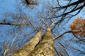
| 11/13/2003 02:45:26 AM | Relaxing In God's Creationby DrakeComment: The first thing that I (and probably 7 other people) am going to say is the image is very small...almost too small to give yourself a fighting chance here at DPC.
The second thing I'm going to say is that I like the composition of the image, but the lighting isn't very dramatic. In order to make a photo of trees interesting a person could try to shoot the trees in an interesting light or with an interesting sky.
I hope this helps,
Quadrajet | | Photographer found comment helpful. |
| 11/13/2003 02:21:15 AM | Sacred corner in my houseby royansComment: The shallow depth of field works well in this shot...it gives a sense of depth to the beads as they trail into the background. I like the violet color of the image, but it's a bit too brint in places for my liking. Overall, I feel this is a decent shot, nice work. |
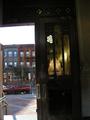
| 11/13/2003 02:10:25 AM | Mix of Church and Stateby rooComment: It looks like the reflection in the door's glass is the interior of a church. I'm thinking that this is almost too much of an "overall shot" of the situation. The whole bottom half of the image doesn't really add anything...if anything it takes away from the top half of the image. The door on the left, the truck, the sidewalk the dark bottom of the door, none of these things are really all that interesting (to me).
In my opinion, a person could with a horizontal orientation and move closer to the door. That way you could get the buildings in the background as well as the reflection of the church interior in the shot without all the extraneous stuff in the bottom of the image.
The shot also looks like it's a bit tilted to the left (see the door and the buildings).
I hope this helps,
Quadrajet
|
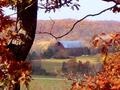
| 11/13/2003 01:55:43 AM | the simple red barnby jpb323redComment: This photo drums up images of youth spent on a farm and a longing for the simple life.
I like how you framed the barn with the trees and branchs, although I feel the branch on top dips a bit too close to the barn and becomes almost a distraction.
The image seems a bit small and somewhat pixelated.
It looks like the barn is pretty dark compared to the rest of the image...and the barn is the subject, right? I can see by the patches of light on the ground, that there were breaks in the clouds. In this instance you may have been better off waiting for a hole in the cloud to shed a bit of light on the barn...this would emphasize the subject (barn).
I hope this helps,
Quadrajet | | Photographer found comment helpful. |
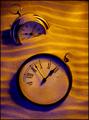
| 11/10/2003 12:33:55 AM | The Sands Of Time by QuadrajetComment: My first ribbon, what a great feeling, thanks everyone for the votes and the great comments.
The way I achieved the ripples in the sand was by first smoothing it all out, then dragging my fingers through it. I stuck the clocks in the sand, grabbed a handful of sand which I poured over the clocks and threw some lightly at the ripples to knock down the peaks. I followed that by touching up the ripples with my fingers. After than I blew on the face of the bottom clock to give the sand a a "windblown" look.
|
Home -
Challenges -
Community -
League -
Photos -
Cameras -
Lenses -
Learn -
Prints! -
Help -
Terms of Use -
Privacy -
Top ^
DPChallenge, and website content and design, Copyright © 2001-2024 Challenging Technologies, LLC.
All digital photo copyrights belong to the photographers and may not be used without permission.
Current Server Time: 04/19/2024 06:07:52 PM EDT.
|