|
|
| Image |
Comment |
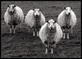
| 01/29/2004 04:43:16 AM | Four of a Kind by KonadorComment: I really like the composition, the choice of black and white, the clarity, the exposure...umm what else do I like...well, pretty much everything. My only nitpick would be that the image seems to be cropped a bit too tightly at the top (for my taste) but that's a minor nitpick. I'm really glad it meets the challenge because this is a great shot, keep up the great work. |  Photographer found comment helpful. Photographer found comment helpful. |
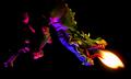
| 01/29/2004 04:38:40 AM | Year of the Dragonby drgsoellComment: Great subject! I really like the flame coming from the mouth and the blue color on the underside of the dragon's neck. In my opinion, this image could be improved by cropping out all the magenta/green stuff in the left half of the image and going with a vertical format...head, neck and flame only.
Just my humble opinion of course, keep up the good work! | | Photographer found comment helpful. |
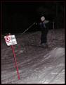
| 01/29/2004 04:20:51 AM | Rules Are There To Brokenby MonaComment: IMHO, using a flash could be considered "painting with light" but in this case it's simply an on camera flash...which doesn't really constitute anything particularly inventive or interesting.
That being said, this shot is entirely too underexposed, the skier barely stands out against the black sky.
Not only does this not meet the challenge, the image is poorly done. I'm sorry but I have to give this shot a 1 for meeting the challenge, a 1 for artistic merit and a 1 for technique.
In this particular instance 1+1+1=1. |
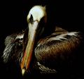
| 01/26/2004 04:42:38 PM | the pelicanby grigrigirlComment: The dark background and the shadows create an aire of mystery to this image, almost as if it was a painting. Beautiful shot. Message edited by author 2004-01-30 13:26:58. | | Photographer found comment helpful. |
| 12/05/2003 12:14:13 AM | Pop!by ScantyNebulaComment: Greetings from the Critique Club.
I have to tell you...when I first saw this shot I had it pegged (in my mind) for a ribbon...unfortunately you didn't get one.
I noticed you had mixed comments regarding the specular highlights around the pin. I think it helps emphasize the fact that you're actually PRESSING the pin into the balloon...I think it's an excellent touch.
I like the different colored balloons and I feel the yellow balloon was the right choice to have up front.
As far as the shallow DOF goes, I like it...it makes the pin/yellow balloon the focus of the image rather than something secondary.
Nice shot, I'm sorry it didn't finish higher!
Quadrajet | | Photographer found comment helpful. |
| 12/04/2003 11:54:29 PM | Caught In The Actby channeledComment: Greetings from the Critique Club.
Well, I have to say that this shot does have that "surprise" look to it. It makes me wish you had included some information in the comments eluding to what she was doing to look so surprised. :)
I think some commenters are confusing focus with motion blur. The part of the exposure that was caught by the flash is certainly in focus. What they're referring to is the motion blur caused by a combination of ambient light and a longer shutter speed. At any rate, I think this movement helps emphasize the element of "surprise" in that, thanks to the motion blur, we can see that she's actually in the process of turning around/being caught.
People have mentioned the red eye, and that is an unfortunate side effect of shooting with an on camera flash so I won't go on about it.
The composition is ok, nothing spectacular. I think this image could have been improved with a lower camera angle. Right before you "surprised" her, you could have knelt (is that a word?) down to her level. That way we're getting a little different point of view as opposed to a "normal" point of view. To me, things like that add a different dimension to an image.
I hope this helps,
Quadrajet |
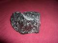
| 12/01/2003 01:15:45 AM | Can you smelllllllll what 'The Rock' is cooking?by mquesnelComment: I am assuming the title has to do with the wrestler "The Rock", which I know very little about. As far as the image goes, it has absolutely nothing to do with scent or aroma. I've smelled many a rock and can say, from first hand experience that the majority of them have no overwhelming scent or aroma.
I'm sorry to have to say this, and I'll probably read about it in the forums...but this image doesn't meet the challenge. Even the title (which is a major stretch imho) doesn't help the image reach across the "doesn't meet the challenge" gap.
I'll now comment on the image itself. The on camera flash gives the subject an "in your face" quality which even when taking a picture of a rock isn't all that flattering. A bit of sidelighting with some interesting shadows could help add a bit of depth and texture to this shot.
The composition is rather dull in that the rock is quite centered and static. It's a rock in the middle of the frame...I'm not sure following the rule of thirds would even help this image.
I do have to say that I like the depth of field you used on this shot. The front of the rock is in focus while the back of it gets slightly blurry.
I'm sorry for the less than spectacular comments, but I'm hoping to give you some help in improving your photography as well as help in meeting the challenge criteria. |
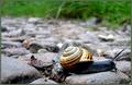
| 11/25/2003 05:10:36 AM | Snailby jaymeekaeComment: Woah, we don't have anything like that in Minnesota (the snail that is).
I like how the grass and the shell stand out against the gray of the rocks. The colors in this shot are great, very vibrant.
I kinda wish the snail him/herself was a bit darker, the contrast would make him/her stand out a bit more against the rocks. I also wonder what the shot would look like if the snail were in the lower left hand corner...pointing into the shot? Bah, now I'm just nitpicking. :P |
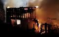
| 11/25/2003 04:48:31 AM | The Burning Bedby RefractedComment: Greetings from the Critique Club.
I seem to recall a made for TV movie starring Farrah Faucet titled “The Burning Bed”. Since most movies are based on books, I took it for granted that this was a legitimate book title. There was no problem meeting the challenge (imho). This is a great documentary type shot, it captures the horrible reality that fire has on a person’s home and belongings. I was relieved to hear no one was hurt.
As far as the image goes, there’s a delicate balance between overexposing the fire to get the smoke and underexposing the smoke to the fire. I have to say, you did a fantastic job capturing both the fire and the smoke, with just enough shutter drag to catch some wonderful sparks. The composition is wonderful, considering you had to use a stump for your tripod. I like the dark clump (and bed) in the lower right hand corner. Since that clump/bed is lower, it seems to balance out the garage in the center/left of the shot while allowing for some smoke/sparks to flow into the upper right.
Like I said earlier, this is a great documentary type shot, perfect for a newspaper or magazine article on the incident.
Quadrajet
| | Photographer found comment helpful. |
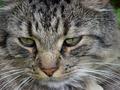
| 11/24/2003 08:14:38 PM | "Cats Are Purr-fect"by slavaComment: Greetings from the Critique Club.
Wow, this looks just like one of my cats! Ok, that said, I am torn when it comes to cat photos, some are cool while others are simply snapshots of a pet. Overall, I like this shot, but I’m a cat person. I feel there are some things that could be improved to make it more interesting to the non-cat person.
I like the fact that you gave the photo a more personal feel by zooming into his/her personal space. One other thing that might help improve this shot would be to crop the face closer. This forces us to focus in on the eyes, nose and face, rather than the whiskers, background and all that extraneous stuff.
Someone has already mentioned this, but I feel it needs to be repeated. This photo could become much more personal if the cat were looking into the camera. In a shot like this, eye contact means SO much (imho) that it could possibly make or break the image.
I hope these suggestions help,
Quadrajet
| | Photographer found comment helpful. |
Home -
Challenges -
Community -
League -
Photos -
Cameras -
Lenses -
Learn -
Prints! -
Help -
Terms of Use -
Privacy -
Top ^
DPChallenge, and website content and design, Copyright © 2001-2024 Challenging Technologies, LLC.
All digital photo copyrights belong to the photographers and may not be used without permission.
Current Server Time: 04/18/2024 09:57:32 AM EDT.
|