|
|
| Image |
Comment |
| 06/13/2009 02:32:58 AM | Honolulu Zoo by JovanComment: Cute title. Is this real or a stuffed cheetah with a painted background? I wish I knew before voting. If it's live it's excellent setup and lighting. If a museum someone else did a great job. I'll give you the benefit of a doubt. In any case it's nicely done. |  Photographer found comment helpful. Photographer found comment helpful. |
| 06/13/2009 02:32:54 AM | | | Photographer found comment helpful. |
| 06/13/2009 02:32:38 AM | Turtle Exhibit Billboard by LydiaComment: Very creative shot nicely titled. It looks like a stuffed lacquer covered turtle, reducing the realism but making a nice shiny image. I love the San Diego Zoo and Wild Animal Park. We've been members there for many years. | | Photographer found comment helpful. |
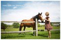
| 06/13/2009 02:21:13 AM | New friendby nico_blueComment: Are you short of zoos in your area? Nice shot of the woman and horse. I would have cropped out the tail end of the other horse. | | Photographer found comment helpful. |
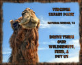
| 06/13/2009 01:34:01 AM | Take Your Childrenby posthumousComment: Interesting take on the challenge and perspective on this shot. You did catch the goat's eyes well. Personally I would not be attracted to this zoo ad. There is too much text that is hard to interpret and not much of interest in the picture. | | Photographer found comment helpful. |
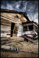
| 06/12/2009 12:52:11 AM | This Old Houseby cutlassdude70Comment: Greetings from the Critique Club
You made a great find with this house. Also living in Southern California myself I know they are pretty hard to find. I like the perspective you got on this building, making it much more interesting than, for example, a straight on shot.
As you said, this is obviously HDR. It's pretty extreme here, but it works well for old buildings, bringing out the grain and other detail, as well as the clouds, which were fortunate.
The exposure is good. I like the room above and below the building. The sides give me sort of a claustrophobic feeling. Perhaps backing up some or widening to the forbidden square format would reduce that feeling. You used a very wide angle lens, but you fortunately don't have the wide-angle distortion.
The tree appears to be coming out of the roof, which wouldn't surprise me since the vent indicates there is no roof. This may be difficult to avoid while still getting the angle you want, and is definitely less objectionable than a tree coming out of someone's head, and it does add to the rustic look, but I think it would be better if it was more to the right. It is good that you had it to the right of the roof peak, and maybe that's as far as you could push it and still get the picture you wanted.
The bars or cables across the front of the house also detract from it. I don't know if it would be legal in advanced editing to clone or spot heal them out of there. It is more than power lines, so removal may be illegal. It would be worth clearing with SC before deadline.
With the above exceptions I think this is a well done shot. You may be correct about people being tired of HDR, but you basically got a 6, which is a very good score (at least I love them!). Keep it up. Let me know via PM if you have any questions or anything. | | Photographer found comment helpful. |
| 06/11/2009 11:50:45 PM | Vortex Shearsby 777STANComment: Greetings from the Critique Club
First what stands out is the angles in this shot. The camera angle and scissors angle give a very off-balance perspective which adds interest to the shot. It also gives the optimum angle to keep the upper side of the shears (is that different than scissors?) in focus and the lower side quickly going out of focus relegating it to a minor part of the picture. Aesthetically this is much better than the opposite. Finally, it allows you to have the largest possible shears size within the picture size allowed in the challenge.
I especially like the table surface lighting, gradually going from nearly full black to nearly full white. It looks to me to be a difficult task, but you did it well.
I'm undecided about the lighting on the shears. If the purpose was to show the shears well it would have probably worked out by rigging up a light tent or otherwise spreading out the light more. As it is much of the shears are dark. However you may not have been able to get the 0 to 255 lighting gradient on the surface. There seems to be a little fuzziness in the foreground. Maybe it's the shallow DOF, but the surface appears much different before the focal plane than in the sharp focus zone.
Other than that, with all due respect there isn't a lot here to hold my attention, which may explain the poor placement you got in this challenge. You did a lot of processing on it. I don't know if you do similar processing normally, but the effort may have been better expended on a more complex subject.
On the other hand I like when shots are simple. I tend to make pictures too complex, usually to my detriment. In any case keep shooting and entering challenges. If you have any questions or comments feel free to contact me. |
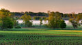
| 06/10/2009 02:04:11 PM | Corn Rows at Dawnby davidwComment: Greetings from the Critique Club
My first reaction when this shot came up was "Woh!". It really jumped out at me with the detail, beautiful coloring, and peaceful composition. It reminds me a lot of where I grew up, also in Minnesota, though corn is generally grown further south.
You were on the scene at a perfect time of day. The dawn lighting does a great job on illumination angle, coloring hues and shadowing, bringing out the depth of the scene. Additionally that is probably the only time of day you can catch that lovely fog/mist on what I assume is a river and faintly under the distant trees. Now if you could have enticed some deer to graze on the light green grassy area it would have been perfect, but that may be too much to ask for.
The S curve of the corn rows gives a very pleasing flow to the picture. This gentle rolling is continued with the curved branches and slightly hilly landscape. I like how the sun is peaking up from the treetop in the left corner. You have enough light to emphasize the sun without throwing off the lighting for the rest of the picture. Your bracketed exposure and Photomatix HDR processing probably helped you with that.
I do like the coloring of the sky, but the clouds are difficult to see. Since you used Photomatix and Topaz Adjust I think it would have been improved it a great deal by selecting the sky and increasing the dynamic range of it to bring out the clouds much more. I just recently found out you can use Topaz Adjust on selections rather than the entire picture. You did very well on brightness, contrast (other than clouds) and color adjustment.
I do not see excessive noise in the shot, but you did shoot at ISO 400. You used f/16 while shooting L glass on a scene that would not be affected much by a larger aperture, so you might have tried dropping to ISO 100 and f/8 for an even better picture, at least with any enlargement. You have fairly slow shutter speed also, but since I'm sure you used a tripod and there is no motion in the shot you would not have benefited by increasing the shutter speed.
The almost letterbox extreme landscape crop works well here, allowing you to get maximum horizontal image while allowing you to have "rule of thirds" lines separating the sky, middle land and trees, and foreground fields. You do lose some allowable pixels that way, but it allows you to increase the definition in the remaining picture.
So in summary, this is an excellent shot that I can only see improved by some sky definition and, next time hire some deer. ;-) Please PM me for any clarification or discussion. | | Photographer found comment helpful. |
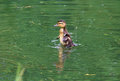
| 06/09/2009 10:07:06 PM | stop swimming and start flying ...by carljacquemynComment: Greetings from the Critique Club
This is a good catch of a very cute duckling learning to fly. I see it's just your second entry. I think it's a good improvement over your first one and you scored well with it being in about the top third.
As one commenter said my initial first reaction was that the duckling occupies too little of the available space and that there is too much blank "negative" space around it. I do get the point of the ripples spreading out from the center, but I feel the picture would have had more impact by sacrificing the ripple effect and cropping for more detail in the duckling. I agree with your comments about not wanting to lose the splashes and not wanting it to be moving out of the picture, so perhaps leaving it with a centered position but cropping some from all sides would help bring out the duckling and get rid of parts that don't add to the picture.
I also agree with the commenters who said it did not meet the challenge. This duckling looks like it's far from quitting. You tried to use the title to shoehorn it into the challenge, but from personal experience I can tell you that rarely works well. This may have worked in another challenge or perhaps the monthly free study, but in the free study you had better have a great shot to have any chance at all. With that in mind you are fortunate to get the score you got.
You did well on the focus and the sharpness with just enough motion in the wings to show the movement was perfect. I don't understand the shutter speed listed as 166.
Keep it up. You're doing great for your 2nd entry. I would recommend you start commenting on other people's pictures. You will find it helps you as much as others. Sometimes newcomers don't feel qualified to critique others shots, but as long as you give honest, non-hurtful feedback it will be fine. Try to keep your comments given and received count in proportion. Your one comment here seemed a little defensive. We're only trying to help each other here. Please PM me if you wish to discuss this critique further. | | Photographer found comment helpful. |
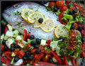
| 06/09/2009 08:37:57 PM | Fish anyone?by docjonnyComment: Greetings from the Critique Club
This is definitely a colorful shot, and the fruit and vegetables look very fresh and appealing despite the comment about the olives. I love the colors produced by the wide variety of delicious looking produce.
I think the f3.8 hurt the depth of field a little making the layout not as sharp overall with this close shot as my taste would prefer.
I do have some issues with the fish. The glaze on the eye and the shininess of the skin make it appear to be not as fresh as the rest of the food. You may have been able to correct that with a polarizing filter and some lighting corrections. I know you can't keep fish long without them getting that glazed look in the eyes.
Personally I would have preferred the fish not being so tight in the corner, especially its face, and having some vegetables around the top-left part of the picture.
I do like the clumped layout of the vegetables which looks more realistic than if it was all tossed together and laid out more randomly.
The subtle frame works well here. I haven't used frames myself, but I do like them when well done. Good job, and I'll come to your house for dinner anytime! | | Photographer found comment helpful. |
Home -
Challenges -
Community -
League -
Photos -
Cameras -
Lenses -
Learn -
Prints! -
Help -
Terms of Use -
Privacy -
Top ^
DPChallenge, and website content and design, Copyright © 2001-2024 Challenging Technologies, LLC.
All digital photo copyrights belong to the photographers and may not be used without permission.
Current Server Time: 04/20/2024 02:32:03 AM EDT.
|