| Image |
Comment |
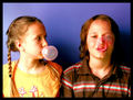
| 05/01/2007 02:51:21 PM |
POP!by kriscros16Comment by zardoz: Love the expression on their faces - it makes me smile every time I look. It looks like the image was over exposed causing the red channel to blow out. That is what has caused the yellowness in the facial highlights. The image also seems rather grainy/noisy as though the ISO was set very high. You score high for creativity but loose some for the technicals I'm afraid. |
 Photographer found comment helpful. Photographer found comment helpful. |
| 05/01/2007 01:19:28 PM |
POP!by kriscros16Comment by Shaman: great expressions. I find it a bit noisey, tho. Also, some bouce lighting coming in from the right would have really helped, by lighting the girls expression. 6 |
| Photographer found comment helpful. |
| 04/15/2007 10:41:36 AM |
Midnightby kriscros16Comment by LuDeLush: i think for me there is to much grain...maybe to high of an ISO...i ran into the same prob. with my photo. And the midtones are to grayed out..it needs some more contrast between the pure whites and pure blacks |
| Photographer found comment helpful. |
| 04/13/2007 05:55:01 PM |
The Medallionby kriscros16Comment by kawesttex: I'll reiterate the obvious focus problem. I think it would have also helped if you had the full medalion within the frame. The attempt at the depth of field is good, the tree does not detract from the picture, but helps fill the frame. Hiding the sun a little more behind the medalion would have given more contrast and vision. Really not that far off from a great picture. |
| Photographer found comment helpful. |
| 04/13/2007 12:38:00 AM |
Midnightby kriscros16Comment by adeldegan: The image is blurred and grainy. I would rather see the colors of the wine and the flower, than the B&W. |
| Photographer found comment helpful. |
| 04/13/2007 12:13:28 AM |
Midnightby kriscros16Comment by essie: Looks kinda cloudy and out of focus, but I like the idea. Maybe try it in color next time (perhaps with a little desaturation in some areas)? |
| Photographer found comment helpful. |
| 04/10/2007 10:34:37 PM |
|
| Photographer found comment helpful. |
| 04/07/2007 09:32:16 AM |
|
| Photographer found comment helpful. |
| 04/04/2007 06:53:19 PM |
|
| Photographer found comment helpful. |
Home -
Challenges -
Community -
League -
Photos -
Cameras -
Lenses -
Learn -
Prints! -
Help -
Terms of Use -
Privacy -
Top ^
DPChallenge, and website content and design, Copyright © 2001-2024 Challenging Technologies, LLC.
All digital photo copyrights belong to the photographers and may not be used without permission.
Current Server Time: 04/19/2024 05:55:02 PM EDT.