|
|
Comments Received by Manic
| Image |
Comment |
| 05/20/2010 01:50:17 PM | |  Photographer found comment helpful. Photographer found comment helpful. |
| 05/19/2010 09:38:44 PM | | | Photographer found comment helpful. |
| 05/19/2010 07:56:25 PM | | | Photographer found comment helpful. |
| 05/19/2010 07:49:32 PM | | | Photographer found comment helpful. |
| 05/19/2010 12:17:53 PM | | | Photographer found comment helpful. |
| 05/19/2010 12:10:53 PM | Take Your Pick...by ManicComment by Luci11e: awwww, lock picks? I'm guessing? I like this shot. I'm thinking you might get some comments about noise, but in this case I think it really adds to your image | | Photographer found comment helpful. |
| 05/19/2010 05:08:05 AM | Take Your Pick...by ManicComment by mrbig65: great idea,,,,,, this is "professional" ,,,,,,,,,,,, | | Photographer found comment helpful. |
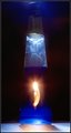
| 05/11/2010 06:07:09 AM | Fire Waterby ManicComment by spiritualspatula: Hey there, looks like I got another one of yours :)
As noted, I like the idea of your subject. With some more careful execution, and some alterations to your props, I think you could make this pretty interesting. Couple comments on the props first- the label is definitely distracting, as is the blemish on the glass. I’d consider using a bottle that the viewer will most definitely associate with booze and readily recognize. I would keep the brand label on it, and position the bottle such that you can read the label but that you can also see inside the bottle. A silver tequila would work well for this, but a colored alcohol would work fine too. Next, I’d choose a bit of fire that is more fitting of the subject matter. A birthday candle just doesn’t quite mesh with firewater to me, so I’d recommend making one of these . I’d then make two separate setups and swivel the camera on my tripod from one to the other- the first one be the flame, which I would use a slotted piece of black tagboard to simulate a fast shutter speed for to capture, then hold the tagboard in front of the lens, rotate the camera, then expose for the bottle and fire flashes. The reason I would do a dual setup is to avoid light contamination from the candle on the table and make setups more consistent. I quite like your lighting from the top though, it’s a very nice touch. It’s a pain trying to keep glare down on curved surfaces, especially in basic, so I’m not really sure what to suggest other than moving your lighting source further away to decrease the relative size of your specular highlights. Message edited by author 2010-05-11 06:15:44. | | Photographer found comment helpful. |
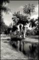
| 05/09/2010 02:29:34 AM | Palm Lakesby ManicComment by spiritualspatula: Hey there  Manic Manic- you testing to see what sort of Critiques are being put out by the Club these days? ;0
First thoughts on seeing your photo-
My preference for Black and White is to maximize contrast and really nail the gamut of tonality to increase the dramatic nature of the BW, because I feel like that’s what it works best for. However, I see you’ve taken a bit of an opposite approach, and I rather like where you’ve taken things. You obviously wanted to make things a bit dreamier, what with the application of gaussian blur, and this was well done. The lack of prominent contrast works wonderfully with the blur, and it also fits the scene. I think of palm trees as tropical, and somewhat dreamy in a vacation sense (perhaps I wouldn’t associate palm trees with dreamy vacations if I didn’t live in Colorado), and you’ve developed a compelling theme through combining these elements (similar to what Deb said).
While I think you really nailed that, the subject matter itself isn’t terribly compelling to me. There isn’t clear points for the viewer to focus upon, and the emphasis on subject is limited by the other intruding elements in the scene. There’s really a lot to look at, but it’s at the awkward point where there is no complete surrender to cluttered madness and it isn’t a clearly defined and simplified scene- it’s in a nether region. I think either more or less subjects would have benefited things. It would also be nice if there was a bit more detail in the clouds, though I understand you had a very contrasty scene so you would’ve been forced to sacrifice more of the palm fronds to complete shadow.
| | Photographer found comment helpful. |
| 05/06/2010 11:51:28 PM | | | Photographer found comment helpful. |
Home -
Challenges -
Community -
League -
Photos -
Cameras -
Lenses -
Learn -
Prints! -
Help -
Terms of Use -
Privacy -
Top ^
DPChallenge, and website content and design, Copyright © 2001-2024 Challenging Technologies, LLC.
All digital photo copyrights belong to the photographers and may not be used without permission.
Current Server Time: 04/24/2024 10:03:19 PM EDT.
|