| Image |
Comment |
| 04/18/2005 08:09:50 AM |
|
 Photographer found comment helpful. Photographer found comment helpful. |
| 04/18/2005 06:54:49 AM |
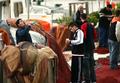
after the fish marketby SnapperLComment by ahaze: This is a busy shot, andto my eye the subjects aren't well enough separated from their background. A tighter crop removing the two guys in the rear might have helped make the three in the foreground more present. |
| Photographer found comment helpful. |
| 04/18/2005 03:51:37 AM |
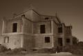
Solitudeby SnapperLComment by Brad: Toning seems a bit off / too dark / lacking contrast in my opinion.
Was this shot through a window or similar? Looks to be some square reflection area just to the left of the ridge. |
| Photographer found comment helpful. |
| 04/18/2005 02:00:56 AM |
after the fish marketby SnapperLComment by nico_blue: seems that you lost some detail in the black clothes (or it could always just be my monitor)... I really want to like this photo, it has really the ingredients for an outstanding capture but i feel that as is presented it lacks a central point of focus, the balance of people on the page is not really strong compositionally, the problem with the darks, and i guess also the shallow dof./ lack of sharpness. 7 |
| Photographer found comment helpful. |
| 04/18/2005 01:43:55 AM |
|
| Photographer found comment helpful. |
| 04/17/2005 04:54:52 PM |
Solitudeby SnapperLComment by smilebig4me1x: i think this might be a little too dark..my eye is drawn to the peak of the building by the transparent white square...but i like the angle of the photo and the look i think you were going for. |
| Photographer found comment helpful. |
| 04/16/2005 03:05:55 AM |
|
| Photographer found comment helpful. |
| 04/15/2005 06:31:00 PM |
Solitudeby SnapperLComment by bclements: Nice composition. Shows the building is abandoned. A little on the dark side, try lightening it up a little. Like the tone of the photograph. |
| Photographer found comment helpful. |
| 04/15/2005 03:15:54 PM |
Solitudeby SnapperLComment by andri: It looks as this was shot through a car window - am I right here?
Anyway, I think it would have been better to go a bit to the left and shoot the front of the house straight on. I think that would have looked neat because of the step-like form of the house. Including some background or foreground would also have been helpful here. If the woman on to the right had been somewhat closer to the camera this could have been a nice photo.
It also irritates me a bit that you have angled the camera upwards here. Better to shoot at a greater distance and crop the lower portion off the picture.
In addition the photograph is too soft but I like the toning though the effect is perhaps a tad strong for my taste. |
| Photographer found comment helpful. |
| 04/15/2005 06:59:41 AM |
|
| Photographer found comment helpful. |
Home -
Challenges -
Community -
League -
Photos -
Cameras -
Lenses -
Learn -
Prints! -
Help -
Terms of Use -
Privacy -
Top ^
DPChallenge, and website content and design, Copyright © 2001-2024 Challenging Technologies, LLC.
All digital photo copyrights belong to the photographers and may not be used without permission.
Current Server Time: 04/25/2024 01:01:54 PM EDT.