| Image |
Comment |
| 05/23/2010 08:23:03 PM |
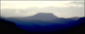
IMG_4625by JokersSoulComment by Ja-9: Kari, this is one of those pictures that looks great with the little white line and a wider black border...just a thought...but I like how it balances out the narrowness of these pictures IMO it is alot more pleasing to the eye.. |
 Photographer found comment helpful. Photographer found comment helpful. |
| 05/23/2010 05:58:21 PM |
IMG_4625by JokersSoulComment by Tammster: I'm REALLY sorry about taking so long to respond. I looked at them all and I completely agree with your choice. I really love this. The blues seem a tiny but oversaturated but I don't think it matters too much (maybe my monitor).
GOOD job! |
| Photographer found comment helpful. |
| 05/23/2010 12:25:15 PM |
IMG_4625by JokersSoulComment by glad2badad: This one stands out the best to me for the group. For me I think it'd be cooler if the foreground was in focus (the very dark areas) and faded out to non-focus on the primary subject (the bg mountain top). The artsy-fartsy group will really like this I think. :-) |
| Photographer found comment helpful. |
| 05/23/2010 11:13:31 AM |
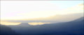
IMG_4480by JokersSoulComment by Ja-9: I would crop the far right of this one and take out some of the sky...it seems to be to much sky to me |
| Photographer found comment helpful. |
| 05/23/2010 11:12:53 AM |
IMG_4625by JokersSoulComment by Ja-9: I like this one the best, your using the RAW conversion software right...when your in that mode could you add just a bit more clarity?...not much...but a bit more to define the colors in the bottom better...but this is the one that I like the best |
| Photographer found comment helpful. |
| 05/23/2010 11:11:21 AM |
|
| Photographer found comment helpful. |
| 05/23/2010 11:11:11 AM |
|
| Photographer found comment helpful. |
| 05/23/2010 11:10:36 AM |
|
| Photographer found comment helpful. |
| 05/22/2010 09:22:40 AM |
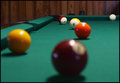
IMG_4421by JokersSoulComment by glad2badad: Nice idea, but I'm not so sure the 'focus' is actually missed. Most action on a pool table involves the cue ball, and that seems to be the in-focus subject IMO. |
| Photographer found comment helpful. |
| 05/21/2010 11:59:55 PM |
IMG_4421by JokersSoulComment by CNovack: Hmmm, first off you mention this is the only good one - could you provide F-stop, Iso, Y/N Flash....just so we can give suggestions on what settings you could try sometime in the future if you utilize this location for another challenge;-)
Strengths: Low angle - you really get us in there. Colors are good and natural looking - no oversaturation. You have some good detail on the corner pocket and the 15 ball.
Weakness: The composition is O.K. As someone who has played pool, I am a little lost on why we are looking at something other than the cue ball when 'we' the player are eyeballing it to sink the 15 ball. Lots of noise - but that can easily be cleaned up with a good denoise program. There is another element that is missing here when it should be part of the composition: the cue stick...I think that is something that could really help srengthen the composition and if composed right add some interesting leading lines. |
| Photographer found comment helpful. |
Home -
Challenges -
Community -
League -
Photos -
Cameras -
Lenses -
Learn -
Prints! -
Help -
Terms of Use -
Privacy -
Top ^
DPChallenge, and website content and design, Copyright © 2001-2024 Challenging Technologies, LLC.
All digital photo copyrights belong to the photographers and may not be used without permission.
Current Server Time: 04/25/2024 12:54:44 AM EDT.