Happy Christmas to you all!by
SaraRComment by karmat: Critique Club Critique
by karmat
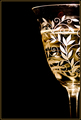
My initial response is that this is a very well focused, sharp picture, but that it feels just a touch "off" for my for some reason.
Compositionally, I usually like the awkward not quite in/not quite out framing like this. In this picture, though, it is a bit too awkward and seems out of balance. Maybe if it were in the left side of the frame it would seem more balanced. maybe. Your background is very nice and clean, so I'm wondering if this wouldn't be a good shot to have a lot more negative space in and just have the glass in one of the lower corners. (I'm gonna contradict myself in just a minute).
Technically, The focus is great. The bottom of the glass is blurred, and that is okay, because it forces the viewer to look at the pattern on the glass. The pattern itself is "cut" by the beverage, so I'm wondering if it would be better to have an empty glass, or fill it up to above the pattern.
About the challenge. This was a good entry for pattern, I think. It is not contrived, as many entries can be, but is an existing pattern that you were able to photograph, and photograph well. It definitely meets the challenge, in that regards. However (and this contradicts my earlier suggestion), I'm thinking seeing more of the pattern would be more effective. If you could play around with different compositions, it may have changed some.
Overall, a very nice shot. I think if more of the pattern could have been seen, it *might* have scored higher. If this were an "elegance" or "glassware" challenge, this would have been at the top of the list, I think.
Please feel free to contact me if you have any comments or questions.
karmat