| Image |
Comment |
| 05/27/2003 07:34:28 AM |
|
 Photographer found comment helpful. Photographer found comment helpful. |
| 05/15/2003 08:07:10 PM |
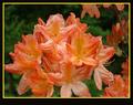
Summerby tragicharpyComment: Nice macro, which I think you could have improved by cropping into the main bunch, leaving out the ones to the right, which are slightly distracting. Unfortunately I think that your boarder is also a bit distracting due to the yellow (would think that you would have been better off using a tri-border - black the pink/orange of the flowers, then black) border and due to the rather thick lower boarder. |
| Photographer found comment helpful. |
| 05/15/2003 08:02:12 PM |
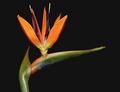
Bird of Paradiseby GalinaComment: Ahhh, I do love this flower. A pity you could not have got one in slightly fuller flower. Also would wonder if it might have been better to foto it from head on, rather than side on. Nice shot anyway - good focus and well lit. |
| Photographer found comment helpful. |
| 05/15/2003 07:54:49 PM |
Performanceby MusicmanComment: I think you might have scored a lot better if you had just taken a picture of the brilliant red spoked wheel (and yes I konw that you would then have lost out on the yellow and blue lights) however I do not feel as though they really add anything to this shot, and the the other cars in the picture are rather distracting. If you wanted to keep the lights, prehaps a tighter shot on the front wheel with just the left set of lights and the grill might have been a lot more interesting. |
| Photographer found comment helpful. |
| 05/15/2003 07:51:41 PM |
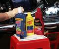
Primary Care - "Code blue"by drydocComment: Nice Idea, however I think that your subject composition is all incorrect and you would have been better leaving out the hand in glove, and the reflected cars, by cropping to your true subject, the three bottles. I feel that this would have been far less distracting. |
| Photographer found comment helpful. |
| 05/15/2003 02:49:19 PM |
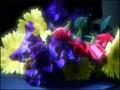
Nature's Primary Colorsby sherryk471Comment: I like the flowers you have used and the attempt you have made in adjusting the colours, unfortunately it has been let down a bit by the "halos" created around the flowers on the left. I am assuming that this is largely due to the compression you have put on saving this file - you have only used 30KB of your 150KB that you could have used. Try redoing this picture, however use less compression when saving and see if the halo effect re-occurs. |
| Photographer found comment helpful. |
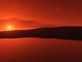
| 05/14/2003 05:25:45 PM |
Orange water... Orange skyby YppieComment: very pretty shot, though on my monitor it does look more red (primary) than orange, but will assume it is just a problem on my side.
Unfortunately where your shot does fall down is the amount of compression you have used in saving it. Your pic is allowed to have a file size of 150KB, where as yours is 26KB. This has caused the jaggies you see on the hill just bellow the usn (there is also some on other parts of the hill)..
Then you also have those funny circular lines in the sky - also due to the same reason (and would also assume that you have used a polarised filter - cause that is when I see them on my shots). |
| Photographer found comment helpful. |
| 05/12/2003 05:43:55 PM |
Primary Glass by JackoComment: I really like the simplicity of this shot - the only thing that I think could improve it would be to have brought it through on the floor. |
| Photographer found comment helpful. |
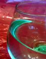
| 05/10/2003 07:59:11 PM |
Cheers!by sabal5Comment: Cheers for your shot. sorry could not resist. Looks as though you have picked up a TV in your glass which has also caused that rather distracting purple fringe at the top of the pic, and on the rim of the glass. I also think that you would been better off using something blue to create the effect that you have with the green. This would have helped the purple bits, and I think blue works better with red than green. |
| Photographer found comment helpful. |
| 05/10/2003 07:55:39 PM |
Nature's Fire (Abstract)by LeahStephenComment: Very nice idea, however I think you do need to have put your glass in better focus. I am also not sure about the background you have used (unless that is what has given the glass the purple fringing, but I doubt it. You probaly could have got a much better effect on a different background. |
| Photographer found comment helpful. |
Home -
Challenges -
Community -
League -
Photos -
Cameras -
Lenses -
Learn -
Prints! -
Help -
Terms of Use -
Privacy -
Top ^
DPChallenge, and website content and design, Copyright © 2001-2024 Challenging Technologies, LLC.
All digital photo copyrights belong to the photographers and may not be used without permission.
Current Server Time: 04/16/2024 08:13:18 AM EDT.