| Image |
Comment |
| 07/14/2006 09:46:15 AM |
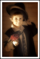
For Youby L1Comment: This is just too cute!
June |
 Photographer found comment helpful. Photographer found comment helpful. |
| 07/12/2006 06:09:36 PM |
|
| Photographer found comment helpful. |
| 06/22/2006 05:39:56 AM |
|
| Photographer found comment helpful. |
| 10/29/2005 09:29:12 PM |
|
| Photographer found comment helpful. |
| 10/29/2005 09:21:31 PM |
Manicby MatthewComment: He better not do this on the wedding pictures! |
| Photographer found comment helpful. |
| 10/29/2005 08:22:07 PM |
|
| Photographer found comment helpful. |
| 10/25/2005 01:57:28 PM |
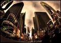
Times Square, 2005 by pawdrixComment: w00t! Finally you get what you deserve (too bad for the other person's DQ). Congratulations!
June |
| Photographer found comment helpful. |
| 10/24/2005 03:06:13 AM |
Times Square, 2005by pawdrixComment: I was sure you'd get the blue. I'm so sorry you didn't. This really is an amazing photo. Excellent job.
June |
| Photographer found comment helpful. |
| 09/23/2005 04:29:32 PM |
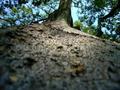
A far way to climbby ad12Comment: Greetings from the Critique Club.
I like how the lines in this picture lead the eye up towards the tree, nicely done. I find the out of focus foreground distracting, I would have used a smaller aperture to achieve a deeper depth of field. The image is also a little dark, perhaps adjusting the levels would have fixed that, or a slower shutter speed since I noticed it was 1/1000 which is pretty fast. Next time, if you have control over your camera's settings, setting a small aperture (higher number) will automatically select a slower shutter speed. Practice makes perfect! :)
If you have any questions or comments about this critique, please feel free to PM me.
June |
| Photographer found comment helpful. |
| 09/23/2005 03:48:22 PM |
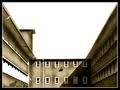
close downby zetosComment: Greetings from the Critique Club.
This is a nice idea for Perspective and Ilike the toning, it goes well with the old building.
There are a couple things that I don't like here. The blown sky is the biggest problem with this image. It is not very appealing and it takes the attention away from the subject. I know how hard it is to get a proper exposure when there is so much contrast between the foreground and the sky but a graduated neutral density filter or graduated gray filter usually works well.
Another thing is the white stripe on the left hand side. I'm not sure what this is but it's just very distracting. Not much that could have been done if it was that blown in camera. Keep trying, practice makes perfect :)
If you have any questions or comments about this critique, please feel free to PM me.
June |
| Photographer found comment helpful. |
Home -
Challenges -
Community -
League -
Photos -
Cameras -
Lenses -
Learn -
Prints! -
Help -
Terms of Use -
Privacy -
Top ^
DPChallenge, and website content and design, Copyright © 2001-2024 Challenging Technologies, LLC.
All digital photo copyrights belong to the photographers and may not be used without permission.
Current Server Time: 04/23/2024 09:31:20 PM EDT.