| Image |
Comment |
| 04/13/2009 06:42:06 AM |
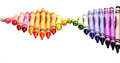
Color meby JC_HomolaComment: Pretty - looks like an advert image for the pencil product! |
 Photographer found comment helpful. Photographer found comment helpful. |
| 04/13/2009 06:41:33 AM |
|
| Photographer found comment helpful. |
| 04/13/2009 06:39:35 AM |
Undulationby CEJComment: ooooo - what a nice set up. Hope this does well! |
| Photographer found comment helpful. |
| 04/13/2009 06:38:55 AM |
Color Of Lifeby bonjoviComment: Pretty heart design in the wood and the white outline...intriguing how that formed in the middle of it all. |
| Photographer found comment helpful. |
| 04/13/2009 06:37:52 AM |
Watercolorsby sfmorrisComment: This is so intriguing... knowing DPC, I am wondering what this idea would have looked like on a black background and an extreme close up or crop? |
| Photographer found comment helpful. |
| 04/13/2009 06:36:24 AM |
Interior designby vawendyComment: I love the colour palette in this composition: his hair tones, the wall, the colour choices of wall scribbles...they all blend. Personally I would have cropped tighter off the bottom. |
| Photographer found comment helpful. |
| 04/13/2009 06:34:48 AM |
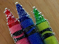
Colour Palletteby CraftyComment: I'm not sure, but I think my eye wants the focus on the pencil tips and it's disconcerting having to find the focus...which is on the wood. Nice composition however. |
| Photographer found comment helpful. |
| 04/13/2009 06:33:24 AM |
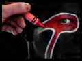
Outside the Linesby desertsnailComment: Oh yes - almost went for this idea myself!!! Great minds .... anyway, couldn't think of an idea for the face art so went another route! Love the red black and white palette. Great. |
| Photographer found comment helpful. |
| 04/13/2009 06:31:28 AM |
|
| Photographer found comment helpful. |
| 02/03/2009 09:49:32 AM |
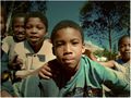
Peter Pan and the Lost Boysby faeryComment: Processing happened by way of an accident. I had trouble with my White Balance and when I got home, the series were overly saturated in BLUE! Loved the content, but the blue was over-powering and I was almost in tears with disappointment. What happened next I think is a form of primitive cross processing, because I applied The Draganizer filter program to the image, which does a whole lot of things: pulls out contrast and warmifies (thus subduing the blues). It was very much a touch of the button to set the Draganizer program running.
We live and learn. I rather liked the result and processed the rest of the images from the outing in the same way. Really gives them a stylistic punch. |
Home -
Challenges -
Community -
League -
Photos -
Cameras -
Lenses -
Learn -
Prints! -
Help -
Terms of Use -
Privacy -
Top ^
DPChallenge, and website content and design, Copyright © 2001-2024 Challenging Technologies, LLC.
All digital photo copyrights belong to the photographers and may not be used without permission.
Current Server Time: 04/16/2024 04:14:30 AM EDT.