| Image |
Comment |
| 01/04/2007 11:38:23 AM |
|
 Photographer found comment helpful. Photographer found comment helpful. |
| 12/24/2006 04:52:10 PM |
|
| Photographer found comment helpful. |
| 12/24/2006 04:49:49 PM |
|
| Photographer found comment helpful. |
| 12/23/2006 03:35:13 PM |
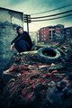
A soul in tension thats learning to flyby danica22Comment: Stunning composition and pose. The wings don't quite convince me but that apart the textures and form are absolutely breathtaking. In part it reminds me of Blake's 'Newton' - just because of the rocks and the feeling that the character is rooted to and constrained by them. |
| Photographer found comment helpful. |
| 12/22/2006 06:28:37 PM |
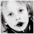
My Boy Lollipopby gsalComment: Partial saturation in the eyes isn't my cup of tea but... I totally love the high contrast, gritty, messy, and downright sticky feel. Especially like the deep black areas around the mouth, devoid of detail they have a slight 'horror' feel to them. Great portrait. |
| Photographer found comment helpful. |
| 12/07/2006 01:44:14 PM |
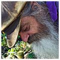
The Market Manby sherpetComment: Great shot - but, in response to your forum thread, the one area I feel you could have improved on is the background... it's very busy, very bright, and the colours clash with the main subject demanding equal attention from the eye. A less contrasty background with neutral colours and maybe a more pronounced DoF would help emphasise the detail in the portrait... could be the whiskers are a little overly sharpened too (?) my absolute favourite part of this is the cap - the textures and detail in that are awesome! |
| Photographer found comment helpful. |
| 12/03/2006 02:57:03 PM |
|
| Photographer found comment helpful. |
| 12/03/2006 02:51:48 PM |
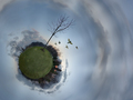
Cruel Beautyby ShmeeComment: Very effective panorama - foreboding and ominous feel - nice work. |
| Photographer found comment helpful. |
| 12/03/2006 02:46:14 PM |
Tokyo Kouyouby NerdJNerdBirdComment: Colours are a bit too vibrant for my taste but the composition and perspective is awesome. |
| Photographer found comment helpful. |
| 12/03/2006 02:43:40 PM |
I l l u m i n a t e dby pepitoidComment: Superb lighting - has the feel of an 'old master' painting.
Might be tempted to suggest croping in from each side to remove the very dark shadow areas - the muted lighter background with vague details works better for me... |
| Photographer found comment helpful. |
Home -
Challenges -
Community -
League -
Photos -
Cameras -
Lenses -
Learn -
Prints! -
Help -
Terms of Use -
Privacy -
Top ^
DPChallenge, and website content and design, Copyright © 2001-2024 Challenging Technologies, LLC.
All digital photo copyrights belong to the photographers and may not be used without permission.
Current Server Time: 04/24/2024 09:00:32 PM EDT.


![fEnCE - [tHe GraSS IsN'T aLWayS GReEneR]](https://images.dpchallenge.com/images_challenge/0-999/609/120/Copyrighted_Image_Reuse_Prohibited_445762.jpg)