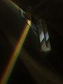
Prism Bluesby
EVincentComment by ambaker: Critique Club Review:
The colors are too saturated to really be called pastels, and it cost you points. Some people put more weight on the challenge topic than others, but very few ignore the topic in their voting.
Lighting, color, saturation, hue, focus and depth of field are all done well. The surface of the background makes the rainbow look a bit too sharpened almost grainy. A smoother surface would have helped here.
The scratches or cuts in the surface near center bottom, in the main highlight are a little distracting. Cloning them out would have helped.
All in all, this is a very good picture. Unfortunately the challenge wasn't well met. There is more than one person here who would rail against such a statement and say that the pictures be judged on their own merits regardless. However, in that case we might as well have free studies for every challenge and be done with it.
Looking at your profile I see your scores are improving every round. You are on your way.