| Image |
Comment |
| 02/01/2007 02:36:25 AM |
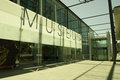
Museum.JPGby RetroesqueComment by roz: hi lisa .. i like your angle and perspective .....
i'd be tempted to saturate the green shade that's already in the glass, and maybe make the concrete etc a bit more orange as a contrast... but thats only my opinion and other ppl might think its better the way it is ... |
 Photographer found comment helpful. Photographer found comment helpful. |
| 02/01/2007 02:23:22 AM |
Museum.JPGby RetroesqueComment by DjFenzl: Interesting building. I like the way the shadow of the sign hits the ground.
I'm not very fond of the color balance though. I think it works for the concrete but the green in the sky is a little odd. Maybe try it as a duotone. |
| Photographer found comment helpful. |
| 01/31/2007 09:51:17 PM |
|
| Photographer found comment helpful. |
| 01/30/2007 05:31:23 PM |
|
| Photographer found comment helpful. |
| 01/30/2007 02:42:31 PM |
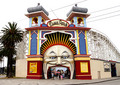
Iconby RetroesqueComment by GeneralE: Great entrance, but I think the shot might be more effective (for this challenge) with a tighter crop. |
| Photographer found comment helpful. |
| 01/30/2007 03:19:05 AM |
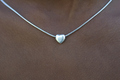
Symbolby RetroesqueComment by w4jzz: Normally a centered subject is frowned upon but the centered heart works here with the arc of the necklace giving a good dynamic element and just the hint of the neck giving the perspective. Nice job. |
| Photographer found comment helpful. |
| 01/29/2007 11:08:14 AM |
Graffitiby RetroesqueComment by pineapple: It's a reproduction - albeit well photographed - of someone else's art and creative ability. You, as photographer are merely acting as distributor. Although well photographed, the aspects of this photo which attract are entirely reliant on the artist's work. Therefore, in that it is a challenge related to photography, my vote is as follows: Artist: 10 Photographer: 1 |
| Photographer found comment helpful. |
| 01/28/2007 11:50:35 PM |
|
| Photographer found comment helpful. |
| 01/28/2007 10:13:13 PM |
Iconby RetroesqueComment by hoffy: Its a shame you cant clone out the power lines in basic editing. May have looked better with a tighter crop on the face (my opinion only) |
| Photographer found comment helpful. |
| 01/28/2007 07:41:16 PM |
Iconby RetroesqueComment by rabinam: Nice shot, this would have looked even more impactful cropped into the 'head', as that's such a unique entrance on it's own. |
| Photographer found comment helpful. |
Home -
Challenges -
Community -
League -
Photos -
Cameras -
Lenses -
Learn -
Prints! -
Help -
Terms of Use -
Privacy -
Top ^
DPChallenge, and website content and design, Copyright © 2001-2024 Challenging Technologies, LLC.
All digital photo copyrights belong to the photographers and may not be used without permission.
Current Server Time: 04/19/2024 09:00:39 AM EDT.