| Image |
Comment |
| 02/12/2003 04:25:27 PM |
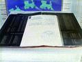
hiddenby kellieComment by Swashbuckler: O.K. I see your waldo. The combination of the lighting and (I think) the black and white doesn't work well here. There seems to be quite a bit of light grain over most of the image. The window's light is fairly blown out. Focus is O.K., but hard to tell through the grain. 5 Swash |
| 02/11/2003 11:52:27 AM |
|
| 02/11/2003 11:43:17 AM |
hiddenby kellieComment by kiwiness: I see you :-))) This photo seems a little grainy to me. The idea is good though. |
| 02/10/2003 02:11:25 PM |
hiddenby kellieComment by carsten: Great idea and composition. The sepia tone works fine. Focus could had been better but it is not THAT disturbing. Overall a great job that gets high score from me. |
| 02/10/2003 01:41:08 AM |
hiddenby kellieComment by leko2k: interesting shot. the enitre frame seems a little out of focus which I found distracting. |
| 02/09/2003 07:53:22 PM |
|
| 02/06/2003 05:02:51 AM |
|
| 02/05/2003 05:55:08 PM |
The Bookby kellieComment by Allen: Even though thisp icture seemed to come out a little blury i like how you set thepicture up. Nice Work |
| 02/05/2003 04:58:00 AM |
|
| 02/04/2003 02:09:25 PM |
|
Home -
Challenges -
Community -
League -
Photos -
Cameras -
Lenses -
Learn -
Prints! -
Help -
Terms of Use -
Privacy -
Top ^
DPChallenge, and website content and design, Copyright © 2001-2024 Challenging Technologies, LLC.
All digital photo copyrights belong to the photographers and may not be used without permission.
Current Server Time: 04/25/2024 05:15:09 PM EDT.