| Image |
Comment |
| 06/04/2003 03:10:12 PM |
Loud Colorsby peggyComment by karmat: Interesting shot. And humorous. I think it needs to be a bit more clear. |
 Photographer found comment helpful. Photographer found comment helpful. |
| 06/04/2003 02:10:31 AM |
Loud Colorsby peggyComment by qachyk: I'd say "It's Mardi Gras!" except, of course, it can't be. However, I am curious what it is.
"Loud colours" is right. This photo is very busy and seems somewhat out of focus. I see the double-display of the challenge topic but the composition is sufficiently distracting that it's not a terribly attractive photo to me. |
| Photographer found comment helpful. |
| 06/02/2003 03:06:01 PM |
Loud Colorsby peggyComment by hawkida: Very busy and the main part of the shot is taken up by people's backs - not a fascinating view. |
| Photographer found comment helpful. |
| 02/27/2003 11:54:13 PM |
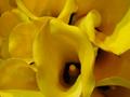
Lilyby peggyComment by tcherring: CRITIQUE CLUB:
Lighting: I don't see anything wrong with the lighting you used... I am assuming it was natural light??
Technical: As you've heard before, I think the focus is soft. These are obviously gorgeous flowers, and a sharper focus would have made for a better photo.
Challenge: Can't get more yellow! Definitely met the challenge head on!
Overall: Really a great shot and a wonderful try! I have always struggled with depth of field and focus, both of which would have made this an even better photo. All I can say is practice practice practice. But, I still think it's a great shot and one you can be proud of. |
| Photographer found comment helpful. |
| 02/23/2003 09:29:40 PM |
Lilyby peggyComment by mcrael: Nice composition, but focus is too soft. Try more lighting, wider aperture? |
| Photographer found comment helpful. |
| 02/19/2003 09:26:37 PM |
Lilyby peggyComment by PTLParsons: At first wanted to say needs more focus, then thought no, now think yes. It needs better focus in the center, then if you want the outsides a little off, ok. Maybe just sharpening it would accomplish the desired effect. Beautiful flower. |
| Photographer found comment helpful. |
| 02/07/2003 10:11:59 PM |
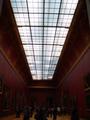
Louve Ceiling Panesby peggyComment by Gracious: Critique Club Comments by Grayce
This is graphically a strong image. It's a simple composition, which I appreciate, yet strong and solid.
My eye gets drawn in by the perspective. The scale is very interesting, and it's good you included the people to show the scale.
I don't agree with the comment that "there is too much negative space." The neg space works well here.
A little more light on the people probably would be enhance the image, but there is enough to make it out.
Overall I like this and I congratulate you on your vision.
Regards,
Grayce |
| Photographer found comment helpful. |
| 02/02/2003 06:30:40 AM |
Louve Ceiling Panesby peggyComment by DougPaz: It actually looks like a painting. Neat take on the challenge and I like the perspective. It may have been just a tad brighter. |
| Photographer found comment helpful. |
| 02/01/2003 11:17:29 PM |
|
| Photographer found comment helpful. |
| 02/01/2003 08:27:24 AM |
|
| Photographer found comment helpful. |
Home -
Challenges -
Community -
League -
Photos -
Cameras -
Lenses -
Learn -
Prints! -
Help -
Terms of Use -
Privacy -
Top ^
DPChallenge, and website content and design, Copyright © 2001-2024 Challenging Technologies, LLC.
All digital photo copyrights belong to the photographers and may not be used without permission.
Current Server Time: 04/24/2024 10:29:40 AM EDT.