| Image |
Comment |
| 10/11/2006 09:42:12 AM |
Hopeby EyesupComment by whiteroom: from experience voters dont go for religious pictures, one.
statutes dont seem to do well either.
then it was too small.
but it is sharp, exposure is right.
better luck next time, dont give up. |
 Photographer found comment helpful. Photographer found comment helpful. |
| 10/11/2006 09:21:11 AM |
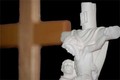
Hopeby EyesupComment by theSaj: I find that the two subjects are clashing with one another. How they overlay on top of the other. The wood cross is really out of focus but sharply outlined. Which gives it the feel of being cut and pasted, even though it wasn't.
I like the exposure on the white cross. But you've cut off the other person's head. You've also cut off the right edge of the cross.
Lastly, there is no border. Everything is cropped so tightly as to not allow the viewer's eyes to back up from the subject.
Hope that helps. Stick with it. You'll improve greatly on this site. |
| Photographer found comment helpful. |
| 10/11/2006 09:18:25 AM |
Hopeby EyesupComment by aznym: Did you find this shot interesting? If so, why?
It's called hope. What is hope? How is hope displayed in this image?
To me, it's a very unattractive image. There's nothing in it. Useless.
I can't tell you how to score higher, but, I think you should try to look more. Look at images that interest you and ask yourself what really is that grabs you. Why an image tells you something and how it's done.
If you have something to say like 'hope', then work on ways to get the message across. A statue and a cross in the image means nothing to me and there will be many others like me too. Of course, I know what the cross is and what's it about - but not because of your photograph.
If you don't understand how something is done, you can always find out by asking on DPC or from other sources.
.... my thoughts. |
| Photographer found comment helpful. |
| 10/11/2006 09:10:13 AM |
Hopeby EyesupComment by ionelpop: The edges of the cross in the background look as they were processed. Besides, the white cross is not entierly in focus. With a better positioning of lights, you could have more relief. The crop is too tight.
|
| Photographer found comment helpful. |
| 10/11/2006 02:21:34 AM |
Hopeby EyesupComment by LERtastic: Biggest reason why this didn't do good Mike, is that the size is so small. Gotta use the max 640.
Second, religous shots like this usually don't score well, not disagreeing or agreeing with that, just a fact. |
| Photographer found comment helpful. |
| 10/10/2006 05:22:16 PM |
|
| Photographer found comment helpful. |
| 10/04/2006 08:29:49 PM |
Hopeby EyesupComment by rballermann: The cross in the background is somewhat distracting, would have worked just as well or better on a flat black background. Using a flash off to the side would improve contrast as well. |
| Photographer found comment helpful. |
| 10/04/2006 05:12:27 PM |
Hopeby EyesupComment by dallasdux: I like religious icons and it is a nice photo with the depth of field blurring the wood cross behind it. But, I almost thing leaving that space on the left void (empty space) would have provided more of the themed "contrast". |
| Photographer found comment helpful. |
Home -
Challenges -
Community -
League -
Photos -
Cameras -
Lenses -
Learn -
Prints! -
Help -
Terms of Use -
Privacy -
Top ^
DPChallenge, and website content and design, Copyright © 2001-2024 Challenging Technologies, LLC.
All digital photo copyrights belong to the photographers and may not be used without permission.
Current Server Time: 04/23/2024 10:02:02 AM EDT.