| Image |
Comment |
| 11/05/2006 02:14:01 PM |
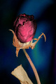
Beauty in Deathby EyesupComment by gerdagrice: I like the idea of this image very much, but the flower needed to be a bit sharper. It seems to be a bit out of focus. Also, I suspect you may have used a bit of poster edges (the blue-green area on the right suggests this), and to my eye at least, it hasn't really enhanced the image. |
 Photographer found comment helpful. Photographer found comment helpful. |
| 11/04/2006 05:10:51 AM |
Beauty in Deathby EyesupComment by mamba: the image feels a little grainy, but good contrast of the background and dying/dead rose. |
| Photographer found comment helpful. |
| 11/03/2006 05:34:35 PM |
Beauty in Deathby EyesupComment by ladyhawk22: Interesting backdrop for this shot. I like that you chose a color that would help the bloom stick out. My main concern with this photo is that the focus does not seem to be on the bloom. The blossom itself looks too soft....perhaps detail was lost in post processing? |
| Photographer found comment helpful. |
| 11/02/2006 12:36:58 PM |
|
| Photographer found comment helpful. |
| 10/25/2006 03:29:57 PM |
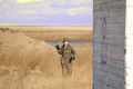
Holy Warby EyesupComment by KaDi: Not really sure what you're going for here. Is it the smiling soldier or the wall that is the subject? Something odd going on with the color in the sky...yellow clouds? |
| Photographer found comment helpful. |
| 10/25/2006 01:14:26 PM |
Holy Warby EyesupComment by Hawk5000: I don�t like the post processing. The clouds and horizon look to artificial compared to the landscape. |
| Photographer found comment helpful. |
| 10/23/2006 10:25:31 AM |
Essential Elementsby EyesupComment by zaflabout: i am not sure how you got the black background, it seems you reduced the brightness in photoshop which created the edges around the blender and the cereal bowl. i think the picutre would have been a lot better if you actually put all the cereal bowl in perspective. |
| Photographer found comment helpful. |
| 10/23/2006 12:36:18 AM |
Essential Elementsby EyesupComment by Jutilda: Just not tons of wow to this one. The focus is good but the subject matter just isn't what gives people that "Woah, did you see that one?" feeling, if you get my drift. I think I would not have cropped the bottom quite as tightly, either, so that the whole bowl is showing. Maybe even scoot down the table further to provide more of a "setting" instead of a closeup, if that makes sense. Hope this helped. ;~D |
| Photographer found comment helpful. |
| 10/18/2006 10:55:57 AM |
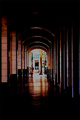
The Long Walkby EyesupComment by atupdate: Hello from the Critique Club,
Welcome to DPC. I must admit that this image has the most detailed comments I've seen of the nearly 100 images I have critiqued. I don�t' have a lot to add, as my impressions of this image before reading the comments mirror those of the comments you received. The two items that hurt your score the most is that something doesn�t look right post processing wise and that for the majority of voters, this does not meet the challenge as a portrait. Without seeing the original image, it is hard to make suggestions as to improving the post processing. Keep trying, the composition of this image shows that you have a good eye and once you master the post processing part and learn what works at DPC, you will find your score will improve dramatically.
Feel free to PM me if you have any questions regarding this critique.
Tim
|
| Photographer found comment helpful. |
| 10/17/2006 05:20:10 PM |
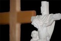
Hopeby EyesupComment by sfalice: Greetings from the Critique Club
Welcome to DPC. I see this is just your second Challenge entry and you already have a feel for the community as many photographers have commented on your entry and have given you valuable information if find it helpful.
Your entry was selected at random by the 'elves' that live in the DPC Critique Club program, and I was lucky enough to draw your image.
Since many of the points I might address have already been touched on by those who commented during and after the Challenge, I'll limit myself to just one compositional suggestion. And, obviously, this is just a suggestion:
Very frequently, when an image is divided in half (in this instance: cross in one half; statue in the other) a viewer doesn't know which is more important, and simply moves on to the next image in the queue. Since we want the viewer to linger and appreciate our own work, it is usually best to make one section of the image more important than the other. In this case, the statue is more in focus and could have taken up more of the space with ease, and also might have given a stronger reason for the background cross to be OOF.
In any event, I do hope you enjoy your participation in DPC. I'll look forward to seeing more of your work.
SFAlice |
| Photographer found comment helpful. |
Home -
Challenges -
Community -
League -
Photos -
Cameras -
Lenses -
Learn -
Prints! -
Help -
Terms of Use -
Privacy -
Top ^
DPChallenge, and website content and design, Copyright © 2001-2024 Challenging Technologies, LLC.
All digital photo copyrights belong to the photographers and may not be used without permission.
Current Server Time: 04/25/2024 12:22:47 AM EDT.