A Portrait of Successby
jodeleeuwComment by ambaker: Critique Club Review:
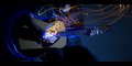
Interesting image... I try not to get too involved with the message of the piece, unless the photographer's comments allude to what they were trying to say. Mainly because many people recieve messages the photographer never sent. In this case though, the image begs to be interpreted because there is little else. So I'm going to guess that the message was that the image doesn't matter, winning does. Am I right?
Yes the white of the "image" is blown out. However, I personally think that it adds to the piece here. It ensures that there is no detail and the "portrait" is empty and featureless.
Focus also seems a bit shallow. The top of the frame appears to be starting to go soft. The computer monitor, would have been better turned off. As it is, it distracts the eye. The back wall, or whatever is behind the picture works. I like that texture in this composition. Had you removed all the other distractions, or made them much softer, I think this would have made a stronger statment, and your score would be higher.
I think your score is a bit lower than you deserved. The problem being that this is one of those pictures that you really need to sit and read for a bit. During the voting, people get in a hurry with all the photos to vote on. One of the reasons I like the Critique Club is that I can take time with a single photo and really explore it. Really see it.
So again I say, this is a very interesting image. Not as colorful, not as busy as the others, but very interesting if you spend a bit of time with it. I'd like to see this one done a again.
Nice job...