| Image |
Comment |
| 08/16/2003 02:01:15 PM |
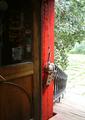
Inside looking out!by RobroComment by justesme: Hmm, interesting contraption. However, the title of the topic is Inside looking out. Perhaps making the door more of the subject by standing back a little and taking a nice landscape pic of most of the door and some inside surroundings would have been effective as I really like the wood. Well done, Good try =) |
 Photographer found comment helpful. Photographer found comment helpful. |
| 08/13/2003 12:31:08 PM |
Inside looking out!by RobroComment by margem: this has some nice elements wished the outside light weren't as bright. wondering did you bracketed your shot . it would been nice to pick up more outside detail |
| Photographer found comment helpful. |
| 08/11/2003 05:35:45 PM |
Inside looking out!by RobroComment by spiller: A little overexposed on the right side but otherwise a good shot. Like the way the red stands out. Good luck. |
| Photographer found comment helpful. |
| 07/29/2003 12:41:35 PM |
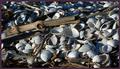
Driftwood and shellsby RobroComment by jodiecoston: Nice shot, good lighting, well seen. I particularly like the arrangement and that it looks like you chose this specific spot out of a huge area. I'd like to have seen it larger, but overall very nice. |
| Photographer found comment helpful. |
| 07/29/2003 06:54:03 AM |
Driftwood and shellsby RobroComment by e301: So small ... a lity really, because it looks like it'd be a great shot. But at that size, it's difficult to make out any detail. |
| Photographer found comment helpful. |
| 07/28/2003 01:31:30 AM |
Driftwood and shellsby RobroComment by patriciabrown2001: This photo would be much more effective if it were larger, but I like it a lot. The composition and lighting are both very strong. The way that the light falls on the shells is nice and the pattern that the wood makes adds a lot of interest. |
| Photographer found comment helpful. |
| 07/24/2003 11:23:07 PM |
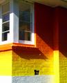
The Vet's placeby RobroComment by karmat: If the emphasis was on the red and yellow, I think a tighter crop would work better. If it was on the shadow/not shadow part, I think a wider crop would be in order. Nice brilliant colors, though. |
| Photographer found comment helpful. |
| 07/22/2003 12:52:49 PM |
|
| Photographer found comment helpful. |
| 07/21/2003 07:34:35 AM |
The Vet's placeby RobroComment by hortopth: As I have said to two other people, This is an example of a great photograph which may get an average score. If this happens, don't worry. You should be judging the mass of voters as much as they are judging you on this one. Great photographs are rarely appreciated on this site. Although it does feel out of focus. 8 |
| Photographer found comment helpful. |
| 07/19/2003 08:10:57 PM |
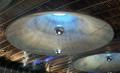
Britomart ceilingby RobroComment by ScottK: Did you try a shot from straight under? The angle doesn't lend itself very well to a feeling of "round". (I'm not saying it doesn't meet the challenge, just that it might have done it better from a lower angle.) |
| Photographer found comment helpful. |
Home -
Challenges -
Community -
League -
Photos -
Cameras -
Lenses -
Learn -
Prints! -
Help -
Terms of Use -
Privacy -
Top ^
DPChallenge, and website content and design, Copyright © 2001-2024 Challenging Technologies, LLC.
All digital photo copyrights belong to the photographers and may not be used without permission.
Current Server Time: 04/23/2024 02:50:25 AM EDT.