| Image |
Comment |
| 08/14/2006 09:32:12 AM |
|
 Photographer found comment helpful. Photographer found comment helpful. |
| 08/12/2006 05:29:48 PM |
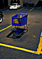
The new Sun Chips CRTby aliquiComment by LucidLotus: I'll come straight out and say that I don't like this in terms of something I"d put on my wall. I do like that you did a more daring PP than is often seen in challenges. I like the vibrancy of the colors and the focus looks good. I think I'd prefer the image was cropped more, crop out the black car and the yellow line on the far right. Its an interesting take on the challenge and while I don't find the overall affect very appealing I'm glad I saw it. Bumping from a 4 to a 5. |
| Photographer found comment helpful. |
| 08/11/2006 10:11:18 AM |
The new Sun Chips CRTby aliquiComment by redmoon: SO completely in two minds about this! by rights this sort of editting should make a photo stink, but, by gods, it works! i think it would be more effective if the cars weren't in the shot, and the background is uninspiringly dull to say the least, but the actually trolley and road surface and yellow lines all work together very effectively. the way the trolley glows with a yellow halo makes it seem, well, almost holy in a biblical manner. i can hear choirs of angels going "laaa!". 8. |
| Photographer found comment helpful. |
| 08/10/2006 06:49:51 PM |
|
| Photographer found comment helpful. |
| 08/09/2006 09:47:05 PM |
|
| Photographer found comment helpful. |
| 08/09/2006 03:46:09 PM |
|
| Photographer found comment helpful. |
| 08/09/2006 10:45:04 AM |
|
| Photographer found comment helpful. |
| 07/28/2006 04:59:23 PM |
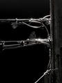
Online Creepy Crawliesby aliquiComment by Louis: I have to say that, in general, there isn't much that holds my interest in this photograph. It could be that I'm looking to ascribe some meaning to what I'm seeing, and that any abstract quality is destroyed by some recognizable shapes, or what, for me, amounts to a lack of structure in the composition. There's a kind of weight to the right edge of the photograph, leaving the rest of it floating in the ether; that may actually be a good thing to some viewers, as it gives a disorienting, weightless impression overall that satisifies some. Generally I very much enjoy the use of negative space in low-key images like this. The different shapes made by the intersecting lines are pleasing. There could be some lighting or post-processing issues to deal with that might result in a higher impact. |
| Photographer found comment helpful. |
| 07/26/2006 10:03:05 AM |
|
| Photographer found comment helpful. |
| 07/23/2006 10:17:11 PM |
|
| Photographer found comment helpful. |
Home -
Challenges -
Community -
League -
Photos -
Cameras -
Lenses -
Learn -
Prints! -
Help -
Terms of Use -
Privacy -
Top ^
DPChallenge, and website content and design, Copyright © 2001-2024 Challenging Technologies, LLC.
All digital photo copyrights belong to the photographers and may not be used without permission.
Current Server Time: 04/18/2024 01:14:29 AM EDT.