| Image |
Comment |
| 07/10/2006 12:00:25 PM |
|
 Photographer found comment helpful. Photographer found comment helpful. |
| 07/10/2006 11:58:14 AM |
Still Waters Run Deepby jenesisComment: What a lovely evening sky! There's a lot I like about this image, but the legs for some reason bother me. I think it's because the torso is bisected by the treeline. And the body also bisects the image. Maybe try some different crops - taking a bunch off the right side would (IMO) create a much more interesting composition right off the bat. I'm also wondering how a seated pose would have worked silhoutted against the water rather than the sky... |
| Photographer found comment helpful. |
| 07/10/2006 11:49:38 AM |
California Palm Trees?by YoungerComment: Very humorous and a nice composition with a dramatic sky. It might benefit from some of the post-processing tricks they are talking about on the Landscape Photo Learning Thread. Check it out and see what you think. |
| Photographer found comment helpful. |
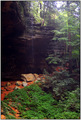
| 07/10/2006 11:45:49 AM |
Over 10,000 yearsby JeileenComment: A lovely spot and nice composition. The colors in the lower half seem unnatural to me. Is it really orange? |
| Photographer found comment helpful. |
| 07/10/2006 11:43:33 AM |
Rustyby venomoussvtComment: I like the colors here! Composition is a little cluttered, though. It must have been a challenge to find the right angle with the right lighting and still get that daylily in there. Try experimenting with a really tight crop (even if it means cutting off part of the daylily or the bird on top) to see if that helps. I would particularly recommend taking out the blue thing - very distracting. |
| 07/10/2006 11:38:56 AM |
Still Moth On Leaded Windowby _fred_Comment: Nice capture - I don't know that I've ever before been this familiar with a moth's face! There is something about the composition that is not working for me, but I can't put my finger on just what it is. I like the colors and the perspective lines. Would have preferred a slightly deeper field. I know this must have been a tricky shot to take. |
| Photographer found comment helpful. |
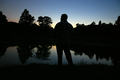
| 07/10/2006 11:35:27 AM |
A Moment In Timeby jordan prattComment: I appreciate the simplicity here, but think the composition could use a little more thought. Is there a reason that the background shadow intersects with the subject's chin? The shallow depth of field works to good advantage for the background, but perhaps needs to be just a bit deeper to make sure the silhoutte is sharply focused throughout. |
| Photographer found comment helpful. |
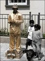
| 07/10/2006 11:30:54 AM |
anything for moneyby saintaugustComment: I enjoy the idea here. The selective desat doesn't add anything for me. I also find the composition a bit cluttered. I'm especially disturbed by the cut off head at the bottom. |
| Photographer found comment helpful. |
| 07/10/2006 05:35:26 AM |
Wheeee!by lwiley212Comment: Thanks, BakerBug, for the comments! I really appreciate your taking the time. I will have to play with the cropping of the guard rail to see what I think of it, since you and others commented on it. I didn't mess with it on the first go-round because I thought it helped to anchor all the motion between the foreground and background. This thinking was only happening in the post-processing -- just trying to learn the technique involved in getting motion blur was taking up most of my attention during the shoot! I felt really lucky that I got a couple of images worth looking at!! The close crop on the "P" is the result of the rotation to straighten it. I had a tough time deciding between the image I submitted and this one

I agree that the motion is cleaner and easier to read (which would definitely have helped since many of my commenters mentioned busyness and clutter). The colors and the sky and the big eye tipped the balance at the last microsecond...
Thanks for the welcome, too! So far I have been finding participation on this site to be an excellent and fun way to learn!
Linda |
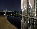
| 06/27/2006 11:45:18 AM |
Relectionsby Steveo77zComment: Overall I like the lighting effects. Part of me really wants to know what is at the top of those columns! |
| Photographer found comment helpful. |
Home -
Challenges -
Community -
League -
Photos -
Cameras -
Lenses -
Learn -
Prints! -
Help -
Terms of Use -
Privacy -
Top ^
DPChallenge, and website content and design, Copyright © 2001-2024 Challenging Technologies, LLC.
All digital photo copyrights belong to the photographers and may not be used without permission.
Current Server Time: 04/24/2024 10:36:26 AM EDT.