| Image |
Comment |
| 01/21/2005 12:33:11 PM |
|
 Photographer found comment helpful. Photographer found comment helpful. |
| 01/20/2005 07:53:35 PM |
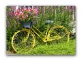
Yellow Bikeby nathaliedooComment by Cam: So pretty, great colors and composition. Less boarder would be nice.....so you could see moreof the photo. |
| Photographer found comment helpful. |
| 01/18/2005 10:27:59 PM |
|
| Photographer found comment helpful. |
| 01/18/2005 05:48:02 PM |
Yellow Bikeby nathaliedooComment by BobsterLobster: Nice photo, completely over-the-top and unnecessary border. I want to enjoy the photo, not have my eyes wrestled away by brute force. |
| Photographer found comment helpful. |
| 01/18/2005 04:29:42 PM |
|
| Photographer found comment helpful. |
| 01/18/2005 09:50:22 AM |
|
| Photographer found comment helpful. |
| 01/18/2005 04:02:45 AM |
Yellow Bikeby nathaliedooComment by RiderGal: I like the colors here, and how you filled the frame. I am NOT a big fan of the elaborate framing you did of the photo, although the photos seems to pop off the page... I want to judge on the photo itself and not on the presentation (but that is just me). Just a couple of ideas that might be fun to play around with here... playing a little with saturation levels might be fun, making the bike really POP out of the leaves, or bringing out the magentas and reds in the flowers, maybe trying a desat of the green? This is a photo that you could probably play around with to get something a little more artsy and less of a well composed snapshot. |
| Photographer found comment helpful. |
| 01/17/2005 11:00:49 PM |
Yellow Bikeby nathaliedooComment by kearock: The border is distracting and seems like a waste of pixels when you only get 640 to work with. It's a nice scene, but I'd like to see the bike stand out a bit more from the greenery. The bike seems a little green and the plants a little yellow. Play with the color balance a bit and see if you can separate them. |
| Photographer found comment helpful. |
| 01/16/2005 11:47:44 PM |
Yellow Bikeby nathaliedooComment by ButterflySis: Lighting is harsh. Interesting bike though. I wonder if this would work better in b&w? The border is wide for this image. A nice thin, simple border is best, imo. |
| Photographer found comment helpful. |
| 01/16/2005 08:18:19 AM |
|
| Photographer found comment helpful. |
Home -
Challenges -
Community -
League -
Photos -
Cameras -
Lenses -
Learn -
Prints! -
Help -
Terms of Use -
Privacy -
Top ^
DPChallenge, and website content and design, Copyright © 2001-2024 Challenging Technologies, LLC.
All digital photo copyrights belong to the photographers and may not be used without permission.
Current Server Time: 04/19/2024 09:42:32 PM EDT.