| Image |
Comment |
| 07/12/2006 02:00:24 PM |
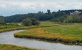
Small House, Big Riverby Mochrie99Comment: Nice idea - the first attempt I have come across at showing perspectives on size. The colours are a little dull. House is nice and sharp |
| 07/12/2006 01:57:57 PM |
|
| 07/12/2006 01:53:27 PM |
|
 Photographer found comment helpful. Photographer found comment helpful. |
| 07/12/2006 01:52:54 PM |
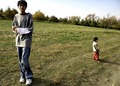
An Apple A Dayby SAhmed1022Comment: This is a strange image. I think it could have been improved by not cropping quite so tightly at the top and by using some fill flash to light the boy's face. His expression is a little odd and his stance isn't very appealing either - he looks uncomfortable, and it makes me as the viewer feel uncomfortable. The centre of the picture is too bare, and you end up looking from one boy to the other, not quite sure where to rest your gaze. Also - what exactly does this have to do with perspective?! |
| Photographer found comment helpful. |
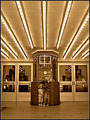
| 07/12/2006 01:48:59 PM |
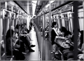
The Golden Age of Cinemaby DrAchooComment: I really like this - great composition, and the children looking in opposite directions adds interest to the shot - it wouldn't have been nearly as good without them. One of my favourites. |
| Photographer found comment helpful. |
| 07/12/2006 01:47:35 PM |
Lifeline or Eyesore?by captbenderComment: Great picture - love the colours. I think you should have been a fraction further to the right though when taking the shot, e.g. the vertical bar just above the cross doesn't quite point to the centre of the cross. In an image that relies heavily on the perspective, it would have been more striking if it was spot on (I have exactly the same problem with my entry by the way!!) |
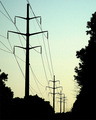
| 07/12/2006 01:44:00 PM |
Powerby TonyTComment: This is nice, but it is a bit too grainy. I like the gentle colours of the sky - works better than b&w would have done. |
| Photographer found comment helpful. |
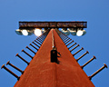
| 07/12/2006 01:42:46 PM |
To The Topby swallaceComment: I like this, but I wish the top of the pole was in better focus - the perspective draws your eye upwards, and then it is a bit disappointing not to be able to see the top of it properly. Lovely colours, and the bottom half is very sharp. |
| Photographer found comment helpful. |
| 07/12/2006 01:39:12 PM |
Sunday Morningby BrianRComment: I don't like the angle on this and the colour is a little strange. Nice subject, and the clouds add interest to the picture |
| Photographer found comment helpful. |
| 07/10/2006 10:32:10 PM |
|
| Photographer found comment helpful. |
Home -
Challenges -
Community -
League -
Photos -
Cameras -
Lenses -
Learn -
Prints! -
Help -
Terms of Use -
Privacy -
Top ^
DPChallenge, and website content and design, Copyright © 2001-2024 Challenging Technologies, LLC.
All digital photo copyrights belong to the photographers and may not be used without permission.
Current Server Time: 04/24/2024 03:27:55 AM EDT.