| Image |
Comment |
| 06/21/2007 11:10:33 AM |
|
 Photographer found comment helpful. Photographer found comment helpful. |
| 06/21/2007 11:07:38 AM |
Stormsriviermondby photokid69Comment: beautiful colours but same feelings as others that the frame is too much and is squeezing the image so that it's too cramped. |
| Photographer found comment helpful. |
| 06/11/2007 04:24:55 PM |
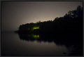
Reflections - Nature's Double Takeby jjusaComment: Love the light emanating from behind the trees and the little oasis of colour in the trees. It's a good shot, but I think that it suffered because of the topic of the challenge, but as a picture in itself I really like it. |
| Photographer found comment helpful. |
| 06/08/2007 07:10:28 PM |
|
| Photographer found comment helpful. |
| 06/08/2007 07:06:37 PM |
Studio Portraitby photokid69Comment: Beautiful model, like the pose and the lighting feels even maybe a little too shadowy on the right of her face and I feel as if it's cropped a little too tight on the top. Otherwise great shot. |
| Photographer found comment helpful. |
| 06/08/2007 06:59:03 PM |
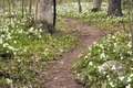
Trillium Pathby jjusaComment: It lacks impact for me. its a good use of the path as a line for the eye to follow through the image but there is nothing of real interest. I agree its too cramped, if it were wider or showed more of the trees it would feel more natural. |
| Photographer found comment helpful. |
| 06/08/2007 06:55:54 PM |
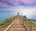
Land's Endby jdannelsComment: Beautiful, Love the colours you achieved with the sky and the ocean. Part of the foreground vegetation feels a little weak for me, but that might just me and If it was more powerful it could have detracted from the overall image. |
| Photographer found comment helpful. |
| 06/08/2007 06:51:39 PM |
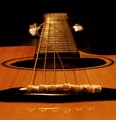
Freak'n String Take Two #1by GivemeashotComment: Out of the three I prefer this shot. I would have to agree and that a little more DoF would have helped it but good image, better than a lot of guitar shots I've seen. |
| Photographer found comment helpful. |
| 03/21/2007 05:17:03 AM |
Look under the Skinby WillSnapsComment: Personally thought this would have done well, shows the idea of cross dressing and differently and well executed, unlucky. |
| Photographer found comment helpful. |
| 03/14/2007 01:47:23 PM |
|
Home -
Challenges -
Community -
League -
Photos -
Cameras -
Lenses -
Learn -
Prints! -
Help -
Terms of Use -
Privacy -
Top ^
DPChallenge, and website content and design, Copyright © 2001-2024 Challenging Technologies, LLC.
All digital photo copyrights belong to the photographers and may not be used without permission.
Current Server Time: 04/16/2024 04:02:43 PM EDT.