|
|
|
Showing 421 - 430 of ~2036 |
| Image |
Comment |
| 04/05/2007 11:48:41 PM | Baby with Bearby kashiComment: I like the subtle and subdued lighting. The teddy bear is a great prop and your baby is beautiful. Picture is a bit on the soft side, but that's ok given the subject matter. Btw, I'm not crazy about baby pictures, but this one is especially compelling. Good job. |  Photographer found comment helpful. Photographer found comment helpful. |
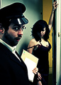
| 04/05/2007 11:45:27 PM | Sonia Gleiss [Paris]by FrancoisBComment: I like the high key, but think the lighting is too harsh. Not crazy about the composition either as her beautiful long torso looks constrained, contorted, and strained and along with the top of her head being cropped off like it is, she appears freakish. Finally, I would like to see a more interesting and contrasted background. I hope you continue to photograph her as I think she's got unique beauty and very interesting to look at. | | Photographer found comment helpful. |
| 04/05/2007 11:34:34 PM | Postman's Knockby kevrobertsonComment: I enjoyed the humor and the composition is good. Just think it's too heavy with the Dragonizer effect. | | Photographer found comment helpful. |
| 04/05/2007 11:29:03 PM | |
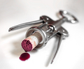
| 04/05/2007 11:27:54 PM | A Vintage Deathby ArtanComment: Cute idea, but the humor really fails me here. Visually uninteresting and boring; Lighting is harsh and the wine/blood gives me a hangover. Doesn't look like you put much effort into it. I want to get away from this picture like I do with an overbearing drunk at a party. | | Photographer found comment helpful. |
| 04/05/2007 11:13:09 PM | |
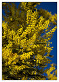
| 04/05/2007 01:55:10 PM | Springtime Yellowby XileboComment: Good color contrast, but image lacks detail and is too busy and out of focus. A closeup of one branch or flower against the sky would have more impact, imo. Also, for a shot like this, deeper DOF would be better. | | Photographer found comment helpful. |
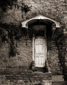
| 04/05/2007 01:50:10 PM | Entre Nousby posthumousComment: Nice tones, and interesting subject matter, but the structure and doorwary seem to just dangle in space without a grounding. | | Photographer found comment helpful. |
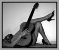
| 04/05/2007 01:46:41 PM | Longing to hear our songby clixographerComment: Good concept (kicking up our heels?) and very sexy picture. Without any facial identification I'm taking this picture to apply to womanhood/feminism on the whole. I'm not sure B&W is appropiate as I think color, and possibly red shoes would make a more effective statement. To me, there seems to be a balance issue in this image. Most of the light is directed at the feet/legs, which it should be, but that leaves the other elements in the picture kind of dark, especially the guitar, which, imo, should be lighter. Also, compositionally it is heavily weighted to the right. The dark border and darker left side adds more solemnity, and a feeling of constriction, imo. Is this what you had in mind? I think what you were intending with this image was more a feeling of freedom and celebration of womanhood. Am I wrong? Finally, I have mixed feelings about the positioning of the guitar. I like how it's neck continues the rhythm of the legs, but I would also like to see the guitar body emphasize the curve of her right thigh more. Perhaps some added light there and slight adjustment of the positioning of the guitar would help. Hope you found my comments helpful and not too wordy :). |
| 04/05/2007 01:17:20 PM | Damby AliciaComment: Could be an interesting image as I like the vista/overlook, but it lacks contrast and sharpness, imo. Forground adds nothing to the picture, is ugly, especially the shrub, and takes away about 1/4 of the image real estate. Could you have moved forward to eliminate it? Deeper DOF would probably help sharpness. What aperture/f-stop did you use? Finally, it appears to need a color balance adjustment to reduce cyan. I hope you found my comments helpful and not hostile. | | Photographer found comment helpful. |
|
Showing 421 - 430 of ~2036 |
Home -
Challenges -
Community -
League -
Photos -
Cameras -
Lenses -
Learn -
Help -
Terms of Use -
Privacy -
Top ^
DPChallenge, and website content and design, Copyright © 2001-2025 Challenging Technologies, LLC.
All digital photo copyrights belong to the photographers and may not be used without permission.
Current Server Time: 08/07/2025 09:51:48 PM EDT.
|


![Sonia Gleiss [Paris]](https://images.dpchallenge.com/images_challenge/0-999/645/120/Copyrighted_Image_Reuse_Prohibited_485123.jpg)