| Image |
Comment |
| 06/05/2003 12:03:04 PM |
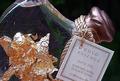
Gold Essenceby basia03Comment: While I know there is liquid in this bottle, you really can't see it (it should be more prominent IMO) and what's of more interest is the gold inside the bottle and the specs either in the liquid, or on the outside of the bottle. |
| 06/05/2003 11:56:33 AM |
|
 Photographer found comment helpful. Photographer found comment helpful. |
| 06/05/2003 11:53:28 AM |
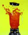
Yoo-Hoo!by Dallas_TXComment: Don't know what liquid is this color, but I would have liked to have seen a wider angled shot so that you could have gotten into the picture what appears to be the multi-colord glass containing the liquid. Also, the specular highlights in the liquid are distracting. |
| Photographer found comment helpful. |
| 06/05/2003 11:40:47 AM |
Blow your topby dan_pendletonComment: Great idea...I hope you didn't get your equipment full of it!
Great capture of lid blowing off blender. I also like the colors. |
| Photographer found comment helpful. |
| 06/05/2003 11:36:06 AM |
|
| 06/05/2003 11:30:52 AM |
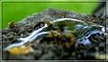
...They Will Comeby mindyparkerComment: I think your DOF is too narrow here and would have liked a brighter and more in focus foreground. Also, I"m a little confused as to what you are trying to say, that more ants/insects will come? |
| Photographer found comment helpful. |
| 06/04/2003 02:34:37 PM |
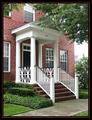
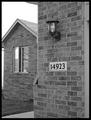
It's the only Brick house on the leftby CreativeFlyPhotoComment: From the standpoint of technique, I like this picture alot. The focus is great, and the colors are very rich. What I find average in it is the composition, which seems to me to be just a snapshot (this is my house type of picture). Also, the overexposed part on the right between the tree and bush is bothersome. I still gave you a high mark on this though. |
| Photographer found comment helpful. |
| 06/04/2003 02:11:53 PM |
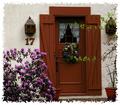
17by nathaliedooComment: Natalie, I disagree with those who dislike the border. I think it adds tremendously to an already fine shot and gives your photo a very artistic feel. The border draws attention to the stucco texture of the house and red wood on either side of the door, and gives the picture a whole new dimension. Very well done on this aspect.
I like the simple composition too, though I wish the two branches on the side were out of the frame and find the shot to be a bit underexposed. I think a little more exposure would have brought out more of the colors in the wreath, which are hard to see. I gave you a 10. Congrats on very fine work and good luck in future challenges. |
| 06/04/2003 01:44:12 PM |
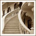
My old sweet home by pikytoComment: Congratulations on your ribbon! This is a wonderful shot and only one of two that I gave a 10 to. Their is much here for the eye to feast on...the shapes, tones and architecture are all very interesting to look at and the focus and exposure are right on. Also, I think your use of this style and color border adds alot of class to an already very classy photo. Much luck in future challenges, although I don't really think you need it. |
| Photographer found comment helpful. |
| 06/02/2003 10:07:08 PM |
Welcomeby LeahStephenComment: Nice focus and good exposure and I like the different shapes, but I think you the border is inappropriate here. |
| Photographer found comment helpful. |
Home -
Challenges -
Community -
League -
Photos -
Cameras -
Lenses -
Learn -
Help -
Terms of Use -
Privacy -
Top ^
DPChallenge, and website content and design, Copyright © 2001-2025 Challenging Technologies, LLC.
All digital photo copyrights belong to the photographers and may not be used without permission.
Current Server Time: 08/06/2025 04:07:12 PM EDT.