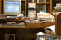
Organize my Computer Desk!by
mpreslarComment by jaysonmc: *Critique Club*
Initial Impressions: Fits the challenge well, still perhaps a bit too busy even if trying to convey a message of being disorganized.
Composition: You have your monitor and paper in the rule of thirds area which stabilizes the image. However, there is really very little eye movement, mostly just at the top of the frame. I do like the slight bend in the desk, conveying the weight of everytihg. However, in the attempt to make things messy you ended up with a very busy image that really isn't connected. I think the composition is the weak point of the image.
Technicals: Now we are talking. Most everything is pretty spot on. Sharpness is great. Everything is level. Exposure is good, with just a few blown highlights, but nothing to really work about. White balance and colors are near perfect.
Possible Ideas: Perhaps cleaning up a little bit in some places and moving the mess in areas so that your eye moves around the frame. Remove the clutter that doesn't help the picture as with the speaker. Think leading lines with trash! Maybe a bit more depth of field, though that is more of a minor issue.
Overall: It is a terrific idea for the challenge subject. All the technicals are pretty good just wish the placement of items helped the photo a bit. Nicely done.